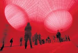
We started by looking at images of his huge installation at Tate Modern in 2002, Marsyas. The ancient Greek story is that Marsyas was a satyr who was flayed alive, literally skinned, and this massive piece is all steel and vivid red pvc, stretched and pulled right across and height and width of the Turbine Hall. I wish I had seen it in situ.


The strength of Kapoor's works seems to me to be in the sheer scale of them - both in their conception - who would think of making something quite so huge and also so simple in form? - and also in their execution - these works require major engineering and construction effort - how are they funded? how do you move from small-scale art-student work to something as huge as this?
Also the intense colour of Kapoor's work is quite overwhelming.

We looked at several other examples of his work, including Temenos in Middlesborough

( a rival to the Gormley Angel of the North in nearby Gateshead?)

the Sky Mirror in Manhatten,

and the Cloud Gate in Chigaco.

Some of the works looked better indoors than out, where their huge scale gets a bit lost in the wide open air, and where the need for scaffolding, etc, diminishes the strength of the structures themselves.


Later I looked on one at the images from his major exhibition at the Royal Academy in 2009. HIs works absolutely filled the gallery, taking over the main staircase with a huge red box-like construction.


The educational guide is here http://static.royalacademy.org.uk/files/anish-kapoor-education-guide-558.pdf
We also looked at some related work by other artists, including Tony Cragg's Plastic Palette II, 1985,

and Barnett Newman's Who's afraid of red, yellow and blue?, 1966.

The colour got me looking at Yves Klein Blue - here is the original piece and the formula for the colour.

The MoMA Gallery website gives the following information about IKB:
2006
Looking up all three of these other artists (Cragg, Newman and Klein) was really exciting for me, because I have tended to work in strong and pure colours in my textiles, and so far in my experiments with paint I have also gone for intense blocks of colour, trying to get a smooth and uninterrupted texture. I think these are all people I will study further.
I liked Kapoor's work. The scale is huge and uncompromising, and the materials are smooth and simple, but the overall effect is huge and imposing. You can't ignore them, and they have a compellingly tactile quality, even though they are so huge.
No comments:
Post a Comment