I have spent the past two days working furiously on my essay, which is about the American artist Ellsworth Kelly, and the influences his work have had on my own. The research was really interesting, and the writing not too hard, but a bit more challenging than I had at first thought.
Here are two of his paintings which I looked at.
Ellsworth Kelly, Colors for a Large wall, 1951, 96" x 96"
Ellsworth Kelly, Spectrum I, 1953
And here are two of my Spectrum-like quilts.....
I also really enjoyed thinking about the parallels, or not, between his work and some of my won, and how I have consistently used the colour spectrum in ways not that dissimilar to his systematic but also random use of colours. A good exercise: don;t know why it took me so long to get into doing it!
But the pffaffing about trying to line up images and text, almost impossible. I gave up with Pages in the end, and downloaded Word for Macs, which made it a whole lot better.
But then, of course, the finished file was enormous, and my e-mail refused to send it. So I learned a few more tricks about compressing picture files and so on, until it would go.
I am so relieved to have got it down, and amazed at the stress and bother it caused. I thought writing a short essay would be a doodle - after all, I've spent my whole working life writing reports, and also have done two post-graduate degrees. But this was still a bit of a struggle, even without the technology issues.
But it feels very good to have completed it (although it is far too long, for which I may yet be penalised) and now I can concentrate on the huge pile of work I still have to do for the assessment day on monday.
Yet more wandering around on the internet and I came across the Albers Foundation, set up to build on the work of Josef Albers(1888-1976) (a colourist) and Anni Albers (1899-1994) (a textile designer/weaver). Both born in Germany, they met at The Bauhaus in 1922, married in 1925 and moved to the US in 1933. They were involved in the newly established Black mountain College in North Carolina, later moving to New England.
Anni's textile weaving caught my eye partly because some of her colours and patterns are similar to one of my recent priced quilt tops., but also because some of her weaving relates to the kind of illegible line work I have been exploring for my Pathway project on writing. Here are two of her pieces.
She also did drawings of marks rather like writing and letter forms, such as this one
Josef Albers work is all about colour, and his paintings are simple, bold statements about colour and the relationship between different colours and scale.
Today we had a day in college working towards our second pathway project, and of course, I made lots of progress and lot of changes. In fact, my thinking has been going round and round over the past couple of days.
Yesterday I was engrossed in the work of people like Jenny Holzer and Fiona Banner, and was thinking about making something, screen printed probably, which was entirely text-based. But I wasn't quite sure why the text should be, and got a bit lost trying to find a reason, a personal theme.
Then I had a conversation with Charlie, who immediately latched onto "writing" as an active verb, rather than a noun - and that set me thinking entirely differently. I began to plan in term of making some big A2 or A3 paintings based on the swirl of script, done as large as I could manage.
But this morning, in college, I was less sure, and spent an hour or so in the library looking at books and images of roman and other, earlier, forms of script. And then, in talking ideas through with fellow-students and also with tutor Mark, I found myself planning to work on the business of writing, and the nature of script and letters as individual 'objects' - i.e. divorcing the idea of letters and script from any worries about meaning or content of a piece of writing.
This of course ties in well with my intention of making something bigger than before, and something celebrating the flow, the physical action, of writing.
So I spent a bit of the afternoon beginning to copy ancient scripts , and to experience some of the 'flow' of the process of boring these unfamiliar letter shapes. I plan to continue with this, concentrating on the nature and design of the letters, and getting my drawings/painting progressively bigger.
Mark encouraged me, also, to look around at letters, individual letters, rather than whole words, in shops, adverts, street signs, etc, etc. I will try to make a photographic collection of such images, which might contribute to the project, perhaps to an alphabet book of some kind. i have a small alphabet book I printed at UWE during the Letterpress Course last summer, and that might come in to the project in some way.
I plan to spend time tomorrow and during the rest of this week on practicing script and experimenting with different kinds of inks, brushes, etc. I will try to keep things (a) simple and (b) as big as I can.
Another idea, to be enveloped if I have time, is to use digital images and computer manipulation to stretch and distort some letter shapes. I might layer some overlapping images. This could relate to some of the images I have seen in the last couple of days by Idris Khan and Jan Owen.
Mark suggested I also look up work by Jasper Johns. So I looked him up tonight. Some of his images were immediately familiar, iconic images of the emerging Pop Art of the 1950s and early 1960s, like this one of the American Flag. Is this a painting of the flags, or is it a painted object which looks like three flags?
Three Flags, 1958
Johns did a lot of paintings based on repeated images of alphabet or numbers. sometimes set out in a grid, sometimes overlaid one on top of the other. He concentrated on the mark-making, the painting and texture and colour, so that the idea of letters or numbers got a bit lost and the finished piece was about colour or texture, rather than about text or meaning.
While he repeated this idea endlessly, to the point of over-saturation and exploitation of ta willing art market, the basic idea is compelling, and chimes well with my intention of producing something which focuses on the action of writing, the essence of individual letters (or numbers, although i hadn't thought to include numerals as well as letters - if numbers, then what about punctuation marks?).
I like oct of these images, and I like the way Johns used paint with such gusto, so thickly and richly. I wonder if I can embrace the paint as eagerly in my own efforts?
Coloured Alphabet
Gray Alphabets " 1960 graphite wash on paper by Jasper Johns. Size: 38 3/8" X 27 7/8"
Oil on canvas support: 1372 x 1048 mm frame: 1401 x 1078 x 48 mm painting
Presented by the Friends of the Tate Gallery 1961
In the 1950s, Johns began using flags, targets and numbers as the basis of his paintings. These were ordinary familiar things, but also had an iconic, emblematic quality. This work is one of a series that he undertook in the summer of 1960, using the superimposed numbers 0 to 9. Johns let the process of painting the number sequence dictate the structure of the painting. This allowed him to concentrate on the qualities of the paint itself, exploring colour and thickness. The result is a highlyabstract structure, but one rooted firmly in the real world.
I have been thinking more about the subject of my art history essay, and begun looking seriously at information about modern colourist painters. And where better to start than with Gerhard richter, not least because there is a major retrospective exhibition of his work on at Tate Modern at present (until January 2012) which I really want to go and sees. There is a film on Tate Channel of Richter talking to Nicholas Serota, Tate Director, about the show, and some film of him at work on his big abstract colour paintings, and about the business of selecting, designing and installing the exhibition itself.
What I found particularly interesting was his very calm and almost casual approach to his work, there is no urgency, no hurry, paintings can take him weeks or even months to do. Serota asked him "how do you know when an abstract painting is finished?" and Richter replied "I don't know, I just know, suddenly, that there is nothing more to be added, and it is done".
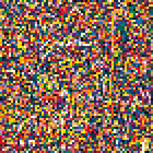
I really like Richter's colour series, simple blocks and stripes of colour. I especially warm to his huge canvasses covered with small squares of colour, some of them like a decorator's colour card, the bigger ones more like postage stamp quilts. These remind me of so many of my own quilt designs. The selection of put bright and random colours, and the vibrant effect that can come from their placement in huge numbers, is compelling and also endlessly interesting.
This is a rather nice portrait of Richter from The Guardian Arts Blog....
Gerhard Richter, whose work will be featured in a forthcoming Tate Modern exhibition, pictured with 4900 Colours: Version II. Photograph: Graeme Robertson, copied from the Guardian Blog, 7th Sept 2011
This afternoon we had a session with Jo on how to tackle our essay assignment. The task is
to select an artist or designer who has particularly influenced you in this year, and to analyse the characteristics of their work and evaluate it relevance to your own work.
This caused me some trepidation as I have not yet decided on an artist and I have been feeling increasingly lost about my own work and where I am going. A very unsettling peer review session yesterday (too painful for me to write about, it all felt horrid) didn't help so today I felt rather exposed having to talk to the whole group about my plans.
So I skulked about hoping not to be noticed, but Jo caught me in the end. I came clean and said I did not yet know who to focus on, because I did not yet know what pathway I was going to go down, nor what kind of work I was going to produce for my two pathway projects. But that I had been much interested in modern colourists - Tony Cragg, Barnett Newman, Yves Klein, Anish Kapoor (see yesterday's post). I might choose one of them.
In fact, I have begun thinking about colour as a theme for my project work, and also about abstract expressionism and minimalism. I am interested in simple process drawing and painting, about repetition and simple shapes, and about bold colour.
Not sure how this will work into my pathway projects of which we have to do two by mid- January, in theory 4 college weeks for each one but Christmas gives us a little extra time. The topics we've been given to choose from are:
My Imaginary Friend
Site/place/map
Tales of the Unexpected
I Am A Camera
Weather
Protection
Ceremony
Writing/Word
Initial favourites are Site/Place/Map and Writing/Word but I will play around with them for a few more days before choosing the first.
We started by looking at images of his huge installation at Tate Modern in 2002, Marsyas. The ancient Greek story is that Marsyas was a satyr who was flayed alive, literally skinned, and this massive piece is all steel and vivid red pvc, stretched and pulled right across and height and width of the Turbine Hall. I wish I had seen it in situ.
The strength of Kapoor's works seems to me to be in the sheer scale of them - both in their conception - who would think of making something quite so huge and also so simple in form? - and also in their execution - these works require major engineering and construction effort - how are they funded? how do you move from small-scale art-student work to something as huge as this?
Also the intense colour of Kapoor's work is quite overwhelming.
We looked at several other examples of his work, including Temenos in Middlesborough
( a rival to the Gormley Angel of the North in nearby Gateshead?)
the Sky Mirror in Manhatten,
and the Cloud Gate in Chigaco.
Some of the works looked better indoors than out, where their huge scale gets a bit lost in the wide open air, and where the need for scaffolding, etc, diminishes the strength of the structures themselves.
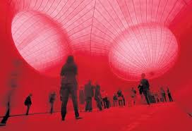
Later I looked on one at the images from his major exhibition at the Royal Academy in 2009. HIs works absolutely filled the gallery, taking over the main staircase with a huge red box-like construction.
We also looked at some related work by other artists, including Tony Cragg's Plastic Palette II, 1985,
and Barnett Newman's Who's afraid of red, yellow and blue?, 1966.
The colour got me looking at Yves Klein Blue - here is the original piece and the formula for the colour.
The MoMA Gallery website gives the following information about IKB:
2006
Monochrome abstraction—the use of one color over an entire canvas—has been a strategy adopted by many painters wishing to challenge expectations of what an image can and should represent. Klein likened monochrome painting to an "open window to freedom." He worked with a chemist to develop his own particular brand of blue. Made from pure color pigment and a binding medium, it is called International Klein Blue. Klein adopted this hue as a means of evoking the immateriality and boundlessness of his own particular utopian vision of the world.
Looking up all three of these other artists (Cragg, Newman and Klein) was really exciting for me, because I have tended to work in strong and pure colours in my textiles, and so far in my experiments with paint I have also gone for intense blocks of colour, trying to get a smooth and uninterrupted texture. I think these are all people I will study further.
I liked Kapoor's work. The scale is huge and uncompromising, and the materials are smooth and simple, but the overall effect is huge and imposing. You can't ignore them, and they have a compellingly tactile quality, even though they are so huge.