Wednesday 30 November 2011

college week 12/2 29th November

Today I spent the morning pressing on with my pathways project work at home, mainly around research and updating this blog. I went in to college for a second drawing session with Abi, but my heart wasn't in ti, and my interest in doing alternative drawings of tiny bird skulls was at a very low ebb.  I spent half the afternoon doing some more plain graphite drawings, and some using coloured water-soluble pencils, and then I called it a day.  I can see little point carrying on when things aren't working and I'm not engaged with the material.  I discussed this with Abib before I left - I hope this was ok...


However, the drawings weren't too bad, even though a bit uninspired....

Monday 28 November 2011

College week 12/1 28th November, Pathway Project encore

Today we had a full day on our projects.  I was at college before 10 and keen to print my 'poor man's etching' and collagraph plates.  Since last week' enthusiastic session, I have failed to find time to make any more plates, but I had three, and in the end that was plenty in terms of the time available.  I was able to experiment a little to explore the different results from various variables such as the amount of ink, the different approaches to cleaning/preparing the plates (wiping the excess ink off with scrim), the type of paper and the length of time soaked, the pressure on the press roller, et, etc, etc.


The full-timers were having assessment eosins all day so we were not able to use all the rooms.  However, the small print room was free so Mary and I had the room to ourselves.

I did several prints from each of my three plates, and the results were fairly good.  I used cream cartridge paper, soaked for about 10 minutes.  Almost all of them came out well, with crisp outlines and confident colour.  
Here are some of today's better results.


I did one with two colours, rubbing them in separately with small pieces of scrim (a la poupette) and trying to avoid the two colours mixing.  I used a vivid green and sepia brown, which colours just happened to be to hand, but the colours do not do each other favours, and although I liked the two-colour effect, these particular colours didn't really work very well together.


Note to self: from time to time, in workshops or sessions like today, I sometimes think to myself "I'm only experimenting, this doesn't really matter" and I make some rather odd prints, using
random colours, whatever paper happens to be around, whatever.  But in fact I need to remember that every print is a potentially useful outcome, and it would be better if I made better use of every attempt...e.g. in this case, a more thoughtful choice of colours would have given me a two-colour print I might want to use, rather than one I'd happily consign to the bin.


I also did a couple of prints on cotton cloth, dug out from Teresa's store by Mary, and not even ironed before printing.  I had not realised you could print onto cloth this way through the etching press. They  worked surprisingly well, and this is something I'd like to try again in future project work.


I pegged the prints up to dry, but realised they were not quite dry by the timeI wanted to collect things up to go home.  So I took them down, and layered them up with tissue paper in between each one, and then I rolled the stack of prints through the press.  When I took them out, the ink had dried but had also transferred a 'shadow' print onto the tissue paper interleaves.  These look rather good and may be useful when I come to develop the prints at home. A nice surprise!


It was good to be working on my own today, feeling fairly confident that I was doing something focussed. and other people seemed to be similar enthusiastic and positive today.

Useful tutorial session with Mark, too, which made me find various new ideas for the project, and beginning to think about Project II, following our assessment day next week.

Tuesday 22 November 2011

College week 11/3 22nd November drawing


This afternoon we all had a session of drawing with Abi, who produced a large box from the Museum, full of small boxes, each containing a tiny bird's skull. Our task was to select a skull and draw it exhaustively, using as many different kinds of drawing tool and technique we could.  There was also a single human skull, and a horses skull.  I started out with a puffin skull, but the poor light (and my old eyes) made it very hard for me to see the detail.  So I opted for the human skull (which wasn't complete - it had 'borrowed' a jaw-bone from elsewhere) and it also had a slice cut out of the eye-brow bone.  However, I tried my best to draw it.  I found it hard going, and I wasn't too happy with the results, some shown here:  


Moral: I need to do lots more drawing, I don't find it easy, and practice would help a lot.

LIfe still gets in the way

We are now into week 5 of the great kitchen extension project.  The dust levels grow, and the chaos in the kitchen is about to get considerably worse, as the focus moves form the outside, inside today. The guys (Duncan, the boss, Benjie, and Leon) are brilliant, work hard, stay late, have good ideas, and drink endless amounts of tea and coffee.  But inevitably the noise and grime at times has been unappealing, to say the least. 
 This is the back half of the sitting room, currently our dining space, kitchen and bike store.


This is the gap in the kitchen where the gas stove used to be, and where, by next week, an AGA will be installed...


The guys built a temporary wooden wall across the kitchen to keep the worst of the mess outside until now, complete with Hobbit-style door, cut on Friday, /  My old kitchen dresser has been wrapped in heavy-duty plastic and remained on the outside, servings a useful tool store...

This is going to be the new utility room, but the glass panels for the roof have still not yet arrived.


There will be big glass doors right across the bad of the kitchen, but they haven't arrived yet.... IN the meantime, we have great ventilation.  The guys here are, from the left, Leon, Benj and Duncan's back.


Duncan fixing the electric saw.  you can tell he's the boss from the pencil behind his right ear...

It will be brilliant when it is all done, and I shall have a house warming party after Christmas.   Duncan etc are top of the list of invitees.   It is not quite a year since I got the keys to this house, and I only moved in in January after these same wonderful guys had done a whole load of improvement work from re-wiring and re-pumbing to re-plastering throughout.  I must be slightly mad, but the house will see me out, I hope.

Maps project - more art I like

This morning I came across the work of artist Layla Curtis, whose website is here,  who has done a huge body of work based around maps and mapping.  Lots I liked, but I was especially intreated in her works which are compositions (or videos) based on traced routes around cities or the world, sometimes recorded via GPS technology and sometimes using more traditional methods.

 In some cases, she traces journeys by people (e.g. taxi drivers) but some are following inanimate objects.  Interesting patterns.  
 Message in a Bottle from Ramsgate to the Chatham Islands, live GPS drawing, 2004


 Cab Routes - One Week in London, 2001


 I particularly like her maps made using indices reflecting characteristics of the people who live in a city or country.  These Index maps reflect people's lives, against a generally familiar geographical outline.

World Index, 2004


 Americas Index Drawing2003
Ink on tracing paper, 91cms x 63cms


I am beginning to reel from the sheer volume of work, of all kinds and by a huge range of artists, based on maps and the idea of mapping.  My own humble project could keep me going for a lifetime, and I actually have less than two weeks....


Monday 21 November 2011

College week 11/2 More Pathway Project 21st November

A whole day working on our Pathway Projects.

I wrote a draft project Proposal (I had done one last week on the computer but forgot to save it and it's disappeared into the electronic wasteland) which formed the basis of a discussion with Mark.

I am working on the Place/Site/Map theme,  focussing on Maps.  What is a map?  What elements of a map do I want to develop?  A map of somewhere or nowhere?  Or just the idea of a map as a (normally) two-dimensional representation of a physical place or of a complex set of information.

My chosen pathway is printmaking, possibly also fine art/making.   I have started by plotting my journeys from my house in and around the city, but I intend to leave the literal representation behind and develop  some images/objects which are derived from, but not necessary represent, the actual map.   For instance,  I have become interested in the use of contour lines as a way of drawing the topography of a map.  I could use contours in a more general way for drawing...

I'm not at all sure I've explained this well - I will have to do better in my revised Proposal!

The discussion with Mark was useful.  The key issues emerging were:

  • the proposal needs to follow the prescribed format - this seems to matter more than I had expected;
  • I need to document my research better;
  • I could take photographs of my frequent walking routes;
  • I need to be aware of the physical and technical resources available for this project (and the limited time) so that my ideas are realisable;
  • perhaps I am trying to do do too many different things?


However, I did get on with some practical work today, to add to the start I'd made at home last week.  Today I decided to cut some plates ready for 'poor man's etching' and/or collagraph printing next week.  I did three boards:

one based on my walking route to town:


 one based on the overlaid tracings of my various walking routes:


 and one derived from the idea of contours:


I gave them each two coats of shellac varnish, but they weren't dry enough to try printing today.  I hope there'll be sufficient time to do quite a lot of printing next week.


While they were drying I also did some tracings of the aggregate set of drawn-out routes.  Not quite sure what I'll do with these, but I like the idea of doing something by way of a digital print from them - or perhaps a stitched piece.  For the moment, this is what they looked like....


College week 11/1 Research Folders 21st November

Today we had a group tutorial with Mark, mostly about our research files.  Mine is at present mainly this blog, but I realise that I need to do more by way of:-
(a) referencing;
(b) commenting on how I respond to the many artists whose work I look up;
(c) making it clear what is research for a specific project, and what is more general, e.g. in support of our art history letters;
(d) making sure I record all the galleries and exhibitions I go and see, however small or grand;
and finally
(e) keeping it in some kind of order so I can show people and also so I can find things myself at a later date.

In other words, I need to revise what I've already done, and do a good deal more.

I think I will also need to maintain a paper file - not least because i pick up flyers and exhibition catalogues, etc, and need somewhere to store them.  Plus bits from the newspapers (although often they're available on-line a well).  So, lots more work to be done on my research...

Sunday 20 November 2011

MIsleading advertisement?

Benetton has got into hot water again with an image purporting to show the Pope kissing the leader of Cairo's grand mosque.

Kiss off … one of the adverts featuring the pope, before Benetton withdrew it, near the Trevi fountain in Rome on 17 November. Photograph: Tiziana Fabi/AFP/Getty Images
Copied from The Guardian.  A Link to the full article is here. and an extract is here....


Benetton's adverts are actually a homage to a renowned Berlin wall graffiti painting of Communist leaders Erich Honecker and Leonid Brezhnev kissing. Everyone finds it funny to see former leaders of the defunct Soviet bloc snogging, it seems, but when contemporary figures from the western world are similarly mocked the cannoli hit the fan.
Why is the Vatican so displeased, and why did Benetton so readily surrender? The image of the pope is one of the greatest triumphs of marketing in history. A church that is led by a venerable celibate might seem to have an in-built selling-point problem. How can popes, who necessarily take the throne of St Peter as old and often ailing men, be made to seem charismatic and glamorous in a world that values youth and physical vigour?
The papacy tackled this problem five centuries ago by calling in some of the greatest image-makers in world history. Today's advertising gurus have nothing on Raphael and Titian. One of the most influential images of power in the history of the world hangs quietly today in London's National Gallery: Raphael's portrait of Pope Julius II created a new paradigm for papal portraiture by showing age as dignity, inner wisdom and sad knowledge. The power of this portrait was emulated and refined by Titian, then by Velázquez. Popes were reimagined in the Renaissance and baroque eras as men whose age and restraint conferred great natural authority.

The interesting thing is how the image of the Pope is instantly recognisable (and perhaps the Islamic cleric's image is similarly well known to Muslim viewers world wide), and also that western viewers, certainly, will immediately make the connection between the image and the seemingly endless revelations about sexual abuse and misdemeanours of various kinds throughout the Catholic church - and the hypocrisy which often goes with the death about these issues.  
But even though Benetton removed the advert very quickly, they have won the attention they were seeking - as they have in various previous provocative adverts in the past.  It is a bit like children behaving badly - it's a good way of getting attention, and negative attention is not much less desirable than positive. 

Saturday 19 November 2011

Pathway Project 1/3 Maps and Contours

Today I got enthusiastic about contours as a way of drawing a landscape.  Looking at various old maps I had in the house, I thought about how to create a 3d version of a contoured landscape.  i decided to cut some imagined landscape contours in a small sketchbook, and idea I had picked up from my research on-line, in a blog by another art student, Heather Bradley, blog here......... for which I am very grateful.

My version looked like this: I got three sets of cuts from one A5 book.   I glued the pages together, but might not do this another time as it would be even better, I think, to have to turn the pages one-by-one to get the full effect.  The photographic images are not brilliant, and as the lines are cut from white paper they are hard to see.  But the effect was quite good, interestingly tactile.


I think I may do more of these, on a bigger scale (size- or depth-wise), or using coloured paper, or cardboard (for added thickness/depth) or using old maps??

Friday 18 November 2011

Pathway Project 1/2 Maps

This week I have been doing some preliminary work towards my Project on maps.  I really didn't now where to start, so began with what is closest - my house, my street, the places I frequently walk, my route to college, to town, to the theatre, et, etc.

I used an A to Z street map of Bristol, and enlarged, on my home scanner, the section covering my house and the city centre.  I then drew, onto tracing paper, the route I normally take to college, and all the other journeys I frequently make from the house on foot.  Each on a different sheet.  I then repeated the process on transparency film, which gives a clearer view when layered together.  Stacked into piles, they look like this....


I am not too sure what these will lead to.  But I quite like the idea of mounting them vertically, somehow, slightly separated from one another, so they provide a sort of 3D record of my regular walking routes.  A bit like scenery slotted into a toy theatre perhaps.  Or hung from rods like quilts or curtains.  Or else built into a book where the pages can be turned separately but than also be looked at together, seeing through all the layers.


Tuesday 15 November 2011

College week 10/1 Art History 14th November


The title of today's lecture was "Case Study: How to fit a mountain into a photograph" and focussed on he work of American photographer Ansel Adams (1902 - 1984).  


Adams was probably dyslexic, didn't do very well at school but taught himself to play the piano, and subsequently photography after being given a Box Brownie camera as a present when he was a teenager.  He specialised in carefully planned shots of wild spaces, famously Yosemite National Park, California.  His wife's daily kept a studio in the park, which Adams eventually took over.  He belonged to the f64 Group of photographers who developed the concept of transcendentalism.  Adams himself was convinced of the importance of visualisation, i.e. of having a mental picture of the image he wished to create in his photographs, so he adjusted light,  exposure, etc, to produce a pre-planned image, sometimes enhancing the reality of the natural world by clever planning, angles, timing, etc.   Adams wrote, in 1948 that 


"The term visualisation refers to the entire emotional -mental process of creating a photograph, and as such, it is one of the most important concepts in photography.  It includes the ability to anticipate a finished image before making the exposure, so that the procedures employed will contribute to achieving the desired result.  This much of the create process can be practices and learned beyond lies the domain of personal vision and insight, the creative 'eye' of the individual, which cannot be taught, only recognised and encouraged."


(Adams, Ansel, The Camera (first published 1948, most recent edition 1995), London: Little, Brown and Co., p.14)


We looked at several of Ansel Adams most celebrated photographs, including these: 


Old Faithful Geyser, Yellowstone National Par


                                                                                             Orchard, Early Spring


                                                                                     Winter Sunrise from Lone Pine


Nevada Fall, Rainbow


Moon and Half Dome, Yosemite Valley, California


Ansel Adams, photographing in Yosemite National Park from atop his car in about 1942. 


Adams work is still stunning in it range and the lowering power of the carefully positioned camera shots.  he would wait ages for the sky, light, etc to be just right, and his photos are iconic, and set the standard for many other landscape photographs later on.  


I like his work:  his photos have great dramatic impact and convey a sense of awe and wonder at the huge natural landscapes of America.  

Monday 14 November 2011

College week 10/2 Pathway Project 14th November

Today was the first full day to work on our first Pathway project.  I had done a fair amount of preliminary research last week at home, looking at all kinds of art from landscape painting of all kinds and scales, thought to land art, graffiti, and site-specific installations, having loosely chosen to focus on the theme of Place/Site/Map.  Within that, I found myself thinking mainly about Maps.

I did quite a lot of on-line research into artists who have used maps in their work, in all kinds of ways.  I had also looked at several books about maps in art.  The range of material is enormous and I really don't now quite how to start.  So I was glad to have chance to discuss my ideas so far in a tutorial with mar.  That helped me focus on several ideas:  to think of a pam as an abstract thing, as well as an interpretation of a single place; to think about scale - can I work on a larger scale than previously?; and to think about the process of making a map, as well as the finished object.


I came away with even more references to look up, including these:

Dennis Woods, a cartographer who thinks about the meaning of maps, why we need them, what kind of thing they can tell us.  He makes maps about the community and the people who live in his neighbourhood, as well as the purely geographic.


 He has done a whole series of such maps published in his book Everything Sings
Link here to a review of his book Everything Sings,   http://www.sigliopress.com/ltdEd/atlas.htm

and has also produced technical books on how to make modern maps with digital technology.


Jorge Macchi, an Argentinian artist (see link to biog and more of his work here...) who has used cut-out sections of city maps to create new images, not directly or obviously related to their previous function, such as these...


http://jorgemacchi.com/eng/obra15.htm
Vidas paralelas(parallel lives) 
1998

Two sheets of glass.
60 x 80 cm each.

Guía de la inmovilidad2003
Buenos Aires sreet guide. 20 x 28 cm

Amsterdam
2004
Mapa de Amsterdam intervenido.
100 x 110 cm


In Liliput2007
Collage. 130 x 180 cm  In Liliput The countries taken out from a world map are placed by chance on a white paper as if they had fallen down from a certain height. This fall has not affected just the position but the scale of the countries in the representation: a relative distances chart drawn on the white paper establishes the new distances in millimetres.


I like the way Macchi's work focuses on the elements of mapping, without attempting to produce a map of anywhere in particular.   This is what I am trying to achieve in my own work for the Place/Site/Map project.


Kathy Prendergast, born in Dublin in 1958, and now lives and works in London,  and has done a lot of work involving maps and mapping.    Her  major work, The City Drawings,  has been a series of 113 pencil drawings of maps of all the capital cities of the world.  In addition she has done all kinds of other draw maps of cities, such as these, two of a series of road maps of Minnesota.  There are more of her images on my blog later on, and here.


Minnesota Road Map XXIII, 2005


Minnesota Road Map XXIX, 2005


City Drawings, London 1997


Tania Kovats has done a lot of varied work on landscape and maps, including wonderful things like the White Cliffs of Dover,  (2000), a relief to hang on a domestic wall; 


More about this is available on the V and A website here.

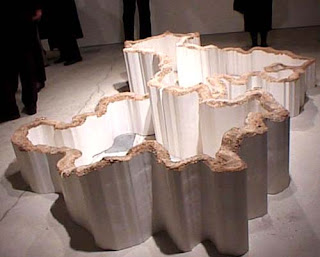
Another of her pieces I like is this one, The Rocky Road, a large, squat sculpture of a twisting mountain road, where everything except the road has been taken away.


Another of her pieces, relevant to the theme of Maps, is a living contour sculpture planted along the bottom of a small valley in Devon.   The piece is described thus:

Tania Kovats is known for her interest in the different ways that our culture represents and mediates nature. She has recreated fictional landscapes, from visions of Utopia to scenes of natural disaster.
Crockerton Combe is a quiet and secluded valley. Its sides have never been ploughed and it plays host to numerous wild plants and flowers. It is noticeably different from the heavily farmed surrounding environment. This difference combined with its topography lends the valley a sense of enclosure and peace which allows it to borrow ‘garden’ status.
Planting a crop of oats in a single strip following the contour along the base of the valley, an area that has been cultivated in the past, Tania made her largest work to date, using the natural landscape.
With kind permission of Clare Farrow and the Ministry of Agriculture, Fisheries and Food.


I really like her work, it's original, interesting, varied and witty.