A day out in Bath on Saturday included a visit to the city's Victoria Art Gallery, where I confess to having been distinctly underwhelmed by an exhibition about art and sport. Lots of small sculptures of sprotspeople of various kinds, but not my cup of tea either sports-wise nor arts-wise. I felt this was simply attempting to cash in on the olympics year. I am not sure whether the works had been specially commissioned: if not, I am surprised that so many small and accommodating pieces could be found, but perhaps I ma a sports dinosaur and this really is a fruitful commonwealth for sculptors.
Then I walked the length of Great Pulteney Street to visit the Holburne Museum which is a small but imposing Georgian house facing back towards Pulteney Bridge and the city.
It was originally a hotel, so the blurb tells us, and converted into a gallery about 100 years ago. It has had a major upgrade and extension in the past few years, only re-opening to the public about 18 months ago. The extension is all at the rear of the building, and on first sight looks pretty dreadful - black pillars and lot of smoked glass. My i-phone photo is not very clear but gives the general impression of the back view...
But the extension does warm on you - and on a lovely summers day, with the garden full of elegant people having elegant lunch from the museum's up-market cafe, it all looked rather splendid. Inside there is a sizeable permanent collection including glass and ceramics as well as 18th and 19th century portraits.
On the top floor there is space (in the new extension) for small special exhibitions. The one currently on view is stunning: Portrait Sculpture is a study of how the human head has been used as a subject for sculpture and various forms of 3D portraiture, from classical times onwards. This is the Silstone Head, described in the catalogue as the striking head of a North African carved in green siltstone in the 1st century BC. with incredibly detailed carving of the hair.
The whole exhibition is a wonderful selection - there were probably less thn 40 pieces in total gathered from various homes including the V and A and the NPG - which demonstrate the enormous range of sculptural work, and how effective sculpture has been in recording the personalities and scale of our forebears - somehow more lifelike than painted portraits, and some, of course, taken from death masks and so exactly reproducing the features and form of the departed. There is even a waxwork from Mme Tusssaud's, which looks tawdry by comparison with the 'real' sculpture - and is ironically of Sir Henry Moore, who own work was so diametrically removed from the wax-works. The range is wide and comprehensive and includes a magnificent and hugely more-than-lifesize head by Ron Muek
Ron Mueck, Mask II, Anthony d'Offay
Showing posts with label sculpture. Show all posts
Sunday, 27 May 2012
Wednesday, 8 February 2012
Edinburgh day 2
To the Scottish National Museum of Modern Art, website link here (all images on this post are taken from the NGS site) which is housed in two adjacent grand old houses, a little way from the 'New Town' (which is in fact 18th Century) in Dean Village.
Modern One's main attraction currently is The Sculpture Show: 1900 to 2012, a truly wonderful survey of key trends in (mainly European but not wholly British) sculpture, starting with collage (Picasso, Kurt Schwitters, Anthony Hill) and assemblage (Ceri Richards) and into relief (Ben Nicholson, Victor Passmore) and then on to a whole range of well-known and impressive sculpture, including Barbara Hepworth's 'Wave, 1943',
and pieces by Jacob Epstein, Elisabeth Frink, Eduardo Paolozzi amongst many. And right through to some very contemporary works, including the enormous and rather terrifying 'Baby' by Ron Mueck,
or a strange thing called 'Nud 25' by Sarah Lucas which looked to me more like a large white turd, all stuffed tights curled up in a messy knot.
There were some works I really didn't get - including Joseph Beuys 'Sled'
and his even odder 'Three pots to the Poorhouse' which is a blackboard marked to record the passing of three dark metal bowls around in an 'event' in 197?. I scribbled in my note book "Why?" and i am still unconvinced - about both pieces.
I was similarly unmoved, and unenlightened, by a piece which had a (small) room to itself, 'Untitled (after Rietveld) 2000' by Martin Boyce, which consisted of three fluorescent light tubes hung at precarious angels. What was this about? I have no idea.
One of the pieces I rather liked, for it's humour as much as anything, was Jim Lambie's 'Bed-Head, 2002', which consisted of a 3' mattress absolutely covered in odd buttons, representing all the dreams which had been dreamt o by people sleeping on it. Lambie has apparently lived much of his adult life in rented rooms and shred houses.
Overall I thought this was terrific show, because of the careful selection of works and the gradual progression from collages to some of the most recent and startling work. And of course outside there are a number of pieces in the grounds of modern One, including a Henry Moore, one of Anthony Gormley's bronze men (well, the top half of his torso, anyway), and a Charles Henckes land art form, complete with small lakes. It was an engrossing morning, and I came away feeling full up with, and well tutored in, a panorama of modern sculpture. Of course there was a lot which was not here: Antony Caro, for instance, but you can't have everything. It was certainly impressive and memorable.
Not sculture, but Modern One also had a Sol le Witt wall drawing, painting actually, on three sides of a room about 20' by 30', in 7 colours, painted in situ.
One of the attendants told me it had taken them about 6 weeks to do it, seven layers of paint, each one sanded back and of course each painted separately so no colours bled into another. Massive and domineering - but I'm not sure I liked it much. In terms of drawing, I'd have preferred his earlier, smaller, drawings exploring lines and colours. But I was glad to see one of his huge pieces up close, and the impact is compelling.
After that I had a severe case of museum feet and needed lunch. I then looked into Modern Two where there is an absolutely enormous Paolozzi figure of Vulcan, a giant, made of all kinds of bits and pieces of ironwork, bolted together like a meccano model. The sculpture towers over the rather old-fashioned and formal dining room, slightly alarming accompaniment to your soup, I suspect.
Also in Two was Richard Wright's Stairwell Project, a carefully planned an painted installation on one of the two-storey, well lit stairs in the old orphanage building which houses Modern two. The overall effect is rather like a swarm of butterflies, or insects, sweeping up to the light; or possibly a bit like iron filings flowing round the opposing poles of a magnetic field. I thought how much the orphans might have liked the image, had it been there in their days.
Another delightful installation was the recreation of Eduardo Paolozzi's studio/workshop - totally crammed with boxes of bits and pieces and half-built sculptures of all kinds, together with his library of books, and his bed on a high-up sleeping platform.
This reminded me of the Camden studio which my aged aunt, Peggy Angus, had in London, and where she lived in the middle of the organised chaos of her hand-printed wall-paper business, with new lino blocks being designed and cut alongside the ordinariness of her daily life.
And after all that, I wandered back into the city and went to find the National Gallery proper, where I enjoyed the small exhibition of George Bain's drawings of Celtic illuminated manuscript designs.
I learned to draw some of these many years ago, influenced again by Peggy Angus, who had used some of these and some from celtic standing stones) on painted pebbles from the beach on Barra, in the Outer Hebrides, where she had a cottage. Anyway, George Bain's drawings and instructions on creating highly complex swirls and circle patterns, all interlaced and absolutely balanced, have stayed with me and influenced, i think, my sense of pattern and design.
Back in about 1972 I designed and cut a lino block and used it to print yards of calico for covering a daybed, loosely based on the design on the Sutton Hoo mirror, which was rather like this. I have only the teeniest scrap left, which I made into a useful needle cases. Oh, those were the days!. And then in about 1982 I designed and made an embroidered panel for my parents, using 7 different celtic knot patterns to represent their seven children. Alas, I don't know hat happened to that when their house was finally cleared, and I have no photo to record it by. Seeing Bain's careful pencil drawings and some of his hand-coloured pieces was interesting and evocative, and I enjoyed them very much.
Finally back to the hostel for a short rest, and then we were off on a Ghost Tour, terribly touristy and overly-hyped, around the dark and "scary" churchyard in which the little faithful dog, Greyfriar's Bobby, is buried. Lots of tales of ghouls and ghosts and poltergeists. Good fun. And at least it was neither too cold nor raining, and there was an almost full moon. After that, a stiff drink was in order before bed. What a long day, lots of walking, very weary feet...
Modern One's main attraction currently is The Sculpture Show: 1900 to 2012, a truly wonderful survey of key trends in (mainly European but not wholly British) sculpture, starting with collage (Picasso, Kurt Schwitters, Anthony Hill) and assemblage (Ceri Richards) and into relief (Ben Nicholson, Victor Passmore) and then on to a whole range of well-known and impressive sculpture, including Barbara Hepworth's 'Wave, 1943',
and pieces by Jacob Epstein, Elisabeth Frink, Eduardo Paolozzi amongst many. And right through to some very contemporary works, including the enormous and rather terrifying 'Baby' by Ron Mueck,
or a strange thing called 'Nud 25' by Sarah Lucas which looked to me more like a large white turd, all stuffed tights curled up in a messy knot.
There were some works I really didn't get - including Joseph Beuys 'Sled'
and his even odder 'Three pots to the Poorhouse' which is a blackboard marked to record the passing of three dark metal bowls around in an 'event' in 197?. I scribbled in my note book "Why?" and i am still unconvinced - about both pieces.
I was similarly unmoved, and unenlightened, by a piece which had a (small) room to itself, 'Untitled (after Rietveld) 2000' by Martin Boyce, which consisted of three fluorescent light tubes hung at precarious angels. What was this about? I have no idea.
One of the pieces I rather liked, for it's humour as much as anything, was Jim Lambie's 'Bed-Head, 2002', which consisted of a 3' mattress absolutely covered in odd buttons, representing all the dreams which had been dreamt o by people sleeping on it. Lambie has apparently lived much of his adult life in rented rooms and shred houses.
Overall I thought this was terrific show, because of the careful selection of works and the gradual progression from collages to some of the most recent and startling work. And of course outside there are a number of pieces in the grounds of modern One, including a Henry Moore, one of Anthony Gormley's bronze men (well, the top half of his torso, anyway), and a Charles Henckes land art form, complete with small lakes. It was an engrossing morning, and I came away feeling full up with, and well tutored in, a panorama of modern sculpture. Of course there was a lot which was not here: Antony Caro, for instance, but you can't have everything. It was certainly impressive and memorable.
Not sculture, but Modern One also had a Sol le Witt wall drawing, painting actually, on three sides of a room about 20' by 30', in 7 colours, painted in situ.
One of the attendants told me it had taken them about 6 weeks to do it, seven layers of paint, each one sanded back and of course each painted separately so no colours bled into another. Massive and domineering - but I'm not sure I liked it much. In terms of drawing, I'd have preferred his earlier, smaller, drawings exploring lines and colours. But I was glad to see one of his huge pieces up close, and the impact is compelling.
After that I had a severe case of museum feet and needed lunch. I then looked into Modern Two where there is an absolutely enormous Paolozzi figure of Vulcan, a giant, made of all kinds of bits and pieces of ironwork, bolted together like a meccano model. The sculpture towers over the rather old-fashioned and formal dining room, slightly alarming accompaniment to your soup, I suspect.
Also in Two was Richard Wright's Stairwell Project, a carefully planned an painted installation on one of the two-storey, well lit stairs in the old orphanage building which houses Modern two. The overall effect is rather like a swarm of butterflies, or insects, sweeping up to the light; or possibly a bit like iron filings flowing round the opposing poles of a magnetic field. I thought how much the orphans might have liked the image, had it been there in their days.
Another delightful installation was the recreation of Eduardo Paolozzi's studio/workshop - totally crammed with boxes of bits and pieces and half-built sculptures of all kinds, together with his library of books, and his bed on a high-up sleeping platform.
This reminded me of the Camden studio which my aged aunt, Peggy Angus, had in London, and where she lived in the middle of the organised chaos of her hand-printed wall-paper business, with new lino blocks being designed and cut alongside the ordinariness of her daily life.
And after all that, I wandered back into the city and went to find the National Gallery proper, where I enjoyed the small exhibition of George Bain's drawings of Celtic illuminated manuscript designs.
I learned to draw some of these many years ago, influenced again by Peggy Angus, who had used some of these and some from celtic standing stones) on painted pebbles from the beach on Barra, in the Outer Hebrides, where she had a cottage. Anyway, George Bain's drawings and instructions on creating highly complex swirls and circle patterns, all interlaced and absolutely balanced, have stayed with me and influenced, i think, my sense of pattern and design.
Back in about 1972 I designed and cut a lino block and used it to print yards of calico for covering a daybed, loosely based on the design on the Sutton Hoo mirror, which was rather like this. I have only the teeniest scrap left, which I made into a useful needle cases. Oh, those were the days!. And then in about 1982 I designed and made an embroidered panel for my parents, using 7 different celtic knot patterns to represent their seven children. Alas, I don't know hat happened to that when their house was finally cleared, and I have no photo to record it by. Seeing Bain's careful pencil drawings and some of his hand-coloured pieces was interesting and evocative, and I enjoyed them very much.
Finally back to the hostel for a short rest, and then we were off on a Ghost Tour, terribly touristy and overly-hyped, around the dark and "scary" churchyard in which the little faithful dog, Greyfriar's Bobby, is buried. Lots of tales of ghouls and ghosts and poltergeists. Good fun. And at least it was neither too cold nor raining, and there was an almost full moon. After that, a stiff drink was in order before bed. What a long day, lots of walking, very weary feet...
Saturday, 28 January 2012
Art I Like: more Tom Phillips
More research for the writing project, which took me back to Tom Phillips.
I came across this etching, inspired by musical scores. PHILLIS
Moment Musicale, etching, 64 x 51 cm. From the Royal Academy 'Members Portfolio' of prints by 15 Academicians. London, 2000. Image size 41 x 27 cms. Image from the Red Grape Gallery website here.
The etching looks rather like some of the 'asemic' writing drawings by artists like Leon Ferrari and Marian Bijlenga, which I looked at a week or two ago - and which in turn influenced my own writing paintings and drawings for this project. I hadn't previously come across these images.
I find it interesting that Tom Phillips has worked very constantly in the area of writing and words, from his Humument in the 1970s onwards. I particularly like his writings in wire, and the way these have translated into 3D sculptures, made from wire or, more recently, from etched glass.
His several different manifestations of Wittgenstein's Dilemma all focus on this idea.
Wittgenstein/Cage, 2009
Wire
90 x 90 x 90 cm / 35½ x 35½ x 35½ in Image copied from Flowers Gallery website here.
Image copied from the Cass Foundation website here.
On this wire writing sculpture, the text is almost illegible: the title emphasises the irony of writing which cannot easily be deciphered and read.
The Calligrapher Replies, 1996
Wire
182 x 115 cm / 71¾ x 438½ in Image copied from Flowers gallery website here.
This Phillips collage also relates to the writing drawings I have been making. The marks look vaguely like script, the layout looks like lines of writing, but it is not really writing or text at all. The title, Rima's Song, however, suggests that there are lyrics somewhere in the script.
I came across this etching, inspired by musical scores. PHILLIS
The etching looks rather like some of the 'asemic' writing drawings by artists like Leon Ferrari and Marian Bijlenga, which I looked at a week or two ago - and which in turn influenced my own writing paintings and drawings for this project. I hadn't previously come across these images.
I find it interesting that Tom Phillips has worked very constantly in the area of writing and words, from his Humument in the 1970s onwards. I particularly like his writings in wire, and the way these have translated into 3D sculptures, made from wire or, more recently, from etched glass.
His several different manifestations of Wittgenstein's Dilemma all focus on this idea.
Wire
90 x 90 x 90 cm / 35½ x 35½ x 35½ in Image copied from Flowers Gallery website here.
On this wire writing sculpture, the text is almost illegible: the title emphasises the irony of writing which cannot easily be deciphered and read.
The Calligrapher Replies, 1996
Wire
182 x 115 cm / 71¾ x 438½ in Image copied from Flowers gallery website here.
This Phillips collage also relates to the writing drawings I have been making. The marks look vaguely like script, the layout looks like lines of writing, but it is not really writing or text at all. The title, Rima's Song, however, suggests that there are lyrics somewhere in the script.
Sunday, 22 January 2012
art I like: Jaume Plensa
Today's Observer Review included a photo of a piece in the Yorkshire Sculpture Park by Jaume Plensa (whose website is here), an artist born in Barcelona in 1955 and now working in France, Spain and the USA. The image caught my eye because if shows part of a large sculpture of a human form, made entirely out of capital letters in a sort of mesh, made of metal. The YSP exhibition website is here.
A Guardian article about his work is here. Lots more image, and interesting analysis of his works, is on this blog, Wanderlust. The link is here. I am making a link because the blog says things so well I don't want to try and repeat ...
His sculptures are made of letters and words, but the whole structure is transparent and also large enough to walk inside, and through. When located outdoors, as in the 2011 exhibition at the YSP, the sculpture provides a kind of tunnel, with the sky visible through it.
Plensa has also made some installations using words suspended, letter by letter, in transparent 'curtains' on a scale big enough for the viewer to walk among the hanging texts.
More about the work can be found here.
A Guardian article about his work is here. Lots more image, and interesting analysis of his works, is on this blog, Wanderlust. The link is here. I am making a link because the blog says things so well I don't want to try and repeat ...
His sculptures are made of letters and words, but the whole structure is transparent and also large enough to walk inside, and through. When located outdoors, as in the 2011 exhibition at the YSP, the sculpture provides a kind of tunnel, with the sky visible through it.
Plensa has also made some installations using words suspended, letter by letter, in transparent 'curtains' on a scale big enough for the viewer to walk among the hanging texts.
This is a steel case he has made for a limited edition of a book about the art heritage of Catalonia.
More about the work can be found here.
Friday, 20 January 2012
Avon valley mud art
Yesterday I went to the Victoria Art Gallery in Bath where there was a very nice show of works by Peter Burke called Earthworks. More information on the gallery website here. Peter Burke's website is here.
The show consisted of a series of works made of earth, clay, mud dug from the ground at various locations within a 20 mile radius of Bath. These had been used to make a series of masks, based on (I presume) the artist's own face. The ways in which the different clays dried and cracked, and the bits of other material, grass, leaves, grit, etc, in the clay/mud mix, gave each one a unique colour and texture. Arranged together in a long line on the gallery wall, they looked a little like a sort of 3D 'rogues' gallery' or a police identity parade line-up. The colours were lovely, ranging form chalky white to almost black, tar-like clay.
A second tranche of work was made in California, and consisted of several installations based on mud casts of feet of forest rangers and people who worked the land in a mountain nature park. Thee feet were very evocative, the casts were so fine that you could see the lines of veins and bones on the feet and toes. Some were arranged in circles, the endless walking we all do, going through life getting nowhere muh.
A third set of works were all about hands, and arm-spans round a circle or across a square, based on steel frameworks. These were, to my mind, less interesting and less visually compelling, as if the artist's original die was being stretch a little too thin.
Overall, I thought this was a good exhibition and I liked much of the work. The colours of the clay were especially lovely. It was good to also have a geological map of the area on sow, making clear where each of the mud samples had come from. Astonishing variety of soil in a relatively small area.
The show consisted of a series of works made of earth, clay, mud dug from the ground at various locations within a 20 mile radius of Bath. These had been used to make a series of masks, based on (I presume) the artist's own face. The ways in which the different clays dried and cracked, and the bits of other material, grass, leaves, grit, etc, in the clay/mud mix, gave each one a unique colour and texture. Arranged together in a long line on the gallery wall, they looked a little like a sort of 3D 'rogues' gallery' or a police identity parade line-up. The colours were lovely, ranging form chalky white to almost black, tar-like clay.
A second tranche of work was made in California, and consisted of several installations based on mud casts of feet of forest rangers and people who worked the land in a mountain nature park. Thee feet were very evocative, the casts were so fine that you could see the lines of veins and bones on the feet and toes. Some were arranged in circles, the endless walking we all do, going through life getting nowhere muh.
A third set of works were all about hands, and arm-spans round a circle or across a square, based on steel frameworks. These were, to my mind, less interesting and less visually compelling, as if the artist's original die was being stretch a little too thin.
There were also some small-cale models of the human form, which were interesting for their careful exploration of scale as much as anything. Some were still attached to a steel grid ro framework, which I rather liked.
Overall, I thought this was a good exhibition and I liked much of the work. The colours of the clay were especially lovely. It was good to also have a geological map of the area on sow, making clear where each of the mud samples had come from. Astonishing variety of soil in a relatively small area.
Thursday, 29 December 2011
Art I LIke: Tom Phillips
I came across Tom Phillips' Humument this summer while doing a letterpress printing course at UWE, Bower Ashton, and rummaging in the wonderful library there. I was interested in the whole idea of altered books, and how people can play around with not just the physical form of a book, but also with the text. The Humument does this to extremes. Here is a single page as an example of the whole book, which is over two hundred pages long.
Now that I'm thinking about words and writing in art for my pathway project, I looked up Tom Phillips again. His work is rich and varied, and appeals to me on several levels - the works with words and writing, the colours he uses and the way he uses paint; his sculptural pieces; and his interest also in quilts.
There was a significant exhibition of his works at the Flowers Gallery in 2010, more info and lots of images to be found on their website here.
His output is huge and diverse, with a great many portraits and large and small paintings. He has played around with systems paintings and series, and with process for its own sake. He has, for years, regularly collected up the paint on his palette at the end of each day or week and used this to slowly fill in pre-drawn slots on prepared canvasses. More recently he has used disposable palettes, and then cut them up and reassemble the pieces as a sort of mosaic of colours and a record of his painting. More about this on his blog here.
He does a lots of work with words. Some is 3D, such as his word sculptures like this one: Miami Beach link here.
Word Sculpture: Miami Beach
Wood and acrylic, 25 cm, 1986
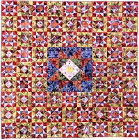
Tom Phillips has also produced three quilts, which began from his collection, for their design quirkery, the 'business' cards left by prostitutes in London phone boxes. The result, after a lot of experimentation, was a quilt made from sections of the cards.
Women's Work
Cotton fabric and paper, 204 x 204 cm, 1997
This led to a second quilt, around the arrival of medical Stealth Bombers at the farnborousgh Air Show but using the same 'calling card' materials.
Manpower (work in progress)
Cotton fabric and paper
204 x 204 cm (finished size), 1997
More about his quilts on his website here.
The idea of a patched quilt recurs in some of his word-based paintings, such as this one,
Had I The Heavens' Embroidered Cloths, 1997-2001
Oil on canvas
184 x 123 cm / 72½ x 48½ in
His recent work includes commercial and PR applications such as this design for the British Heart Foundation which cleverly uses text as a verbal message about the healing power of art, as well as a visual image of a cracked and broken heart being mended.
In other work he plays around with the get to such an extent that the words are almost impossible to read, but the viewer is nevertheless aware that there is script within the overall design, which appears to be a series of irregular geometric shapes in muted colours.
Here We Exemplify, 1969
Oil on canvas
30¼ x 30¼ in / 76.5 x 76.5 cm
AFG 43798
Some of his work just uses simple text, in beautiful typefaces, to repeat a borrowed text ro one he has created himself. He uses these in different materials, including screen print onto transparent perspex cubes, or in wire sculptures designed to be wall mounted like this one.
After Henry James, 2009
Wire
18½ x 24¼ x 2 in / 46.5 x 61.5 x 5 cm
I really like the range and humour in Phillips many and varied works, and I am inspired by his ability to play around with very simple text and typeface forms to create beautiful and balanced pieces.
Now that I'm thinking about words and writing in art for my pathway project, I looked up Tom Phillips again. His work is rich and varied, and appeals to me on several levels - the works with words and writing, the colours he uses and the way he uses paint; his sculptural pieces; and his interest also in quilts.
There was a significant exhibition of his works at the Flowers Gallery in 2010, more info and lots of images to be found on their website here.
His output is huge and diverse, with a great many portraits and large and small paintings. He has played around with systems paintings and series, and with process for its own sake. He has, for years, regularly collected up the paint on his palette at the end of each day or week and used this to slowly fill in pre-drawn slots on prepared canvasses. More recently he has used disposable palettes, and then cut them up and reassemble the pieces as a sort of mosaic of colours and a record of his painting. More about this on his blog here.
He does a lots of work with words. Some is 3D, such as his word sculptures like this one: Miami Beach link here.
Word Sculpture: Miami Beach
Wood and acrylic, 25 cm, 1986
Tom Phillips has also produced three quilts, which began from his collection, for their design quirkery, the 'business' cards left by prostitutes in London phone boxes. The result, after a lot of experimentation, was a quilt made from sections of the cards.
Women's Work
Cotton fabric and paper, 204 x 204 cm, 1997
This led to a second quilt, around the arrival of medical Stealth Bombers at the farnborousgh Air Show but using the same 'calling card' materials.
Manpower (work in progress)
Cotton fabric and paper
204 x 204 cm (finished size), 1997
More about his quilts on his website here.
The idea of a patched quilt recurs in some of his word-based paintings, such as this one,
Had I The Heavens' Embroidered Cloths, 1997-2001
Oil on canvas
184 x 123 cm / 72½ x 48½ in
His recent work includes commercial and PR applications such as this design for the British Heart Foundation which cleverly uses text as a verbal message about the healing power of art, as well as a visual image of a cracked and broken heart being mended.
In other work he plays around with the get to such an extent that the words are almost impossible to read, but the viewer is nevertheless aware that there is script within the overall design, which appears to be a series of irregular geometric shapes in muted colours.
Here We Exemplify, 1969
Oil on canvas
30¼ x 30¼ in / 76.5 x 76.5 cm
AFG 43798
Some of his work just uses simple text, in beautiful typefaces, to repeat a borrowed text ro one he has created himself. He uses these in different materials, including screen print onto transparent perspex cubes, or in wire sculptures designed to be wall mounted like this one.
After Henry James, 2009
Wire
18½ x 24¼ x 2 in / 46.5 x 61.5 x 5 cm
I really like the range and humour in Phillips many and varied works, and I am inspired by his ability to play around with very simple text and typeface forms to create beautiful and balanced pieces.
Monday, 7 November 2011
College week 9/1 Art History, 7th November
Anish Kapoor was the subject of this morning's lecture. An Independent review of his career is here and a lengthy Guardian piece is here.
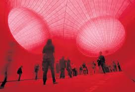
We started by looking at images of his huge installation at Tate Modern in 2002, Marsyas. The ancient Greek story is that Marsyas was a satyr who was flayed alive, literally skinned, and this massive piece is all steel and vivid red pvc, stretched and pulled right across and height and width of the Turbine Hall. I wish I had seen it in situ.
The strength of Kapoor's works seems to me to be in the sheer scale of them - both in their conception - who would think of making something quite so huge and also so simple in form? - and also in their execution - these works require major engineering and construction effort - how are they funded? how do you move from small-scale art-student work to something as huge as this?
Also the intense colour of Kapoor's work is quite overwhelming.
We looked at several other examples of his work, including Temenos in Middlesborough
( a rival to the Gormley Angel of the North in nearby Gateshead?)
the Sky Mirror in Manhatten,
and the Cloud Gate in Chigaco.
Some of the works looked better indoors than out, where their huge scale gets a bit lost in the wide open air, and where the need for scaffolding, etc, diminishes the strength of the structures themselves.
The educational guide is here http://static.royalacademy.org.uk/files/anish-kapoor-education-guide-558.pdf
We also looked at some related work by other artists, including Tony Cragg's Plastic Palette II, 1985,
and Barnett Newman's Who's afraid of red, yellow and blue?, 1966.
The colour got me looking at Yves Klein Blue - here is the original piece and the formula for the colour.
The MoMA Gallery website gives the following information about IKB:
Monochrome abstraction—the use of one color over an entire canvas—has been a strategy adopted by many painters wishing to challenge expectations of what an image can and should represent. Klein likened monochrome painting to an "open window to freedom." He worked with a chemist to develop his own particular brand of blue. Made from pure color pigment and a binding medium, it is called International Klein Blue. Klein adopted this hue as a means of evoking the immateriality and boundlessness of his own particular utopian vision of the world.
We started by looking at images of his huge installation at Tate Modern in 2002, Marsyas. The ancient Greek story is that Marsyas was a satyr who was flayed alive, literally skinned, and this massive piece is all steel and vivid red pvc, stretched and pulled right across and height and width of the Turbine Hall. I wish I had seen it in situ.
The strength of Kapoor's works seems to me to be in the sheer scale of them - both in their conception - who would think of making something quite so huge and also so simple in form? - and also in their execution - these works require major engineering and construction effort - how are they funded? how do you move from small-scale art-student work to something as huge as this?
Also the intense colour of Kapoor's work is quite overwhelming.
We looked at several other examples of his work, including Temenos in Middlesborough
( a rival to the Gormley Angel of the North in nearby Gateshead?)
the Sky Mirror in Manhatten,
and the Cloud Gate in Chigaco.
Some of the works looked better indoors than out, where their huge scale gets a bit lost in the wide open air, and where the need for scaffolding, etc, diminishes the strength of the structures themselves.
Later I looked on one at the images from his major exhibition at the Royal Academy in 2009. HIs works absolutely filled the gallery, taking over the main staircase with a huge red box-like construction.
The educational guide is here http://static.royalacademy.org.uk/files/anish-kapoor-education-guide-558.pdf
We also looked at some related work by other artists, including Tony Cragg's Plastic Palette II, 1985,
and Barnett Newman's Who's afraid of red, yellow and blue?, 1966.
The colour got me looking at Yves Klein Blue - here is the original piece and the formula for the colour.
The MoMA Gallery website gives the following information about IKB:
2006
Looking up all three of these other artists (Cragg, Newman and Klein) was really exciting for me, because I have tended to work in strong and pure colours in my textiles, and so far in my experiments with paint I have also gone for intense blocks of colour, trying to get a smooth and uninterrupted texture. I think these are all people I will study further.
I liked Kapoor's work. The scale is huge and uncompromising, and the materials are smooth and simple, but the overall effect is huge and imposing. You can't ignore them, and they have a compellingly tactile quality, even though they are so huge.
Subscribe to:
Posts (Atom)