Showing posts with label book art. Show all posts

Sunday, 15 January 2012

Books and Holes: Tree of Codes

Yesterday I had a look in the Arnolfini Bookshop at Tree of Codes, the latest book - or art work - by the New York novelist Jonathan Safran Foer.  He has taken what he claims is his favourite novel, The street of Crocodiles, by a Polish author Bruno Schulz, and produced a different story from the words in that book - by extensive laser cutting of the pages, to remove the majority of the words and leave a new pattern in the text which is his new short novel.   Here's a video from the Guardian in which Foer explains how the book was created.


The actual book is something of a technical triumph for the publisher (Visual Editions whose website about the book is here) is interesting to hold - it feels nice, the cut pages look clean and sharp, and there is a strange intensity about flicking through the pages, which are more empty holes than paper, and seeing bits of text in layers bobbing out from the pages below.  But it si almost impossible to read, or at least I would find it so.  I would need a sheet of paper to interleave underneath the text on each page, or else it would be nigh on impossible to separate out 'this page' words from those of later, lower-lying, pages.

At least some of the critics think it is wonderful.  Here's one, from Vanity Fair.  The Guardian review, by MIchael faber, which is here, is less enthusiastic..  I am not so sure,.  I haven't actually read Foer's earlier novels, so I'm in no position to judge the quality of the story telling.  But it seems an odd thing todo.

On the other hand, is it so very different from Tom Phillips much admired Humument, where he didn't cut holes in the pages, but he painted over, or otherwise masked, much of the original txt, to create a 'new' story.


That is almost impassible to follow, too.  I have a copy, and although it is fun to flip through, I found  the painting, squiggles, colouring in, etc totally distraction, so much so that I couldn't' make any sense of the 'new' text.

But other people have simply cut holes in printed books to create interesting shapes and paper sculpture, and have made no pretence of keeping any sort of 'meaning' from the words on the pages.  This example is by Sara Bodman, from UWE.


This one is by Su Blackwell

Both photos are copied form this very good blog, Curled up with Book.

I think many of these altered books are successful pieces of artwork, because they create whelky new images or things out of otherwise dusty and unloved pages. But this, too, is in danger of losing it's claim on the art world, as it increasingly becomes a device for the 'homestyle and rafts' market. But even there, why not?  If people can alter a book and make something visually and aesthetically pleasing from it, why not?  it may ever be - and would not claim to be - high art, but altered books can be fun and sometimes quite beautiful things emerge from the dusty old pages.   Many of the works on show at the Bristol Book Arts show last year were remarkable,  and fascinating, and also very skilfully made.

Tuesday, 27 December 2011

More art I like: Charles Round and Matej Kren


I have also come arose the work of Charles Round, a contemporary British artist.


Font Especial, 2005-7
True type font, vinyl on wall
Dimensions variable

Installation view at El Basilico, Buenos Aires


The following is an extract from the ICA's website (link is here)  relating to a recent exhibition of Round's work.


The relationship between line and volume is explored by Round in his typographic work. The artist has created a series of fonts that mimic this formal balance, and which he uses on the posters, hangings and animations that feature within his installations. These 'signs' contain texts that fluctuate in their legibility, overwhelmed by the structure of the font and its grid-like presentation. Containing phrases of romantic excess, their semantic collapse evokes an altered state of perception; the bourgeois refinement of forms and arrangements shifting towards a giddy, transgressive lyricism. Round's Nought to Sixtyproject makes reference to the British sculptor and printmaker Eric Gill (1882–1940), through a phrase lifted from the latter's diaries: “Strange days and nights of mystery and fear mixed with excitement and wonder strange days and nights strange months and years”. Round's use of the text – which operates as a leitmotif throughout the exhibition – evokes Gill's influential work as a typographer, but also the latter's complex persona. During his lifetime Gill presented himself as a deeply religious man, publishing numerous essays on the relationship between art and religion, and encouraging the formation of arts and crafts communities. This worthy image was shaken when the artist's diaries were published in the late 1980s, documenting his adulteries, incestuous liaisons and experiments with bestiality. The confrontation between noble aspirations and transgressive desires that is apparent in Gill's diaries is mirrored in Round's exhibition. 

I think it is interesting that Round deliberately creates a font which is hard to read - while clearly wanting the meaning of the text to be apparent.  This makes the work something of a puzzle for the viewer to decipher.


Another artist working with books is Matej Kren, a Czech artist who builds seriously large structures from old books.  His website (the link is here) says that this is an attempt to convey the increasingly blurred boundaries between fiction and real life:   "His work not only touches on very contemporary problems, such as erasing the boundaries between reality and fiction, memory and the present, but also on classic themes in art - the relation between inner and outer, the part and the whole. Typical of his work is a searching for a complexity of content expressed in a monumental and comprehensible language."
Book Cell, Centro de Arte Moderna - Foundation Calouste Gulbenkian, Lisbon, Portugal, 2006. 

Passage, Bratislava, 2005

Passage, Passage, GMPassage, GMB,PassagePP Bratislava, 2005B, Bratislava, Bratislava
I like these works because of the way in which Kren uses the books in such a simple way, rather like building blocks, and makes such enormous constructions out of them.  They remind me of library stacks,  where you can get lost among the books and lose track of being among writing, but rather among buildings.  The Passage reminds me of old libraries, like the Chained Library at Hereford Cathedral, here...


or the wonderful sixteenth century library at Trinity College Dublin. 


Art I LIke: Tom Friedman

Tom Friedman is another artist who uses the written word in a creative and witty way, as here:


Untitled 1990 The artist writes his signature repeatedly for the life of a pen 106.7 cm
(detail below)


Many of his works are made of recycled paper or cardboard, but the focus is on the material itself, rather than any writing it contained.  This is another example, which I like for it's simplicity and sense of balance.


                             Smile (2009)     
sculpture, Assemblage de rondelles de papiers, 27 cm x 65 cm


More of his work, and about him, is here.

Art I Like: Wendy Wahl

High time I was back on this blog!  House building, Christmas and a heavy cold are my excuses for rather a long absence.   But now I must focus on my next Pathway Project,  around the theme Writing/Word.

Looking around at the work of artists who use writing and words in their work, I came across Wendy Wahl, (b 1961, Los Angeles, now living in Rhode Island) who creates fantastic and often large sculptures out of old copies of the Encyclopaedia Britannica.    Her website is here, including some of her works, also more here and yet more about her is on the Encyclopaedia Britannica blog (yes, there really is an EB Blog) here.


Wendy Wahl
seven pieces, paper, yarn

95" x 60" x 36", 2001-2002 


REBOUND: MIXED VOLUMES 3
Wendy Wahl
discarded/deconstructed/restructured encylopedia pages

40" x 16" x 17" ; 50" x 78" x 17" ; 60" x 95" x 17", 
2009


I like the structures themselves, for their obviously tactile appeal, and their simple but somehow organic shapes.  But most of all, I like that Wendy Wahl has found a way to translate (or perhaps transfer) the information and knowledge contained within the EB to new and visible forms.  The EB sits on many dusty library shelves, often unopened for years, and the contents are seen only by the eager searchers after knowledge.  her works expose the pages, individually and en masse, to a wider audience, who may wonder about their original meaning, while enjoying the fantastic shapes and swirls of her sculptures. 

Friday, 2 December 2011

Maps Project, contour lines again, 3rd december

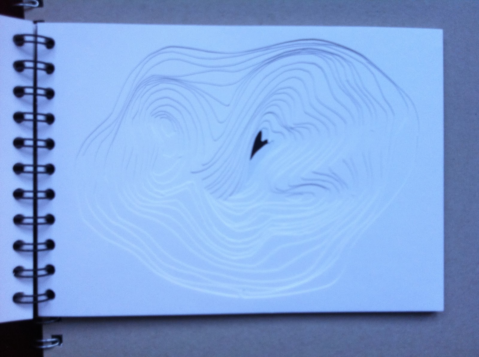
Alongisde the work on print and stitch, I have done some more contour cutting.  Just because it is rather fun and I like the results.  I made another sketch-book, this time with two different contour cut-outs, designed to be read from the smallest cutting , turning the pages one by one to reveal the whole 'hole' in the middle.  Separately, I assembled the cut-out sections to make a small relief of the imaginary hills I had recorded.


Not terribly clever or meaningful, but fun to do and interesting to explore the pages.  Also, it's possible to hold the book like a flick-book so the 'hole' or the mountain contours flop open in a rapid stream, emphasising the tactile, playful nature of this construction.

Saturday, 19 November 2011

Pathway Project 1/3 Maps and Contours

Today I got enthusiastic about contours as a way of drawing a landscape.  Looking at various old maps I had in the house, I thought about how to create a 3d version of a contoured landscape.  i decided to cut some imagined landscape contours in a small sketchbook, and idea I had picked up from my research on-line, in a blog by another art student, Heather Bradley, blog here......... for which I am very grateful.

My version looked like this: I got three sets of cuts from one A5 book.   I glued the pages together, but might not do this another time as it would be even better, I think, to have to turn the pages one-by-one to get the full effect.  The photographic images are not brilliant, and as the lines are cut from white paper they are hard to see.  But the effect was quite good, interestingly tactile.


I think I may do more of these, on a bigger scale (size- or depth-wise), or using coloured paper, or cardboard (for added thickness/depth) or using old maps??