Showing posts with label maps. Show all posts

Friday, 2 December 2011

Maps Project, contour lines again, 3rd december

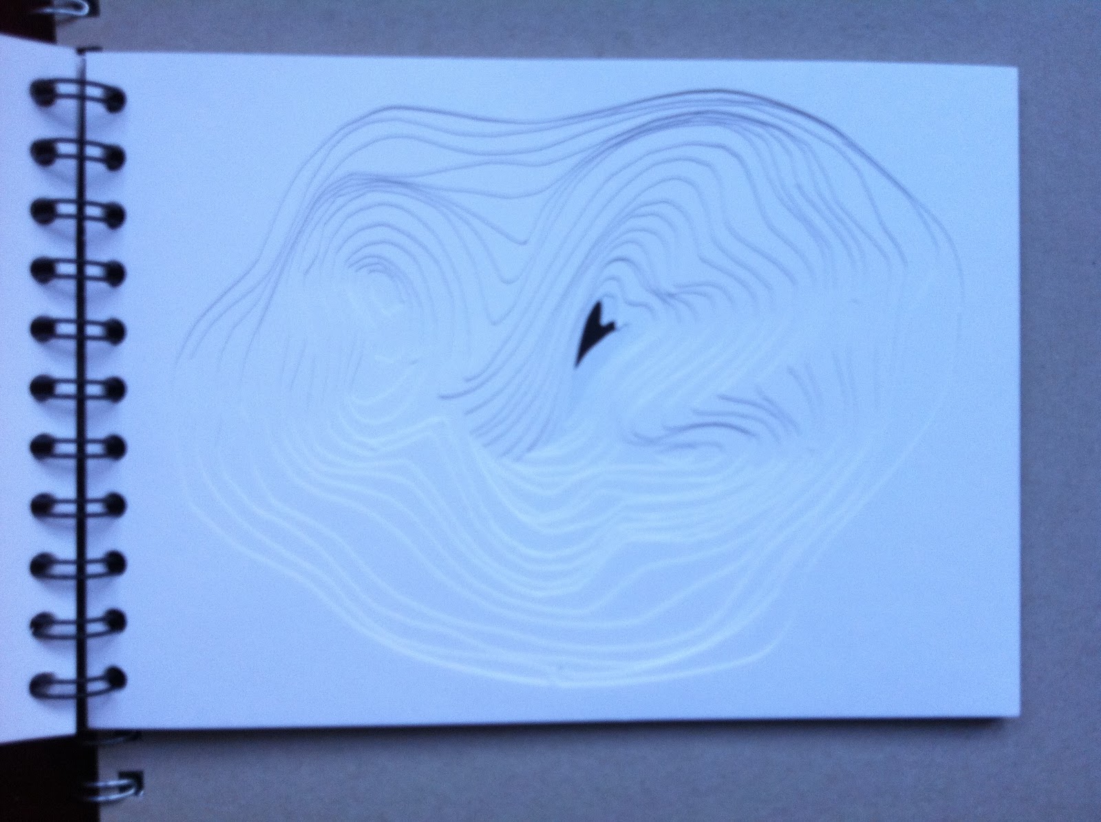
Alongisde the work on print and stitch, I have done some more contour cutting.  Just because it is rather fun and I like the results.  I made another sketch-book, this time with two different contour cut-outs, designed to be read from the smallest cutting , turning the pages one by one to reveal the whole 'hole' in the middle.  Separately, I assembled the cut-out sections to make a small relief of the imaginary hills I had recorded.


Not terribly clever or meaningful, but fun to do and interesting to explore the pages.  Also, it's possible to hold the book like a flick-book so the 'hole' or the mountain contours flop open in a rapid stream, emphasising the tactile, playful nature of this construction.

Pathway Project, continued. Quilting, painting and discharge paste. 2nd December

This week, in between the builders and various singing things, I have been trying to focus on getting my project together.  On Monday at college I did some reasonable prints, but I now need to do more, and to find a way to bind all my various and disparate efforts together into something approaching a coherent whole.

I had been trying to avoid using stitch as a vehicle, - because textiles is what I have always done, because I can always do this at home, and because I wanted to branch out into something new.  But time has been against me, and so I decided to resort to my sewing machine to extend the work in my prints into new directions.

First off,  I tried some freehand machine embroidery, following a roughly drawn version of my contour print.  But the result wasn't very good, and also I didn't like the rather flat result.


 I realised that free stitching was too random unless I drew the design quite carefully.  

I did this using an air-vanishing marking pen (bought for embroidery and quilting), and I traced the design
 and sewed the line from that. 


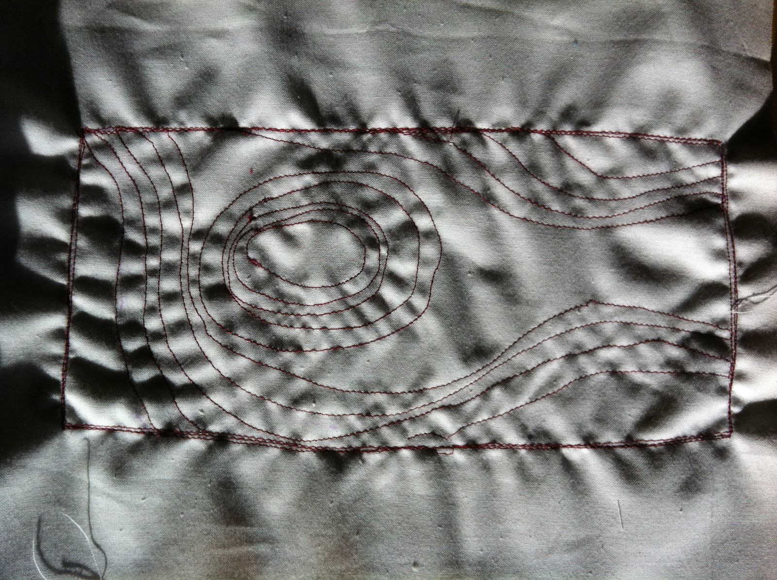
This worked, but was rather flat and uninteresting, so I turned to a method I am more familiar with - quilting.  I used the tissue-papaer off-print as a guide, and sewed quite carefully along the lines of my prints.  Sewing with the walking foot through three layers (calico, cotton wadding an calico) produced quite a nice 3D representation of the printed image, which in turn represented my journeys from my house to the city centre.


I made several samples, some retaining the tissue paper, and some tearing it away, leaving a monochrome off-white article.


I had printed two on the prints onto cloth in the printing session at college on MOnday.  I took the one printed on scrap green cotton, and layered that with calico and wadding, and then machine quilted the outline in brown thread, to give it a bit of depth.  The result improves what was otherwise a rather sorry coloured print.

Photos to be aded....

Tip for future reference: (a) don't print on horrid seen scrap! and (b) if you do, a bit of stitching on top can work wonders.  I could have done even more with hand stitching or some hand-painted colour, but time was pressing and I'm not sure the results would have made a great deal of improvement.

This made me think about how best to introduce colour, in order to sharpen the line.  In a printed map, contour lines are usually pale, thin line, sometimes in different colours representing increasing altitude, or whatever.  I have been greatly inspired by the work, based largely on landscape and geographical forms, of the British quilt-maker Pauline Burbridge, whose website is here.  I did a wonderful week's drawing and stitching course with Pauline in Italy in October 2009.  Examples of her use of paint over stitch are here...


 I decided to try using acrylic paint brushed lightly onto the surface of the quilted pice, which would accentuate the lines, and give an enhanced 3D effect.

I had not done this before, so I experimented on a scrap bit of trial machine quilting, and discovered that 'less is more' - i.e. using an almost dry sponge brush, and very light touch, produced the best results.  I used ordinary cheap students' Chromacryl liquid acrylic paint, mixed 50/50 with Golden Textile Medium so as not to add a rigid 'hand' to the finished fabric.


Here are the results, on my stitched pieces of calico and quilt wadding, from the two map print designs.  I am quite pleased with how they worked out, accentuating the lines of the 'maps' and enhancing the tactile quality of the quilting.


This one was a sample to see how the method would work on a simple pattern of lines and spiral stitching. It was not intended to be particularly related to the theme of maps, but in fact it has a slightly landscape look.  I rather like this one, even though it was done just as a test piece.


Inspired by these, I remembered another technique much loved by quilt artists, i.e. of using discharge medium to remove the colour from a dark fabric.  I made two sample pieces on black fabric, one based on my Bristol walking routes map, and one more random as a test piece.  I brushed each one, both sides with Discharge Paste (which is, essentially, bleach), and followed the instructions to let it dry and then iron it, and finally wash them to remove excess paste.

Black fabric can discharge white or grey, or sometimes deep rust colour.  I used two different black fabrics I had in my store, I thought one of them would discharge red and one grey.  In the event, only the grey side worked.

Note for future reference: test the discharge colour of your fabric before making anything significant...!

However, that problem aside, the results were quite satisfactory, as here.

This is based on the print which is derived from my walking routes to town ....


This is the 'front' side - where the colour didn't discharge apart from a little bit on the sewing thread itself...


Those are the results for a test piece using stitched lines in various random patterns.  Again, one side discharged nicely, the other hardly at all. 

Thursday, 1 December 2011

Maps Project, More kinds of printing, 1st December

After my day in college doing 'poor man's etching' and collagraph prints, I wanted to explore printingg a bit more - but what with the lack of time in college, and the chaos at home because of the building work in the kitchen, i have been reed to doing things in a very basic way.  So I have only been able to make a very small attempt at relief printing, using what was available at home.

The biggest problem was that I only hd acrylic paint, and not printing ink (I have some relief printing ink, but it has been pack away and is totally impossible to relocate at present).  I discovered very quickly that you need th right kind of ink!

However, I had a go first at doing a mono print, rolling ink onto an acetate sheet, dropping paper onto that, and then tracing the lines of my walking routes round Bristol through all the layers, using a sharp pencil and working as fast as I could.

The first print was very dark - there was too much paint, and it was paint! And it wasn't printing ink!.


This was what the acetate ink plate looked like after the print was pulled.  Still rather a lot of ink!


So I managed to pull a second print from the inked acetate, which was actually a lot better.


 A second inking failed for a different reason - I drew into the print rather too heavily, and the paper (torn form a spare sketch book) stuck to the printing planet and tore a little.  Effects of the wrong kind of ink and the wrong kind of paper.


This was the acetate inked plate, with traces of torn paper stuck to the paint.


Next up, I decided to try something much simpler, a potato cut relief print.  I cut a motif derived from my 'walking routes' print design, and inked the potato using a sponge brush. The results were far from brilliant (I think I would have done better with proper printing ink) but I quite liked the design itself.


This is where I was working, on the kitchen table in the cramped chaos of the sitting room.


Inspired by this design, I cut a simple lino block, and tried printing from that.  The results were seriously marred by the lack of proper printing ink....


 I might have another go at this later with the right materials, as I quite liked the effect, and I would like to see why it looked like as a repeat pattern over a larger area.


Tuesday, 22 November 2011

Maps project - more art I like

This morning I came across the work of artist Layla Curtis, whose website is here,  who has done a huge body of work based around maps and mapping.  Lots I liked, but I was especially intreated in her works which are compositions (or videos) based on traced routes around cities or the world, sometimes recorded via GPS technology and sometimes using more traditional methods.

 In some cases, she traces journeys by people (e.g. taxi drivers) but some are following inanimate objects.  Interesting patterns.  
 Message in a Bottle from Ramsgate to the Chatham Islands, live GPS drawing, 2004


 Cab Routes - One Week in London, 2001


 I particularly like her maps made using indices reflecting characteristics of the people who live in a city or country.  These Index maps reflect people's lives, against a generally familiar geographical outline.

World Index, 2004


 Americas Index Drawing, 2003
Ink on tracing paper, 91cms x 63cms


I am beginning to reel from the sheer volume of work, of all kinds and by a huge range of artists, based on maps and the idea of mapping.  My own humble project could keep me going for a lifetime, and I actually have less than two weeks....


Monday, 21 November 2011

College week 11/2 More Pathway Project 21st November

A whole day working on our Pathway Projects.

I wrote a draft project Proposal (I had done one last week on the computer but forgot to save it and it's disappeared into the electronic wasteland) which formed the basis of a discussion with Mark.

I am working on the Place/Site/Map theme,  focussing on Maps.  What is a map?  What elements of a map do I want to develop?  A map of somewhere or nowhere?  Or just the idea of a map as a (normally) two-dimensional representation of a physical place or of a complex set of information.

My chosen pathway is printmaking, possibly also fine art/making.   I have started by plotting my journeys from my house in and around the city, but I intend to leave the literal representation behind and develop  some images/objects which are derived from, but not necessary represent, the actual map.   For instance,  I have become interested in the use of contour lines as a way of drawing the topography of a map.  I could use contours in a more general way for drawing...

I'm not at all sure I've explained this well - I will have to do better in my revised Proposal!

The discussion with Mark was useful.  The key issues emerging were:

  • the proposal needs to follow the prescribed format - this seems to matter more than I had expected;
  • I need to document my research better;
  • I could take photographs of my frequent walking routes;
  • I need to be aware of the physical and technical resources available for this project (and the limited time) so that my ideas are realisable;
  • perhaps I am trying to do do too many different things?


However, I did get on with some practical work today, to add to the start I'd made at home last week.  Today I decided to cut some plates ready for 'poor man's etching' and/or collagraph printing next week.  I did three boards:

one based on my walking route to town:


 one based on the overlaid tracings of my various walking routes:


 and one derived from the idea of contours:


I gave them each two coats of shellac varnish, but they weren't dry enough to try printing today.  I hope there'll be sufficient time to do quite a lot of printing next week.


While they were drying I also did some tracings of the aggregate set of drawn-out routes.  Not quite sure what I'll do with these, but I like the idea of doing something by way of a digital print from them - or perhaps a stitched piece.  For the moment, this is what they looked like....


Saturday, 19 November 2011

Pathway Project 1/3 Maps and Contours

Today I got enthusiastic about contours as a way of drawing a landscape.  Looking at various old maps I had in the house, I thought about how to create a 3d version of a contoured landscape.  i decided to cut some imagined landscape contours in a small sketchbook, and idea I had picked up from my research on-line, in a blog by another art student, Heather Bradley, blog here......... for which I am very grateful.

My version looked like this: I got three sets of cuts from one A5 book.   I glued the pages together, but might not do this another time as it would be even better, I think, to have to turn the pages one-by-one to get the full effect.  The photographic images are not brilliant, and as the lines are cut from white paper they are hard to see.  But the effect was quite good, interestingly tactile.


I think I may do more of these, on a bigger scale (size- or depth-wise), or using coloured paper, or cardboard (for added thickness/depth) or using old maps??

Monday, 14 November 2011

College week 10/2 Pathway Project 14th November

Today was the first full day to work on our first Pathway project.  I had done a fair amount of preliminary research last week at home, looking at all kinds of art from landscape painting of all kinds and scales, thought to land art, graffiti, and site-specific installations, having loosely chosen to focus on the theme of Place/Site/Map.  Within that, I found myself thinking mainly about Maps.

I did quite a lot of on-line research into artists who have used maps in their work, in all kinds of ways.  I had also looked at several books about maps in art.  The range of material is enormous and I really don't now quite how to start.  So I was glad to have chance to discuss my ideas so far in a tutorial with mar.  That helped me focus on several ideas:  to think of a pam as an abstract thing, as well as an interpretation of a single place; to think about scale - can I work on a larger scale than previously?; and to think about the process of making a map, as well as the finished object.


I came away with even more references to look up, including these:

Dennis Woods, a cartographer who thinks about the meaning of maps, why we need them, what kind of thing they can tell us.  He makes maps about the community and the people who live in his neighbourhood, as well as the purely geographic.


 He has done a whole series of such maps published in his book Everything Sings
Link here to a review of his book Everything Sings,   http://www.sigliopress.com/ltdEd/atlas.htm

and has also produced technical books on how to make modern maps with digital technology.


Jorge Macchi, an Argentinian artist (see link to biog and more of his work here...) who has used cut-out sections of city maps to create new images, not directly or obviously related to their previous function, such as these...


http://jorgemacchi.com/eng/obra15.htm
Vidas paralelas(parallel lives) 
1998

Two sheets of glass.
60 x 80 cm each.

Guía de la inmovilidad2003
Buenos Aires sreet guide. 20 x 28 cm

Amsterdam
2004
Mapa de Amsterdam intervenido.
100 x 110 cm


In Liliput2007
Collage. 130 x 180 cm  In Liliput The countries taken out from a world map are placed by chance on a white paper as if they had fallen down from a certain height. This fall has not affected just the position but the scale of the countries in the representation: a relative distances chart drawn on the white paper establishes the new distances in millimetres.


I like the way Macchi's work focuses on the elements of mapping, without attempting to produce a map of anywhere in particular.   This is what I am trying to achieve in my own work for the Place/Site/Map project.


Kathy Prendergast, born in Dublin in 1958, and now lives and works in London,  and has done a lot of work involving maps and mapping.    Her  major work, The City Drawings,  has been a series of 113 pencil drawings of maps of all the capital cities of the world.  In addition she has done all kinds of other draw maps of cities, such as these, two of a series of road maps of Minnesota.  There are more of her images on my blog later on, and here.


Minnesota Road Map XXIII, 2005


Minnesota Road Map XXIX, 2005


City Drawings, London 1997


Tania Kovats has done a lot of varied work on landscape and maps, including wonderful things like the White Cliffs of Dover,  (2000), a relief to hang on a domestic wall; 


More about this is available on the V and A website here.

Another of her pieces I like is this one, The Rocky Road, a large, squat sculpture of a twisting mountain road, where everything except the road has been taken away.


Another of her pieces, relevant to the theme of Maps, is a living contour sculpture planted along the bottom of a small valley in Devon.   The piece is described thus:

Tania Kovats is known for her interest in the different ways that our culture represents and mediates nature. She has recreated fictional landscapes, from visions of Utopia to scenes of natural disaster.
Crockerton Combe is a quiet and secluded valley. Its sides have never been ploughed and it plays host to numerous wild plants and flowers. It is noticeably different from the heavily farmed surrounding environment. This difference combined with its topography lends the valley a sense of enclosure and peace which allows it to borrow ‘garden’ status.
Planting a crop of oats in a single strip following the contour along the base of the valley, an area that has been cultivated in the past, Tania made her largest work to date, using the natural landscape.
With kind permission of Clare Farrow and the Ministry of Agriculture, Fisheries and Food.


I really like her work, it's original, interesting, varied and witty.