I had been trying to avoid using stitch as a vehicle, - because textiles is what I have always done, because I can always do this at home, and because I wanted to branch out into something new. But time has been against me, and so I decided to resort to my sewing machine to extend the work in my prints into new directions.
First off, I tried some freehand machine embroidery, following a roughly drawn version of my contour print. But the result wasn't very good, and also I didn't like the rather flat result.
I realised that free stitching was too random unless I drew the design quite carefully.
I did this using an air-vanishing marking pen (bought for embroidery and quilting), and I traced the design
and sewed the line from that.

This worked, but was rather flat and uninteresting, so I turned to a method I am more familiar with - quilting. I used the tissue-papaer off-print as a guide, and sewed quite carefully along the lines of my prints. Sewing with the walking foot through three layers (calico, cotton wadding an calico) produced quite a nice 3D representation of the printed image, which in turn represented my journeys from my house to the city centre.


I made several samples, some retaining the tissue paper, and some tearing it away, leaving a monochrome off-white article.


I had printed two on the prints onto cloth in the printing session at college on MOnday. I took the one printed on scrap green cotton, and layered that with calico and wadding, and then machine quilted the outline in brown thread, to give it a bit of depth. The result improves what was otherwise a rather sorry coloured print.
Photos to be aded....
Tip for future reference: (a) don't print on horrid seen scrap! and (b) if you do, a bit of stitching on top can work wonders. I could have done even more with hand stitching or some hand-painted colour, but time was pressing and I'm not sure the results would have made a great deal of improvement.
This made me think about how best to introduce colour, in order to sharpen the line. In a printed map, contour lines are usually pale, thin line, sometimes in different colours representing increasing altitude, or whatever. I have been greatly inspired by the work, based largely on landscape and geographical forms, of the British quilt-maker Pauline Burbridge, whose website is here. I did a wonderful week's drawing and stitching course with Pauline in Italy in October 2009. Examples of her use of paint over stitch are here...


I decided to try using acrylic paint brushed lightly onto the surface of the quilted pice, which would accentuate the lines, and give an enhanced 3D effect.
I had not done this before, so I experimented on a scrap bit of trial machine quilting, and discovered that 'less is more' - i.e. using an almost dry sponge brush, and very light touch, produced the best results. I used ordinary cheap students' Chromacryl liquid acrylic paint, mixed 50/50 with Golden Textile Medium so as not to add a rigid 'hand' to the finished fabric.

Here are the results, on my stitched pieces of calico and quilt wadding, from the two map print designs. I am quite pleased with how they worked out, accentuating the lines of the 'maps' and enhancing the tactile quality of the quilting.


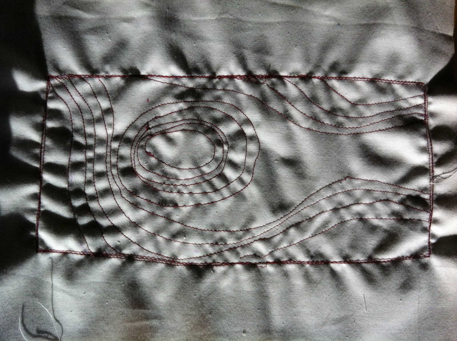
This one was a sample to see how the method would work on a simple pattern of lines and spiral stitching. It was not intended to be particularly related to the theme of maps, but in fact it has a slightly landscape look. I rather like this one, even though it was done just as a test piece.

Inspired by these, I remembered another technique much loved by quilt artists, i.e. of using discharge medium to remove the colour from a dark fabric. I made two sample pieces on black fabric, one based on my Bristol walking routes map, and one more random as a test piece. I brushed each one, both sides with Discharge Paste (which is, essentially, bleach), and followed the instructions to let it dry and then iron it, and finally wash them to remove excess paste.
Black fabric can discharge white or grey, or sometimes deep rust colour. I used two different black fabrics I had in my store, I thought one of them would discharge red and one grey. In the event, only the grey side worked.
Note for future reference: test the discharge colour of your fabric before making anything significant...!
However, that problem aside, the results were quite satisfactory, as here.
This is based on the print which is derived from my walking routes to town ....

This is the 'front' side - where the colour didn't discharge apart from a little bit on the sewing thread itself...

Those are the results for a test piece using stitched lines in various random patterns. Again, one side discharged nicely, the other hardly at all.


No comments:
Post a Comment