
Now that I'm thinking about words and writing in art for my pathway project, I looked up Tom Phillips again. His work is rich and varied, and appeals to me on several levels - the works with words and writing, the colours he uses and the way he uses paint; his sculptural pieces; and his interest also in quilts.
There was a significant exhibition of his works at the Flowers Gallery in 2010, more info and lots of images to be found on their website here.
His output is huge and diverse, with a great many portraits and large and small paintings. He has played around with systems paintings and series, and with process for its own sake. He has, for years, regularly collected up the paint on his palette at the end of each day or week and used this to slowly fill in pre-drawn slots on prepared canvasses. More recently he has used disposable palettes, and then cut them up and reassemble the pieces as a sort of mosaic of colours and a record of his painting. More about this on his blog here.
He does a lots of work with words. Some is 3D, such as his word sculptures like this one: Miami Beach link here.

Wood and acrylic, 25 cm, 1986
Tom Phillips has also produced three quilts, which began from his collection, for their design quirkery, the 'business' cards left by prostitutes in London phone boxes. The result, after a lot of experimentation, was a quilt made from sections of the cards.
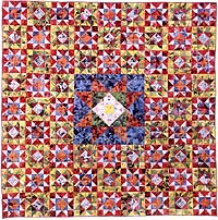
Cotton fabric and paper, 204 x 204 cm, 1997
This led to a second quilt, around the arrival of medical Stealth Bombers at the farnborousgh Air Show but using the same 'calling card' materials.

Manpower (work in progress)
Cotton fabric and paper
204 x 204 cm (finished size), 1997
More about his quilts on his website here.
The idea of a patched quilt recurs in some of his word-based paintings, such as this one,

Oil on canvas
184 x 123 cm / 72½ x 48½ in
His recent work includes commercial and PR applications such as this design for the British Heart Foundation which cleverly uses text as a verbal message about the healing power of art, as well as a visual image of a cracked and broken heart being mended.

In other work he plays around with the get to such an extent that the words are almost impossible to read, but the viewer is nevertheless aware that there is script within the overall design, which appears to be a series of irregular geometric shapes in muted colours.

Here We Exemplify, 1969
Oil on canvas
30¼ x 30¼ in / 76.5 x 76.5 cm
AFG 43798
Some of his work just uses simple text, in beautiful typefaces, to repeat a borrowed text ro one he has created himself. He uses these in different materials, including screen print onto transparent perspex cubes, or in wire sculptures designed to be wall mounted like this one.

After Henry James, 2009
Wire
18½ x 24¼ x 2 in / 46.5 x 61.5 x 5 cm
I really like the range and humour in Phillips many and varied works, and I am inspired by his ability to play around with very simple text and typeface forms to create beautiful and balanced pieces.
No comments:
Post a Comment