This morning was almost the last session we will have with Jo Kear, and she gave us a quiz, drawing randomly on some of the images and artists we'd looked at over the pats year. All kinds of things came up, from the terracotta Army, to the Sistine Chapel, to Annie Liebowitz's photo of John Lennon and Yoko Ono, to the Thames Mud project. Our team of (older) part-times came second, beaten only by not knowing the exact date of the terracotta army. It was fun, and a good reminder of the huge range of things we've covered.
Showing posts with label Art HIstory. Show all posts
Showing posts with label Art HIstory. Show all posts
Monday, 30 April 2012

Monday, 20 February 2012
College, 20th February: Art History
Today we looked at how to make comparisons between two artists, The two Jo had selected were Henry Fuseli (1741-1825), born in Germany but latterly living in England,

Image copied from the V and A website here
and Paula Rego who was born in Portugal in 1935 but has lived almost all her life in the UK.

Image from London Evening Standard website here.
Both artists have been described as Gothic, Sublime and Romantic: they have both concentrated on figurative painting, on narrative works, and on dramatic compositions and settings. Both have used strong contrast between dark and light (chiaroscuro) in their works, and their compositions often have a sense of the mysterious, the slightly un-settling, the grotesque. The fact that they are separated by 200 years makes little different to the way in which we should analyse and describe the main themes of their work. INdeed, making the comparison between them heightens our understanding and awareness of these characteristics. We can see the strong contrast of light and dark in Fuseli's painting The Weird Sisters or The Three Witches (1783),

Image copied from the Tate website here.
and see a similar device in Rego's The Dance, 1988.

Image copied from the Tate website here.
Fuseli was almost entirely self-taught, and he did not start painting until his late '30s, but he was quickly accepted into the art establishment and was appointed Professor of Drawing at the Royal Academy. He had some fairly torrid love affairs. He was working at time of great political turmoil in Britain and Europe, through the American and french revolutions, and the Napoleonic Wars and the upheavals in domestic British politics (the corn laws, etc) which followed. He was firmly within the Romantic school, but perhaps this rich and dark approach to narrative painting fitted well in that broader social and political context of change and uncertainty.
Rego came to Britain as a child and while at art school she fell in love with a married artist, Victor Willing, and became pregnant at 19. After a dramatic intervention by her father, she and Willing married and had 3 children. However, Willing later contracted MS and became immobilised. Rego had to act as his carer for years. Many of her paintings depict the conflicting emotions this created, and the tensions within the family that his dependency caused. Many of her images are quite disturbing, depicting him as helpless, sometimes as a dog, and the children watching from the sidelines. Rego was also influenced by times of upheaval in politics and society, her childhood in Portugal influenced by living under a dictatorship (Gen Salazar) and then the huge disruption of the Second World War.
The lecture showed how you can take tow artists and make meaningful comparisons between them in terms of style, tone, subject matter and approach. As ever with JO's classes, it was lively and stimulating.
Monday, 6 February 2012
College 6th February: The Body as Art, and Fluxus
Today we looked at the work of Japanese artist Tatsumi Orimoto, (b. 1946, Kawasaki, Japan), and his work in film, photography and performance art. Much of his work has included his mother, who encouraged his career, and whom he now cares for as she has become dependent in old age.

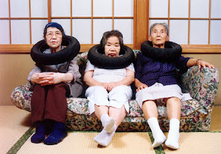 "Tire Tube Communication: Mama and Neighbours"
1996/2007
 "Breadman Son + Alzheimer Mama"
1996/2007
Images are all taken from the website of the DNA Gallery which is here.
I am not quite convinced by the argument, which jo urged on us today, that these images of his elderly mother are acceptable. I think it is somewhat intrusive to use her images in this way, because even if orimoto himself takes them lovingly,they are open to interpretation as abusive and manipulative of a person who probably has little choice.
I am not sure any of this work is try convincing, actually. What is Orimoto really trying to say? Is any of this "art"? Or is he just making some rather odd and sometimes amusing photographic images? Are the 'events' achieving anything meaningful other than some odd looks from passing people? The Bread Man series in particular seems to me to have no obvious point - nor is it particularly pleasing in aesthetic terms.
Or perhaps I am missing the point somewhere...
Orimoto's work is part of the ongoing Fluxus movement, which began in the 1960s in New York, and was part of the wider democratisation of art. The four principles of Fluxus are that Fluxus is an attitude, not a style; it is inter-media, it transcends the separate artistic categories, its works are simple, and are fun. Fluxus often emerges as performance art or events or 'happenings', rather than static and 'finished' pieces of viewable art of the more traditional kind, and including music, poetry and film. Another influence was Arte Povera, or Poor Art, i.e. art which used 'found' materials, which emerged in Europe, and Italy in particular, during the 1970s.
Other artists within Fluxus include Joseph Beuys, George Maciunas and Yoko Ono, and the composer John Cage. There is a helpful Guardian piece about Maciunas (1931 - 1978) here and more here about his Lithuanian background and involvment in the Fluxus in New York, from where this is copied.....
My feelings about some of these artists and their works is that, while purporting to be accessible, non-elitist, using found materials and simple compositions or structures, in fact they require quite a lot of interpretation before they make much sense. So they are not terribly accessible, after all. Or else they just seem bizarre, strange, a bit crazy at times. Or perhaps I am getting old and a bit set in my ways.

Small Mama & Big Shoes, 1997/2007

1996/2007

1996/2007
Images are all taken from the website of the DNA Gallery which is here.
I am not quite convinced by the argument, which jo urged on us today, that these images of his elderly mother are acceptable. I think it is somewhat intrusive to use her images in this way, because even if orimoto himself takes them lovingly,they are open to interpretation as abusive and manipulative of a person who probably has little choice.
I am not sure any of this work is try convincing, actually. What is Orimoto really trying to say? Is any of this "art"? Or is he just making some rather odd and sometimes amusing photographic images? Are the 'events' achieving anything meaningful other than some odd looks from passing people? The Bread Man series in particular seems to me to have no obvious point - nor is it particularly pleasing in aesthetic terms.
Or perhaps I am missing the point somewhere...
Orimoto's work is part of the ongoing Fluxus movement, which began in the 1960s in New York, and was part of the wider democratisation of art. The four principles of Fluxus are that Fluxus is an attitude, not a style; it is inter-media, it transcends the separate artistic categories, its works are simple, and are fun. Fluxus often emerges as performance art or events or 'happenings', rather than static and 'finished' pieces of viewable art of the more traditional kind, and including music, poetry and film. Another influence was Arte Povera, or Poor Art, i.e. art which used 'found' materials, which emerged in Europe, and Italy in particular, during the 1970s.
Other artists within Fluxus include Joseph Beuys, George Maciunas and Yoko Ono, and the composer John Cage. There is a helpful Guardian piece about Maciunas (1931 - 1978) here and more here about his Lithuanian background and involvment in the Fluxus in New York, from where this is copied.....
In 1948, Maciunas and his family emigrated to the USA after a brief period in Germany. At various universities there, he studied art history, graphic art, architecture, musical theory and European and Siberian Art of Migrations from 1949 to 1960. From his student days on, Maciunas was deeply interested in the systematisation of knowledge using numerous diagrams, atlases and charts.
In 1960, when Maciunas was still involved in the Lithuanian diaspora of New York, he conceived his first plans to publish a magazine called Fluxus. As from 1961, in the AG Gallery in New York that he ran together with Almus Salcius, he organised concerts with artists like Dick Higgins, Yoko Ono and Jackson Mac Low, which can be categorised as Pre- or Proto-Fluxus. In 1961, he moved to Germany (Wiesbaden) and met Emmett Williams, Nam June Paik, Ben Patterson and Wolf Vostell. In September 1962, the first series of concerts organised by MaciunasFluxus – International Festival of Newest Music took place in Wiesbaden, attracting considerable attention and unsettling the public, mainly due to the complete destruction of a concert grand piano (the performance was of the piece Piano Activities by Philip Corner). As a fervent Communist, at this time Maciunas was also committed to the union of “revolutionary-realist artists” with the “revolutionary-realist society” of the USSR as the main aim of Fluxus. However, numerous plans for travel to or even the complete transfer of the Fluxus “collective” to the former Eastern Bloc were not realised. Having returned to the USA in 1963, Maciunas continued to be the main organiser of numerous Fluxus events and the self-appointed President of Fluxus. There was serious discord within the Fluxus network in 1964, due to Maciunas’ and Henry Flynt’s protest actions against Karlheinz Stockhausen’s Originale.
Maciunas published numerous editions by the artists of the network (which he himself designed strikingly), and as from 1966, he planned the Fluxhousing Cooperative, which established Soho as an artists’ quarter. In 1975, Maciunas withdrew to New Marlborough, Massachusetts, where he died of cancer at the age of forty-six in 1978.
My feelings about some of these artists and their works is that, while purporting to be accessible, non-elitist, using found materials and simple compositions or structures, in fact they require quite a lot of interpretation before they make much sense. So they are not terribly accessible, after all. Or else they just seem bizarre, strange, a bit crazy at times. Or perhaps I am getting old and a bit set in my ways.
Thursday, 26 January 2012
Essay writing!
I have spent the past two days working furiously on my essay, which is about the American artist Ellsworth Kelly, and the influences his work have had on my own. The research was really interesting, and the writing not too hard, but a bit more challenging than I had at first thought.
Here are two of his paintings which I looked at.
 Ellsworth Kelly, Colors for a Large wall, 1951, 96" x 96"
 Ellsworth Kelly, Spectrum I, 1953
And here are two of my Spectrum-like quilts.....


I also really enjoyed thinking about the parallels, or not, between his work and some of my won, and how I have consistently used the colour spectrum in ways not that dissimilar to his systematic but also random use of colours. A good exercise: don;t know why it took me so long to get into doing it!
But the pffaffing about trying to line up images and text, almost impossible. I gave up with Pages in the end, and downloaded Word for Macs, which made it a whole lot better.
But then, of course, the finished file was enormous, and my e-mail refused to send it. So I learned a few more tricks about compressing picture files and so on, until it would go.
I am so relieved to have got it down, and amazed at the stress and bother it caused. I thought writing a short essay would be a doodle - after all, I've spent my whole working life writing reports, and also have done two post-graduate degrees. But this was still a bit of a struggle, even without the technology issues.
But it feels very good to have completed it (although it is far too long, for which I may yet be penalised) and now I can concentrate on the huge pile of work I still have to do for the assessment day on monday.
And now my e-mail is playing up....
Oh well, on with the 'script' paintings ....
Here are two of his paintings which I looked at.


And here are two of my Spectrum-like quilts.....


I also really enjoyed thinking about the parallels, or not, between his work and some of my won, and how I have consistently used the colour spectrum in ways not that dissimilar to his systematic but also random use of colours. A good exercise: don;t know why it took me so long to get into doing it!
But the pffaffing about trying to line up images and text, almost impossible. I gave up with Pages in the end, and downloaded Word for Macs, which made it a whole lot better.
But then, of course, the finished file was enormous, and my e-mail refused to send it. So I learned a few more tricks about compressing picture files and so on, until it would go.
I am so relieved to have got it down, and amazed at the stress and bother it caused. I thought writing a short essay would be a doodle - after all, I've spent my whole working life writing reports, and also have done two post-graduate degrees. But this was still a bit of a struggle, even without the technology issues.
But it feels very good to have completed it (although it is far too long, for which I may yet be penalised) and now I can concentrate on the huge pile of work I still have to do for the assessment day on monday.
And now my e-mail is playing up....
Oh well, on with the 'script' paintings ....
Monday, 23 January 2012
College: art history 23rd January
Interesting session today with Jo Kear on our emotional responses to art. Much of this was influenced by the work of James Elkins in his book Pictures and Tears: A History of People Who Have Cried in Front of Paintings, (New York, Routledge, 2004).

Why do people clap at concerts and theatre performances, but not at galleries? Why do people so rarely weep in front of paintings and other forms of art, but quite often at the cinema? We talked about our own experiences and why these phenomena should be so. Looking at art is a static, private thing (in spite of the crowds at big galleries), and the artist is generally not present. We do not witness the actual creation, the business of performance. So there is no individual present to receive our applause, to be congratulated - whereas in a concert, the performers are there, and we are able to show our reaction immediately to them.
But there are some people for whom art makes no impact at all - and Elkins quotes Mark Twain who remarked, caustically, on seeing Leonardo's Last Supper (1495-97/98, at the church of Santa Maria delle Grazie, Milan)

"We don't know any more about pictures than a kangaroo does about metaphysics, but we decided to go anyway" but was then disappointed with the painting: "It is battered and scarred in every direction and stained and discoloured by time, and Napoleon's horses kicked the legs off most of the disciples when they were stabled there... So what is left of the once miraculous picture? Simon looks seedy, John looks sick, and half the other blurred and damaged apostles have a general expression of discouragement about them"...."You wander through ... a mile of picture galleries and stare stupidly at ghastly old nightmares done in lampblack and lightning, and listen to the ecstatic encomiums of the guides".
(From a letter written by Twain in 1867 and later adapted for his novel Innocents Abroad, 1869, quoted in Elkins, p 52, and reproduced in Jo Kear's lecture notes for us).
This sounds very philistine, but perhaps only because we value Leonardo's work in a particular way, and forgive the ageing and wear-and-tear that a mural of this kind has suffered, In 1867 people were perhaps a bit more literal about their expectations. And it is true that the picture has been damaged so much that the images are not clear. Perhaps Twain was hoping for something more photographic.
But his reaction is not so very different to that of very many people when confronted with art which they either don't understand, or which may seem old and unfashionable. I'm not that keen on Constable, for instance - but I can appreciate that others find his paintings almost overwhelmingly beautiful, and I can recognise their technical merit, and appreciate the historical significance of their subject-matter an their place in the broader history of painting. I don't have to like things, but I think it is appropriate to acknowledge and respect the value of artwork, even those one doesn't much like.
But there are also some pieces of contemporary art which, to my mind, don't make sense and have little or no aesthetic appeal. Quite a lot of conceptual art which is, to the 'informed' art world, established modern classics, don't make much sense to the 'person on the Clapham omnibus" (or to The Sun).
Is that ok? Yes, of course. We have differing tastes and differing perspectives, and everyone's view is valid. The trick comes in being able to explain and justify one's likes and dislikes, while respecting the diversity of opinions about art (as about everything else).
Sunday, 15 January 2012
When text looks like text but isn't
I spent a happy hour or two this afternoon drawing a whole series of pages of script which wasn't rally script, but looked vaguely like some unknown foreign script, as part of the work for my pathway project on writing. I had seen some work by Brazilian artist Leon Ferrari, and that had inspired me. I am planning to turn my drawings into silk screens and print the out, including onto fabric, o I can then stitch into and over the "text".
This is what some of my pages look like at present.


But I've just come across a web-reference (the link is here) to something called Asemic Writing - i.e. writing which sin't real text, but i entirely made-up, like the work I've jut done. Like this (from here) :

Oh goodness me! There are whole magazines (on line, anyway) about this kind of thing. How weird is this? And I have to admit it is fun to do - as others have found too - "Oh Boy, I am smitten!" says this one, whose work includes this beautiful piece

Another South American, Mirtha Dermisache, from Argentina, has been producing astonishingly beautiful, I think, asemic writings and drawings since the 1970s. Here are a few of her images


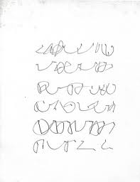
 More images of her work on Flikr here.
One thing leads to another: asemic writing takes me inexorably towards Concrete Poetry, the kind of poetry where the visual shape of the words is at least as important as the meaning, maybe the visual actually enriches or illustrates the meaning, or maybe the visual is the point, and the meaning or any words used doesn't much matter. A useful definition and some examples of different types of concrete poetry are on Infinity's Kitchen blog here which includes this succinct exemplar:
 lesabres in unlesbares ubersetzen by Claus Bremer (1963). Translated from German.
But people have been doing this, i.e. playing around with text and images, for a very long time. This was done by Simmias of Rhodes, a 4th Century BC poet and scholar. It is called Hacha and is about a double-header axe, which is the image produced by his arrangement of the words.

This is what some of my pages look like at present.


But I've just come across a web-reference (the link is here) to something called Asemic Writing - i.e. writing which sin't real text, but i entirely made-up, like the work I've jut done. Like this (from here) :

Oh goodness me! There are whole magazines (on line, anyway) about this kind of thing. How weird is this? And I have to admit it is fun to do - as others have found too - "Oh Boy, I am smitten!" says this one, whose work includes this beautiful piece

Another South American, Mirtha Dermisache, from Argentina, has been producing astonishingly beautiful, I think, asemic writings and drawings since the 1970s. Here are a few of her images


One thing leads to another: asemic writing takes me inexorably towards Concrete Poetry, the kind of poetry where the visual shape of the words is at least as important as the meaning, maybe the visual actually enriches or illustrates the meaning, or maybe the visual is the point, and the meaning or any words used doesn't much matter. A useful definition and some examples of different types of concrete poetry are on Infinity's Kitchen blog here which includes this succinct exemplar:

But people have been doing this, i.e. playing around with text and images, for a very long time. This was done by Simmias of Rhodes, a 4th Century BC poet and scholar. It is called Hacha and is about a double-header axe, which is the image produced by his arrangement of the words.
This last image, and Lots more about text in art history on a really useful blog here.
Monday, 9 January 2012
College 9th January: Art History
This morning we were looking at Order, and Collections, and in particular, some of the work of American artist Mark Dion (b 1961) who organised a dig of the Thames river bank outside Tate Britain and Tate Modern in 1999 (the year Tate Modern opened), and exhibited a collection of the material he found in a purpose-made display cabinet in Tate Modern.

More information about the exhibition is on the Tate website here, from where this image was copied. Dion did something smilier in Venice, and while he attracted the ire of the venetian authorities, he also uncovered valuable and previously unknown evidence about the earliest human settlement in Venice.
He has collaborated with various universities and museums on similar works, such as this one at the Natural History Museum, which he saw as a tribute to Linnaeus, the Swedish botanist who invented the way scientists still categorise plant and animal species.


More information about the exhibition is on the Tate website here, from where this image was copied. Dion did something smilier in Venice, and while he attracted the ire of the venetian authorities, he also uncovered valuable and previously unknown evidence about the earliest human settlement in Venice.
He has collaborated with various universities and museums on similar works, such as this one at the Natural History Museum, which he saw as a tribute to Linnaeus, the Swedish botanist who invented the way scientists still categorise plant and animal species.

There is more information about the exhibition here, from where this image is copied, and which includes the following extract about Dion's intention.
Dion appropriates the methods, tactics and traits of science, to explore serious questions in a playful and subjective manner that scientists cannot adopt. In his own words, he is able to act as a "lightning rod" for ideas about science. "I'm not conducting an experiment in strict scientific terms, but for some people it's enough to look the part," he comments in an interview published in the catalogue to a concurrent, touring exhibition, The Natural History of the Museum.
Personally, I am not rally sure if this is 'art' or not - it is certainly a means to make previously hidden things more visible and possibly more accessible to the viewer. If it helps people get interested in museums and archaeology, then it's fine by me. But a similar approach, by a rained archaeologist or naturalist, but with the vision to present things in non-traditional ways, might do an even better job of this. Of course, it's interesting that archaeologists hadn't thought about trawling through the thames mud themselves....
We then looked at work by Christian Boltanski, born in Paris in 1944. He has done a lot of big installations around the themes of loss, many of them about war and the Holocaust in particular.
This one is about the lost children of Dijon, made in 1986.

He did a huge and impressive installation t the Grand Palais in Paris in 2010

Image was copied from the Guardian article here, which also has a helpful discussion about the piece.
This installation, called Personne or "Nobody" is a massive statement about the Holocasut. It is on a huge scale (the Grand Palais is vast, much bigger than Tate Modern's Turbine Hall) and as well as the mounds of clothes, and the mechanical grabber which constantly lifts an drops clothes on the heap, there was a constant and loud soundtrack of heartbeat, so the overall effect must have been almost overwhelming. In terms of making an unforgettable impact on the viewer, this succeeded big time.
Boltanski has made a lot of work on this theme of death and remembrance, and often of ordinary and unnamed people, like this installation at the Guggenheim Gallery in Bilbao.
Humans, 1994. Photographs and lights, overall dimensions variable. Guggenheim Bilbao Museoa GBM1998.1. Photo: Erika Barahona-Ede
Other artists we looked at briefly included Tracey Emin (Everyone I have ever slept with, and My Bed, among other works based on collections of her belongings or her past lives); Cornelia Parker's feathers, and German artist Kirsten Bott who has been collecting and cataloguing everyday objects for over 20 years. One is tempted to ask "why?" and "why should we want to look at his collections?" but they do have a strangely compelling attraction, perhaps because we all hoard 'stuff' and it is challenging to have to confront, visually, the scale and banality of a lifetimes' wroth of every-day 'stuff', most of it pretty worthless and useless. So perhaps there is a point to it... jut about. This is an image from one of his exhibited collections.

Karsten Bott,One of Each, 1993, detail,
Installation at the Offenes
Kulturhaus, Linz, 1993,
10 x 30 m.
Installation at the Offenes
Kulturhaus, Linz, 1993,
10 x 30 m.
The antithesis of collections, however, is Michael land, who famously destroyed every single one of his possessions
Overall, I am still not quite convinced about the relevance of some (or all) of these collections as 'art' although they can be witty and intriguing, and perhaps they are a statement on consumerism, or whatever.
If they create order out of chaos, or make us look at ordinary objects in a new way, or pose questions about the consumption and waste of everyday life, then perhaps they have value. I am not sure...
Tuesday, 3 January 2012
College again already! 3rd January 2012
Only ten of us managed to make it to college for the first day of the new term today - and we had a very god session on art history with Jo Kear looking at portraits, and what makes celebrity.
 This one, of Michaelangelo painted in 1504-6 while he was painting the Cistine Chapel ceiling was made by one of his apprentices, Marcello Venusti and was commissioned by the Medici family.
We looked at how the use of light and shade (chiaroscuro) concentrates the viewer's attention purely on the face, and even then only half the face is illuminated. The sitter seems to be looking confidently out towards the viewer, but also seems distracted, as though he will turn back to his painting in a moment. We are told nothing about him apart from his face, no information about dress, location, etc. It is a very concentrated portrait.
Other images we considered included this deep and meaningful portrait of Princess Diana, by Mario Testino in March 1997, 5 months before the car accident in Paris.

We all thought this was a lovely portrait of Diana, but also that it was carefully managed to project her intended new image as a single woman, no wedding ring, no fancy background, just a very nice dress.
In looking up the image, I found that it was actually a cropped down version of a slightly bigger image, shown here...

Another dramatic portrait was this one by Martin Schoeller of Barack Obama tank in 2004, well before Obama won the Democratic nomination for the US presidency election in 2008.

I found this image very negative, but some of us thought it was strong and carefully presented to show Obama as a powerful potential presidential candidate. There is something strange about the focus (the ears and the neck are out of focus) and the lighting (the lack of shadows, and the reflected light source in the eyes) and also the camera position seems to exaggerate the nose.
Later I looked up more of Martin Schoeller's portraits - The Google Image search results are available here. Seeing so many, all rather odd, portraits, put the Obama one into a better context. He seems to have come out relatively well. Some of the images are really strange, like this one of Paris Hilton
 Or this one of Jack Nicholson

Then, rummaging through other images of portraits by Schoeller, I came across these, done for an article in the January 2012 edition of National Geographic on identical twins. A really interesting, and less distorted, set of images of pairs of twins, showing how his 'up close and personal' portraiture can help distinguish the fine detail of differences between otherwise very similar faces.
 The National Geographic photo archive link is here.
We all liked the interesting and unusual 3D construction portrait of J K Rowling, made by Stuart Pearson Wright in 2005 for the National Portrait Gallery. The only images I could find online showed only the painting/construction, and not the surroundings which show the 'box' like room in which the images are located. So this doesn't show quite the 3D impact of the whole. I'm not are where Jo found the bigger image she showed us today.

There is something almost dolls-house like about the way the portrait is mounted within a "room" depicting the simple writing requirements of Rowling in her early, unpublished years in Edinburgh, , and her still very private life.
We looked at several other images, including Sam taylor-Wood's video portrait of David Beckham sleeping, which I have seen at the NPG, and a rather unpleasant (deliberately so?) newspaper portrait of Damien Hirst in 1997. We also looked briefly at four ancient busts of Roman Emperors - two of which looked to me just like former senior civil servant colleagues of mine...who shall be nameless. The point of all this was to make us see what we could perceive of character from an un-named portrait, and how we ascribe attributes and personality on the basis of presentation. Also, a brief discussion about who commissions portraits, who controls the page, how much leverage the sitter has, or not, over the pose, tone, style, etc. All very interesting, and food for thought at future exhibitions.

We looked at how the use of light and shade (chiaroscuro) concentrates the viewer's attention purely on the face, and even then only half the face is illuminated. The sitter seems to be looking confidently out towards the viewer, but also seems distracted, as though he will turn back to his painting in a moment. We are told nothing about him apart from his face, no information about dress, location, etc. It is a very concentrated portrait.
Other images we considered included this deep and meaningful portrait of Princess Diana, by Mario Testino in March 1997, 5 months before the car accident in Paris.

We all thought this was a lovely portrait of Diana, but also that it was carefully managed to project her intended new image as a single woman, no wedding ring, no fancy background, just a very nice dress.
In looking up the image, I found that it was actually a cropped down version of a slightly bigger image, shown here...

This shows Diana a lounging in a slightly more relaxed pose. Does this change our assessment of the picture? I think not really, although there is slightly less simplicity in the bigger picture.
Another dramatic portrait was this one by Martin Schoeller of Barack Obama tank in 2004, well before Obama won the Democratic nomination for the US presidency election in 2008.

I found this image very negative, but some of us thought it was strong and carefully presented to show Obama as a powerful potential presidential candidate. There is something strange about the focus (the ears and the neck are out of focus) and the lighting (the lack of shadows, and the reflected light source in the eyes) and also the camera position seems to exaggerate the nose.
Later I looked up more of Martin Schoeller's portraits - The Google Image search results are available here. Seeing so many, all rather odd, portraits, put the Obama one into a better context. He seems to have come out relatively well. Some of the images are really strange, like this one of Paris Hilton

Then, rummaging through other images of portraits by Schoeller, I came across these, done for an article in the January 2012 edition of National Geographic on identical twins. A really interesting, and less distorted, set of images of pairs of twins, showing how his 'up close and personal' portraiture can help distinguish the fine detail of differences between otherwise very similar faces.

We all liked the interesting and unusual 3D construction portrait of J K Rowling, made by Stuart Pearson Wright in 2005 for the National Portrait Gallery. The only images I could find online showed only the painting/construction, and not the surroundings which show the 'box' like room in which the images are located. So this doesn't show quite the 3D impact of the whole. I'm not are where Jo found the bigger image she showed us today.

There is something almost dolls-house like about the way the portrait is mounted within a "room" depicting the simple writing requirements of Rowling in her early, unpublished years in Edinburgh, , and her still very private life.
We looked at several other images, including Sam taylor-Wood's video portrait of David Beckham sleeping, which I have seen at the NPG, and a rather unpleasant (deliberately so?) newspaper portrait of Damien Hirst in 1997. We also looked briefly at four ancient busts of Roman Emperors - two of which looked to me just like former senior civil servant colleagues of mine...who shall be nameless. The point of all this was to make us see what we could perceive of character from an un-named portrait, and how we ascribe attributes and personality on the basis of presentation. Also, a brief discussion about who commissions portraits, who controls the page, how much leverage the sitter has, or not, over the pose, tone, style, etc. All very interesting, and food for thought at future exhibitions.
Monday, 21 November 2011
College week 11/1 Research Folders 21st November
Today we had a group tutorial with Mark, mostly about our research files. Mine is at present mainly this blog, but I realise that I need to do more by way of:-
(a) referencing;
(b) commenting on how I respond to the many artists whose work I look up;
(c) making it clear what is research for a specific project, and what is more general, e.g. in support of our art history letters;
(d) making sure I record all the galleries and exhibitions I go and see, however small or grand;
and finally
(e) keeping it in some kind of order so I can show people and also so I can find things myself at a later date.
In other words, I need to revise what I've already done, and do a good deal more.
I think I will also need to maintain a paper file - not least because i pick up flyers and exhibition catalogues, etc, and need somewhere to store them. Plus bits from the newspapers (although often they're available on-line a well). So, lots more work to be done on my research...
(a) referencing;
(b) commenting on how I respond to the many artists whose work I look up;
(c) making it clear what is research for a specific project, and what is more general, e.g. in support of our art history letters;
(d) making sure I record all the galleries and exhibitions I go and see, however small or grand;
and finally
(e) keeping it in some kind of order so I can show people and also so I can find things myself at a later date.
In other words, I need to revise what I've already done, and do a good deal more.
I think I will also need to maintain a paper file - not least because i pick up flyers and exhibition catalogues, etc, and need somewhere to store them. Plus bits from the newspapers (although often they're available on-line a well). So, lots more work to be done on my research...
Tuesday, 15 November 2011
College week 10/1 Art History 14th November
The title of today's lecture was "Case Study: How to fit a mountain into a photograph" and focussed on he work of American photographer Ansel Adams (1902 - 1984).

Adams was probably dyslexic, didn't do very well at school but taught himself to play the piano, and subsequently photography after being given a Box Brownie camera as a present when he was a teenager. He specialised in carefully planned shots of wild spaces, famously Yosemite National Park, California. His wife's daily kept a studio in the park, which Adams eventually took over. He belonged to the f64 Group of photographers who developed the concept of transcendentalism. Adams himself was convinced of the importance of visualisation, i.e. of having a mental picture of the image he wished to create in his photographs, so he adjusted light, exposure, etc, to produce a pre-planned image, sometimes enhancing the reality of the natural world by clever planning, angles, timing, etc. Adams wrote, in 1948 that
"The term visualisation refers to the entire emotional -mental process of creating a photograph, and as such, it is one of the most important concepts in photography. It includes the ability to anticipate a finished image before making the exposure, so that the procedures employed will contribute to achieving the desired result. This much of the create process can be practices and learned beyond lies the domain of personal vision and insight, the creative 'eye' of the individual, which cannot be taught, only recognised and encouraged."
(Adams, Ansel, The Camera (first published 1948, most recent edition 1995), London: Little, Brown and Co., p.14)
We looked at several of Ansel Adams most celebrated photographs, including these:


Orchard, Early Spring

Winter Sunrise from Lone Pine


Adams work is still stunning in it range and the lowering power of the carefully positioned camera shots. he would wait ages for the sky, light, etc to be just right, and his photos are iconic, and set the standard for many other landscape photographs later on.
I like his work: his photos have great dramatic impact and convey a sense of awe and wonder at the huge natural landscapes of America.
Adams was probably dyslexic, didn't do very well at school but taught himself to play the piano, and subsequently photography after being given a Box Brownie camera as a present when he was a teenager. He specialised in carefully planned shots of wild spaces, famously Yosemite National Park, California. His wife's daily kept a studio in the park, which Adams eventually took over. He belonged to the f64 Group of photographers who developed the concept of transcendentalism. Adams himself was convinced of the importance of visualisation, i.e. of having a mental picture of the image he wished to create in his photographs, so he adjusted light, exposure, etc, to produce a pre-planned image, sometimes enhancing the reality of the natural world by clever planning, angles, timing, etc. Adams wrote, in 1948 that
"The term visualisation refers to the entire emotional -mental process of creating a photograph, and as such, it is one of the most important concepts in photography. It includes the ability to anticipate a finished image before making the exposure, so that the procedures employed will contribute to achieving the desired result. This much of the create process can be practices and learned beyond lies the domain of personal vision and insight, the creative 'eye' of the individual, which cannot be taught, only recognised and encouraged."
(Adams, Ansel, The Camera (first published 1948, most recent edition 1995), London: Little, Brown and Co., p.14)
We looked at several of Ansel Adams most celebrated photographs, including these:

Old Faithful Geyser, Yellowstone National Par
Orchard, Early Spring
Winter Sunrise from Lone Pine
Nevada Fall, Rainbow

Moon and Half Dome, Yosemite Valley, California
Ansel Adams, photographing in Yosemite National Park from atop his car in about 1942.
Adams work is still stunning in it range and the lowering power of the carefully positioned camera shots. he would wait ages for the sky, light, etc to be just right, and his photos are iconic, and set the standard for many other landscape photographs later on.
I like his work: his photos have great dramatic impact and convey a sense of awe and wonder at the huge natural landscapes of America.
Subscribe to:
Posts (Atom)