I had a day out in Birmingham to see the well-reviewed Lost in Lace exhibition at the City Museum and Art gallery, which finished this weekend. The Lost in Lace website, here, has images of all the works and information about the artists participating. It was well worth the trip. The exhibition is in the Gas Hall, separate from the main city museum, and although it is not huge in terms of the number of pieces, it was massive in terms of offering new thoughts about what lace is, and how the idea of lace, i.e the effect of knotting and tying threads, and creating patterns and images in the spaces between the threads, can be translated into intriguing and beautiful objects and designs.
The first piece you see, on entering the Gas Hall, is the tremendous series of hanging panels by Naomi Kobayashi, the Cosmos series, made of paper and string, assembled and glued together to make complex shapes and shadows which are semi-trasparent.


I loved the construction, and also the huge scale - there are 8 columns, about 15 or more feet high.
I also really liked the long this piece by Diana Harrison, called simply Line, made of carefully stitched black thread on simple trips of cotton cloth and paperer which had been painted and then torn or dissolved away. Again 6 or 8 panels, but making a very long thin line.

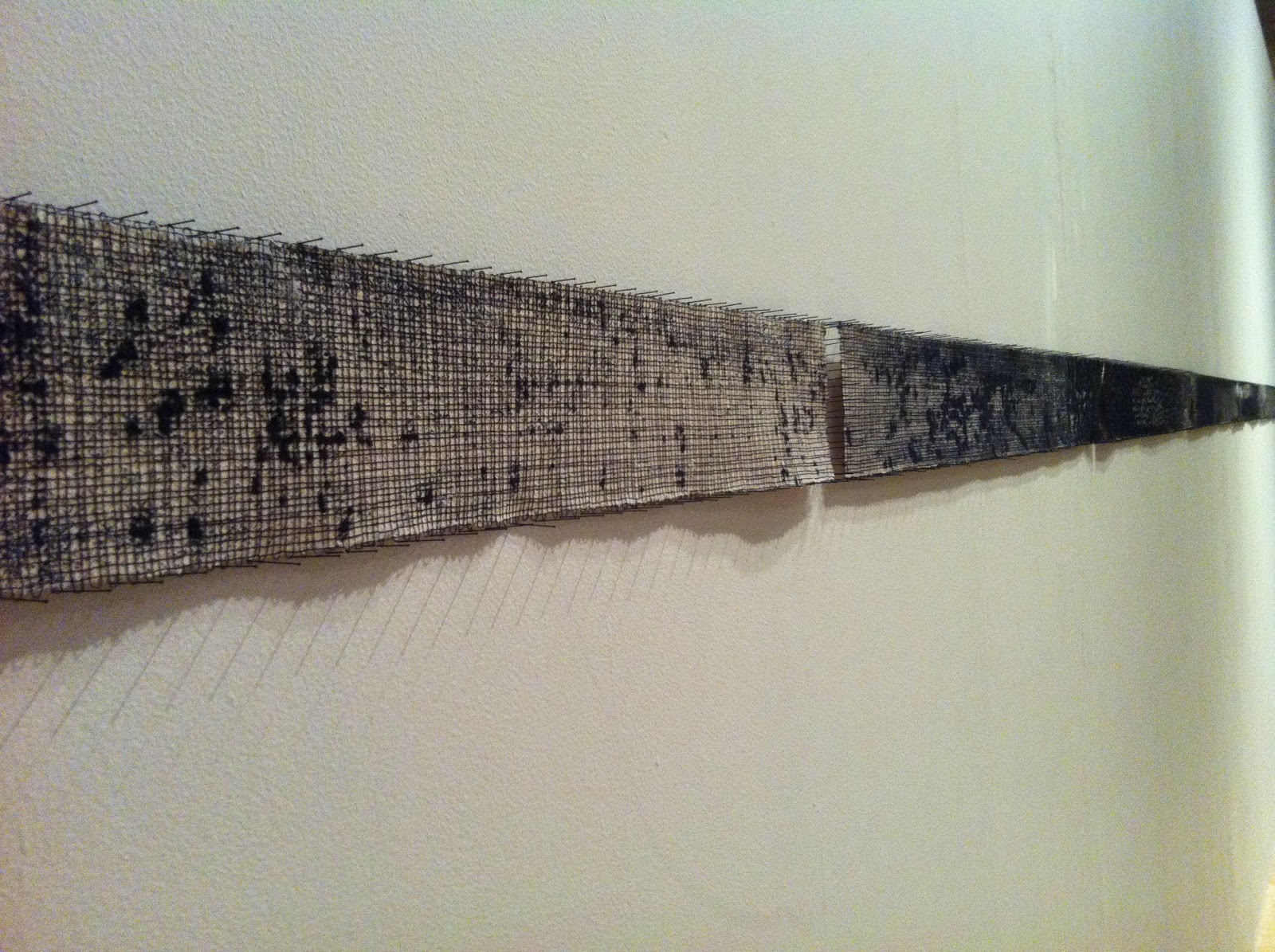
The stitching was perfectly even, not easy to do on such a scale, and the random patterns of black and white gave it a huge amount of texture and depth.
Then there was Tanabata Lace, by Suzumi Noda, made from black punch cards and black cotton thread, with complex knotting to bing them together into a huge set of panels.

I liked too the series of hanging panels called the Latticed Eye of Memory, by Liz Nilsson, which was made of printed and stitched and laser cut panels, each about a metre square.

I liked the overall effect, but was intrigued to see that several of the panels have been printed with script, or something like script, and this was related to my own work on 'not-writing' and the thoughts I've had so far about my final project, on deconstructing words and writing.
Tarmar Frank's installation, A Thin Line between Space and Matter, was really lovely. It developed form the string patterns we probably all made in maths lessons at school, but turned into a 3D version, on a grans scale, and then added intriguing lighting effects, so you saw the shapes made by the string has white lines in a totally dark room. Very effective, and so good to take something we have all seen in a 2D way, and made it into something far more complex and interesting .

Chiaru Shiota's installation was also on a grand scale, consisting of 5 unrealistically long plain white cotton dresses, hung high in a room, which was then almost completely filled with a caplet web of balck woollen thread, so that the dresses could hardly be seen. I t reminded me of the Sleeping Beauty and the thick hedge protecting her from rescue. there was a helpful film showing in time lapse photos how the piece had been made, using ladders, and scaffolding, and several people tying lots and lots of knots.


I liked, too, the simple but effective piece by Katharina Hinsberg, Perceids, which was a simple lacy pattern made by the incredibly simple method of drilling lots of holes in a piece of white-painted board.

And Michael Brennan-Wood's Lace the Final Frontier, which was made of red-painted wood, cut into intricate patterns which at first sight looked a little like the paper snowflakes people make at Christmas, but on closer inspection you realise that the shapes in the patterns are military objects, like guns and tanks and aeroplanes and soldiers.


Interestingly, this was the only piece in the shoe show which was not monochrome black and white. The red perhaps signifying the red of Mars, god of war, or the blood of the battlefield. Whatever, it stood out among the mostly white and black of all the other pieces. The works were all commissioned especiaially for the exhibition, so this black and white colour theme may have been one of the conditions set by the gallery.
The overall effect of the show was impressive, a fresh look at the idea of lace, of the holes and negative shapes within a space, at the scope for sculptural forms made largely of wool or cotton threads, and of the inventiveness of modern textile artists. This was especially pertinent for me while I'm thinking about my next project and the idea of hanging or suspending or weaving together somehow my deconstructed writing. Also, I had been looking at images of modern japanese and scandinavian textile artists last week, some of whom featured in the show.
The overall effect of the show was impressive, a fresh look at the idea of lace, of the holes and negative shapes within a space, at the scope for sculptural forms made largely of wool or cotton threads, and of the inventiveness of modern textile artists. This was especially pertinent for me while I'm thinking about my next project and the idea of hanging or suspending or weaving together somehow my deconstructed writing. Also, I had been looking at images of modern japanese and scandinavian textile artists last week, some of whom featured in the show.


