Saturday, 3 March 2012

More Paper-making, 3rd March

On Friday I managed to track down a proper paper-making frame and mesh from the Creativity shop in Clifton, and I also acquired a small paper shredder, because I can't see how else I can shred or tear or cut up enough paper without damaging my r.s.a.-worn hand.  The shredder will be useful for other things,  and I had been thinking about getting one for some time anyway.

It made a huge difference!  I shredded several history articles, and put them in a bucket of warm water to soak, while I went to get the frames and mesh.

On Friday evening I made my first batch of paper suing this method.  It was much, much easier than my efforts in college!   There were clear instructions with the gauze, and the frames were big enough to produce roughly A4 sheets.

I liquidized the soaked, shredded paper in the liquidizer goblet until it looked like pale grey porridge.  


I filled the utility room sink with cold water and added a few handfuls of pulp and swirled it all around.  I submerged the frames and mesh, and lifted them out carefully, shaking them gently to get rid of  most of the water.


Then I put the mesh and 'paper' onto a pile of old towels and old newspapers on the kitchen floor,


 and covered the paper with a J-cloth


and then a wooden chopping board.


I stood on the whole lot for about 15 seconds, as the water squelched through into the towel.


At this stage the damp sheet of new paper sticks magically to the J-cloth, and you can peel the cloth away from the mesh, and lay it out flat to dry.


 I made about a dozen sheets, and layered the sheets between pieces of J-cloth and stacked them up on top of a cake rack on the AGA to dry overnight.


On Saturday morning the sheets of new paper were not quite dry, but ok to move and put under a heavy pile of magazines to finish off drying and to make them flat.  They were far less grey than the paper I made from newspaper in college last week, and had interesting and tantalising flecks of text showing through.  The sheets were varied in thickness, but I was quite pleased with their consistency overall.

This evening I have made a whole lot more sheets, this time (I hope) getting them a bit thinner and more even.  In some of them I included little strips of un-pulped paper in the mix, in the hope that random words will emerge in the finished paper.  I also stacked them up on a base sheet of flat plastic, to avoid any trace of the cake-drying rack coming through.

I plan to use some of these on Monday at college to (a) try some relief printing onto these sheets to see if they are robust enough to take ink; and (b) try making some of them into a book of some kind.

I still have half a bucket of shredded and soaked paper, and I'm not quite sure what to do with it - it will not keep for long.  So tomorrow I think I will try making it into papier macho forms, possibly letter forms, - both to see how this will work, and possibly for the idea of some kind of suspended, broken-up words.

I also plan, next, to try making some paper out of 'clean', i.e. unused white paper, but including odd words or strips of text from printed essays, etc.  And I also want to try making some a paper out of coloured pretend material, e.g. old copies of the RWA magazine, with is printed on quite heavy but not-glossy paper.

Tuesday, 28 February 2012

Paper Making: 27th February

This morning our art history session was about writing your cv, which for me was largely academic, as I am unlikely to be applying for any more jobs, and my chances of needing a 'creative' cv e.g. for an exhibition are fairly slim.  But it was fun to see a couple of video cvs, and have pointers to various on-line sites with advice on what to do, or why not to do, in promoting one's career.  Jo passed on a link about cvs made using lego, including a rather good one by a former civil servant.

The rest of the day was studio time on our final projects.  I had a tutorial session with Matt, who seemed reasonably interested in my ideas for deconstructing and reconstituting old work-related papers and reports, into something new.

I also had my first attempt at making paper.  This was not too easy in the sculpture room because I didn't have the right equipment, in particular there were only two small but differently sized screens, no deckles, and no large flat basin big enough to submerge the frames in.  I tore up the newspaper (which made my wrist/hand sore very quickly - the old repetitive strain injury war-wound is never far away) and then soaked it in a basin before putting it into the kitchen mixer, and whizzing it into  a pulp.   I realised that it should have a lot more soaking time - the hour of the lunch break wasn't anywhere near enough.

Because there was no big basin in which to dilute the pulp and scoop the frame through, I had to improvise.   I tried spooning the liquid paper pulp onto the mesh of the frames,  in 4 or 5 spoonfuls for each frame,  and hoping I could spread it out fairly evenly.  I then simply turned the frame over and dropped the 'paper' onto a damp J-cloth.  I made a small pile of these before the pulp was used up.  Unfortunately I didn't take any more pictures, not least for fear of getting my camera very wet.


I left the sheets to dry on a radiator in the sculpture room overnight, and on Tuesday when I found them, they were dry and a bit crinkly, but straightened out quite quickly once I got them home and under a few books for a while.  The grey colour is the result of using newspaper, but I knew this would happen.


I plan to have another go at home during the week, using photocopy or printer paper, which will be better quality and less grey, although there will still be unite  bait of print on the surface.


Saturday, 25 February 2012

Hajj exhibition at the British Museum

After the Hockney I wandered across to the BM to see what was on.  As I have a member's card I was able to get into the special exhibitions for free and without queuing, which was a relief after the crowds at the RA.

I did rather like the exhibition about the Hajj, the pilgrimage to Mecca, its history, its rituals, its artefacts and manuscripts.  BM website info is here.

This was a wonderful piece, by Ahmed Mater, another British Muslim artist.  It is made very simply of a small black cube, rather like the Ka'ba, the sacred centre of the pilgrimage, which people walk around seven times anticlockwise at the most important part of the 5-day Hajj festival.    When crowds of people are walking round and round,  there is constant movement at the centre of the enormous space, and on some films this has been speeded up so that it looks a little like a spinning wheel.  The action of iron filings around a magnet mimics this image very closely.   It is a clever piece, because it relates the action of the pilgrims and the magnetic attraction/commitment of the faithful.


This was among several modern pieces of art, commissioned by the BM to accompany the exhibition, including a couple of works by Idris Khan, whose writing/not-writing and repeated images I had admired when working on my last project at QR.


This installation by Khan was in the main entrance in the Great Court.  It is a series of black boxes, each about 18" square, with islamic script written round three sides, it looks like several layers of writing one on top of another.  There are maybe 100 blocks.  It is impressive in scale.  it reminded me rather of the Holocaust memorial installation in Berlin, which of course is on a  much, much larger scale.


This piece is written onto the wall of the gallery, near the end of the exhibition.  It comprises a series of statements made by people who have made the Hajj about the impact it had on them.  Idris Khan has taken some of these comments and made print blocks from them, and then used the print blocks to make radiating series of lines, which remind you of the journeys made by Hajj pilgrims from across the world.  


This piece was not in the BM exhibition, but is about to go on show in Manchester, also related to the Hajj and the experience of Islamic pilgrimage.  I like the idea of the words disappearing into a kind of vortex, a black hole, which is dark but is also about light and discovery.

I liked the BM Hajj exhibition because it was very informative but also presented some really lovely artefacts and images.  There were a lot of personal stories, too, and a good balance between the historical and religious and the modern experiential.  I knew very little about the Hajj until now, and I am glad I have seen the show.  There were a lot of Muslim families there when I went  (late on a Friday afternoon) and they and their children seemed as interested in the exhibits as those of us, like me, who probably had very little prior knowledge.

I also looked in at the exhibition curated by Grayson Perry, (the BM website link is here)


but I fear I didn't find much to like there, possibly because by then I was very tired and not very receptive.  I know others have been very enthusiastic about this show, both his new work and the association with items in the museums' collections.  But not, on this occasion, the thing for me.


David Hockney at the RA

To London, with friend Sylvie, to see the David Hockney show at the Royal Academy, The RA website with info about the show is here. Glad we had pre-booked timed tickets, as there was quite a long queue in the courtyard, all advance tickets having been sold ages ago.  There were an awful lot of people there,  although the crowd spread out a little after the first room.

The majority of the works on show are his recent large landscape paintings, done in Yorkshire in the last few years, and done on a grand scale using a large number of separate but joined smaller canvases and lots of strong colours.  Many have been painted from memory in the studio, although Hockney also uses photographs a lot, and he also does a lot of pointing in situ.  Some of the works were lovely, but some looked rather formulaic, a bit child-like even, although I admired the sheer scale of the big landscapes, they capture expansive vistas of the English countryside,


the rolling hills and hedges, and - in spring and summer, anyway - the strong colours.   The paintings of the lane near Woldgate Woods were lovely, depicting the changing seasons. and had a lyrical quality in the grandeur of the trees and the perspective of the receding track disappearing into the vanishing point at the end of the lane.  Lovely.


His big landscapes also showed off his painting technique - almost like the pointtiliste impressionists - lots of  small lines and marks, using bold and unexpected colours - blue in the grass, red in the green of the trees, purple in a tree stump.  The build-up of make-making conveyed depth and town and the changing light.  Vaguely reminiscent of Van Gogh in places - his fields not unlike the fields in Van Gogh's paintings at Arles.


I liked the much-vaunted paintings of trees and cut timber rather less,  possibly because they seemed less subtle, rather coarsely executed.  Indeed, the quality of the pairing itself was not always very good - you can see the bare canvas underneath in many places, the paint is almost thrown onto the canvas, all a little slap-dash and hurried.  

While the colours in these pairings are stunning,  the heavy outlined shapes, and the stylised leaves and grasses, reminded me of cartoon images in kids picture books rather than observed landscape, and i was not sure what Hockney was trying to convey by them.


However,  the series of paintings of three magnificent trees in a field,  Thixendale Trees, seen at different seasons through the year, were stunning.  I also very much liked the charcoal drawing of these trees, from which the pairings were done.


There were a few earlier works, including Mulholland Drive: The road to the Studio (1980)  (we lived with a very nice print of this for some years, courtesy of Ken, so I thought how nice it was to see the original).


 Except, hey, what's this?  It wasn't the original  painting after all,  but a 'photographic reproduction".  Now, that seems a very poor show, to me.   Couldn't they have persuaded the Los Angeles gallery to let them borrow the real thing?  Or if not, why not show a different real painting,  if not this iconic one, from the Californian landscape series?  This seemed to me to be a bit of a cheat.

There is a video on the RA website in which he discussed his huge painting, A Closer Grand Canyon,  (which is in the RA show, and has the most amazing colours, especially strong reds) ) and which was done on a large number of smaller, roughly 2' x 3' canvasses, all hung together to make a single picture..  He explained that the Mulholland Drive painting was done in acrylic on a single canvas, and it is absolutely huge and therefore very difficult to move - and the LA gallery wouldn't agree to move it because of the risk of damage.  So that explained the photographic reproduction - but it's a pity the gallery notes in the RA show didn't explain the reasons why.

However, they did have the original of Nichols Canyon, also 1980, which was terrific, and similar in style and colours to the Mulholland Drive  original.


I did like very much the i-pad drawings, of which about 50 had been enlarged and printed on A2 sheets. Presented this way the wonderful use of line and colour really shows up well.
 I-pad drawing No 2 from David Hockney's The Arrival of Spring in Woldgate, East Yorkshire 2011
Image copied from The Guardian website here.


 A whole room full of them  hung three rows high, was also quite startling.  There was quite a lot of repetition in the subject matter of these drawings, but somehow this was less troublesome (to me, the viewer) in the i-pad drawings than in the bigger tree paintings.

Then there was a room with 6 cabinets containing some of his sketchbooks, and cleverly-mounted screens above each one showing a looped sequence of images of each of the sketch-book pages. These were truly inspiring for me.  His drawings are generally lovely - simple, clear, lots of pen and ink, and lots of watercolour.  He uses books of varying sizes, and seemed frequently to fill a book in a single day.  Some of the pages showed that even Hockney can make a mess of a drawing sometimes!  Some of the pages had very little, a few smile lines, the idea of a drawing rather than a finished sketch.  Others were very detailed, with heavily worked sketches covering a double page.   I learned a lot from these, about his process and about simply getting on with doing the drawing, and not worrying too much about composition or subject matter.  Some of the pages were very hum-drum domestic subjects, the breakfast things on the table, a plate or a book.  Drawing every day is the thing.

This he now does increasingly on his i-pad rather than in a sketch book, and there were a fair number of small i-pad images too.  And then some, drawn in Yosemite National Park in the US, which had been magnified and enlarged massively - to fill a whole wall in the fnal room.  You would expect them to lose their impact when enlarged so very far - but somehow they were enhanced, and the quality of the print, and the coverage of the colour, was fantastic.

I think I liked these best of all, after the sketchbooks.

Finally there was a room showing some of his videos made with 18 adjacent but slightly mis-aligned cameras.   The idea was, I think, to replicate the way the human eye looks at lots of separate images simultaneously and somehow magically joins them up to crate a single image.  But our eyes are flitting boat all the time, and our perspective changes constantly as we move our heads.  The video images attempt to copy this sense of movement and overlapping images.  Some of the film sequences were just of hedges or trees, with leaves waving in the wind.  The nicest, I thought, were the ones of dancers, which had clearly been great fun for those involved too.

Overall, I enjoyed the exhibition but I felt that Hockney's landscape work, while impressive in many ways, had been a bit over-hyped. And the RA was no doubt making a fortune from the crowds, the books, the merchandising, etc.  I would have preferred to see more of a retrospective covering a wider range of Hockney's work, rather than concentrating so much space and energy on a very specific period and style of his work.  But perhaps that will be coming at a future date.

Wednesday, 22 February 2012

Paper project

I wanted to make a start on the experimental stage of my final project, just to get my creative juices flowing.  I decided to try making knitted textile from newspaper - why not?

I stitched lines on the paper to strengthen it, up and down in a continuous line, with gaps of about an inch between each line.  


Then I cut up and down between the stitching to make a long 'thread' of strengthened paper.


And then I started knitting, on fairly big, size 3, needles..


I made two test pieces,one in garter stitch (i.e. all 'plain' knitting)


and one in 'stocking stitch (i.e. one row plan, one row purl).


The 'stocking stitch' looks better and has a more regular, smooth texture.  It was surprisingly easy to knit with this 'thread, it didn't break and held it's shape pretty well.  I'm not sure why use this might be, but it was fun to do and got me started.

Next stop, though, is making some paper - fun task for college on Monday.

Tuesday, 21 February 2012

21st february: Art History

More to follow on this, but for the moment suffice it to say that...

Today we looked at copying, fakes and forgeries, which prompted interesting discussion about the ethics of forgery, the financial pressures within the art market, and the legitimacy or otherwise of copying.

We also looked at writing an artist's statement.

Monday, 20 February 2012

College, 20th February: Art History


Today we looked at how to make comparisons between two artists,  The two Jo had selected were Henry Fuseli (1741-1825), born in Germany but latterly living in England,


Image copied from the V and A website here

and Paula Rego who was born in Portugal in 1935 but has lived almost all her life in the UK.


Image from London Evening Standard website here.

Both artists have been described as Gothic, Sublime and Romantic: they have both concentrated on figurative painting, on narrative works, and on dramatic compositions and settings.  Both have used strong contrast between dark and light (chiaroscuro) in their works, and their compositions often have a sense of the mysterious, the slightly un-settling,  the grotesque.  The fact that they are separated by 200 years makes little different to the way in which we should analyse and describe the main themes of their work.  INdeed, making the comparison between them heightens our understanding and awareness of these characteristics.  We can see the strong contrast of light and dark in Fuseli's painting The Weird Sisters or The Three Witches (1783),

Image copied from the Tate website here.

and see a similar device in Rego's The Dance, 1988. 


Image copied from the Tate website here.


Fuseli was almost entirely self-taught, and he did not start painting until his late '30s, but he was quickly accepted into the art establishment and was appointed Professor of Drawing at the Royal Academy.  He had some fairly torrid love affairs.  He was working at  time of great political turmoil in Britain and Europe, through the American and french revolutions, and the Napoleonic Wars and the upheavals in domestic British politics (the corn laws, etc) which followed.  He was firmly within the Romantic school, but perhaps this rich and dark approach to narrative painting fitted well in that broader social and political context of change and uncertainty.

Rego came to Britain as a child and while at art school she fell in love with a married artist, Victor Willing, and became pregnant at 19.  After a dramatic intervention by her father, she and Willing married and had 3 children.  However, Willing later contracted MS and became immobilised.  Rego had to act as his carer for years.  Many of her paintings depict the conflicting emotions this created, and the tensions within the family that his dependency caused.  Many of her images are quite disturbing, depicting him as helpless, sometimes as a dog, and the children watching from the sidelines.  Rego was also influenced by times of upheaval in politics and society, her childhood in Portugal influenced by living under a dictatorship (Gen Salazar) and then the huge disruption of the Second World War.

The lecture showed how you can take tow artists and make meaningful comparisons between them in terms of style, tone, subject matter and approach.  As ever with JO's classes, it was lively and stimulating.  


College, 20th February

The main part of the day was taken up with continuing research for my Confirmatory Stage, i.e. final, project.  I had done quite a lot of thinking over the half-term break, and had drafted a Statement of Intent which I discussed with Abi.  I think I am clear about my intentions.  I am going to work around the idea of change from my old, working life, of writing reports, essays, briefings, committee papers, speeches.  All those words, all that paper, all that thought and argument and analysis.  But my new post-work world has very little of that.  Instead of words and arguments, I'm dealing with images, textures, things.  Both are about begin creative, but creativity on terms of art and drawing, making, designing things is so much freer, mre satisfying.

So my project is going to take apart the physical evidence of my old world, and break it up, de-construct it, and transform it into something new.  I've been influenced by all kinds of artists and images, including Cornelia Parker's work with words (throwing them off the cliffs at Dover back in 1992) and her work of deconstructing, separating out the parts as in Cold Dark Matter


  • Cold Dark Matter: An Exploded View, 1991
  • A garden shed and contents blown up
  • Dimensions variable

Image copied from The Frith Street Gallery website here.

 I think that approach, of physically tearing apart and scattering around, is what appeals to me most.

But I'm also interested in the possibility of mashing paper up into pulp, and either making new paper (on which to draw or print or paint new and hopefully hopeful images) or to make new 3D objects, although I'm not yet sure what they might be like.  Probably not representational.  I might suspend these in a group, creating a kind of maze of objects and textures.  Some of these ideas have been influenced by looking at pieces by Marian Bijlenga and Jaume Plensa, who I've blogged about previously.  Also by some of the objects I saw at the Lost in Lace show in Birmingham last week.

There is a mass of material on line about working with paper, as well as the research I did on a number of artists for the Writing - or Not pathway project.

I want to experiment and play around with paper and paper pulp for a while, to find out what feels right to develop further.

I might also use some stitch, and I have not ruled out the option of making some books.  I have liked the idea of books which cannot be read:  Anselm Kiefer's lead books are inspiring.


Alternately, I did think, a couple of weeks ago, about making a sort of book from enamelled metal.  But these ideas take me in the wrong direction, really.  The written words I used to create didn't end up in books, but normally in sheaves of printed white A4, sometimes bound into loose-leaf folders and ring-bound files.


Saturday, 18 February 2012

Birmingham: Lost in Lace


I had a day out in Birmingham to see the well-reviewed Lost in Lace exhibition at the City Museum and Art gallery, which finished this weekend. The Lost in Lace website, here, has images of all the works and information about the artists participating.  It was well worth the trip.  The exhibition is in the Gas Hall, separate from the main city museum, and although it is not huge in terms of the number of pieces, it was massive in terms of offering new thoughts about what lace is, and how the idea of lace, i.e the effect of knotting and tying threads, and creating patterns and images in the spaces between the threads,  can be translated into intriguing and beautiful objects and designs.

The first piece you see, on entering the Gas Hall, is the tremendous series of hanging panels by Naomi Kobayashi, the Cosmos series, made of paper and string, assembled and glued together to make complex shapes and shadows which are semi-trasparent.


I loved the construction, and also the huge scale - there are 8 columns, about 15 or more feet high.

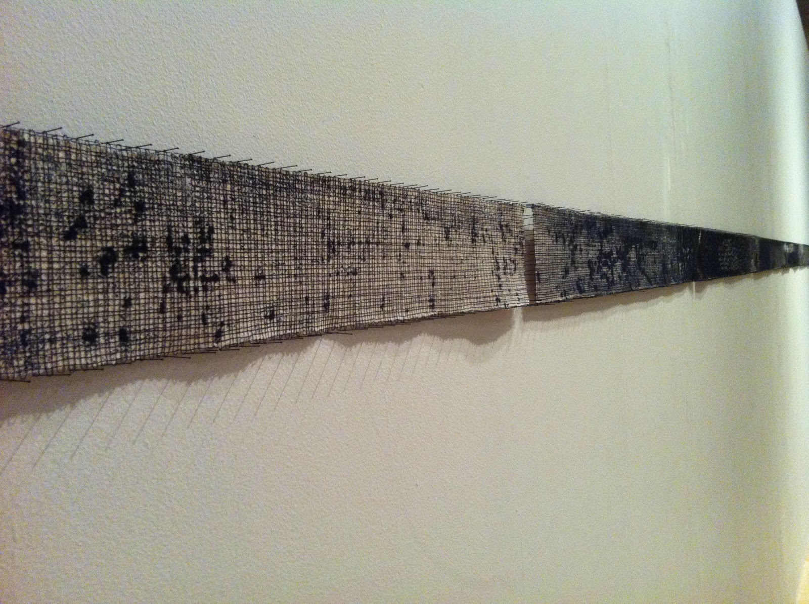
I also really liked the long this piece by Diana Harrison, called simply Line, made of carefully stitched black thread on simple trips of cotton cloth and paperer which had been painted and then torn or dissolved away.  Again 6 or 8 panels, but making a very long thin line. 


 The stitching was perfectly even, not easy to do on such a scale, and the random patterns of black and white gave it a huge amount of texture and depth.

Then there was Tanabata Lace, by Suzumi Noda, made from black punch cards and black cotton thread, with complex knotting to bing them together into a huge set of panels.  


I liked too the series of hanging panels called the Latticed Eye of Memory, by Liz Nilsson, which was made of printed and stitched and laser cut panels, each about a metre square.  


I liked the overall effect, but was intrigued to see that several of the panels have been printed with script, or something like script, and this was related to my own work on 'not-writing' and the thoughts I've had so far about my final project, on deconstructing words and writing.  

Tarmar Frank's installation, A Thin Line between Space and Matter, was really lovely.  It developed form the string patterns we probably all made in maths lessons at school, but turned into a 3D version, on a grans scale, and then added intriguing lighting effects, so you saw the shapes made by the string has white lines in a totally dark room.  Very effective, and so good to take something we have all seen in a 2D way, and made it into something far more complex and interesting .


Chiaru Shiota's installation was also on a grand scale, consisting of 5 unrealistically long plain white cotton dresses, hung high in a room,  which was then almost completely filled with a caplet web of balck woollen thread, so that the dresses could hardly be seen.  I t reminded me of the Sleeping Beauty and the thick hedge protecting her from rescue.  there was a helpful film showing in time lapse photos how the piece had been made, using ladders, and scaffolding, and several people tying lots and lots of knots.


I liked, too, the simple but effective piece by Katharina Hinsberg, Perceids, which was a simple lacy pattern made by the incredibly simple method of drilling lots of holes in a piece of white-painted board.  


And Michael Brennan-Wood's Lace the Final Frontier, which was made of red-painted wood, cut into intricate patterns which at first sight looked a little like the paper snowflakes people make at Christmas, but on closer inspection you realise that the shapes in the patterns are military objects, like guns and tanks and aeroplanes and soldiers.  


Interestingly,  this was the only piece in the shoe show which was not monochrome black and white.   The red perhaps signifying the red of Mars, god of war, or the blood of the battlefield.  Whatever, it stood out among the mostly white and black of all the other pieces.  The works were all commissioned especiaially for the exhibition, so this black and white colour theme may have been one of the conditions set by the gallery.

The overall effect of the show was impressive, a fresh look at the idea of lace, of the holes and negative shapes within a space, at the scope for sculptural forms made largely of wool or cotton threads, and of the inventiveness of modern textile artists.  This was especially pertinent for me while I'm thinking about my next project and the idea of hanging or suspending or weaving together somehow my deconstructed writing.  Also, I had been looking at images of modern japanese and scandinavian textile artists last week, some of whom featured in the show.