Sunday, 15 January 2012

When text looks like text but isn't

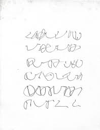
I spent a happy hour or two this afternoon drawing a whole series of pages of script which wasn't rally script, but looked vaguely like some unknown foreign script, as part of the work for my pathway project on writing.  I had seen some work by Brazilian artist Leon Ferrari, and that had inspired me.  I am planning to turn my drawings into silk screens and print the out, including onto fabric, o I can then stitch into and over the "text".

This is what some of my pages look like at present.


But I've just come across a web-reference (the link is here) to something called Asemic Writing - i.e. writing which sin't real text, but i entirely made-up, like the work I've jut done.    Like this (from here) :

Oh goodness me!  There are whole magazines (on line, anyway) about this kind of thing.  How weird is this?  And I have to admit it is fun to do - as others have found too - "Oh Boy, I am smitten!" says this one, whose work includes this beautiful piece


Another South American, Mirtha Dermisache, from Argentina, has been producing astonishingly beautiful, I think, asemic writings and drawings since the 1970s.  Here are a few of her images


 More images of her work on Flikr here.


 One thing leads to another: asemic writing takes me inexorably towards Concrete Poetry, the kind of poetry where the visual shape of the words is at least as important as the meaning, maybe the visual actually enriches or illustrates the meaning, or maybe the visual is the point, and the meaning or any words  used doesn't much matter.   A useful definition and some examples of different types of concrete poetry are  on Infinity's Kitchen blog here which includes this succinct exemplar:

lesabres in unlesbares ubersetzen by Claus Bremer (1963). Translated from German.

But people have been doing this, i.e. playing around with text and images, for a very long time.  This was done by Simmias of Rhodes, a 4th Century BC poet and scholar.  It is called Hacha and is about a double-header axe, which is the image produced by his arrangement of the words.


Design I like: typography

On my continuing searches into typography and writing I came across some wonderful typefaces and poster etc designs using strange and wonderful type. I particularly liked these two.


This one is called "The Best Time of my Life"


Both these images were copied from this site.

Saturday, 14 January 2012


A reference today by a British quilt maker, Margaret Cooter (in her tremendously informative blog, to be found at http://margaret-cooter.blogspot.com/) sent me looking for the work of Dutch textile artist Marian Bijlunga (website here), who has done amazing work with horsehair and fish scales and fine cotton thread.  But what interested me was her work with seed pods and grasses, to create collages which look like beautiful but entirely unreadable script.   I found the following images of some of her work on her  flickr site through the link here.   All images are her copyright.


In an interview published in FibreArts Magazine in 2003 (the link is here) Marian Biljenga said

"I see my work as drawing," says Bijlenga. "I like patterns, and when you work with lines and dots, you see lines and dots everywhere." While her early work often alluded to alphabets and calligraphy, she now takes her inspiration from nature: white fungal dots on tree trunks, the curve of eucalyptus leaves, swirling water eddies. She also recently completed a series of portraits, a departure from her usual abstractions.


Biljenga's calligraphic work is very compelling.  It exploits the pattern of elegant script through the not-quite-regular patterns of natural forms, arranged in a way which tricks the eye into thinking it is seeing script, because of the regularity of the patterning - and our awareness of many types of writing from different languages and cultures around the world.  Presenting her collages rather like calligraphy, with margins and lines and borders, adds to this illusion.  


Her work fits very closely with my own thinking about my current Pathway Project on writing - where I have been working away from legible, accessible, meaningful text, towards the shapes and patterns which suggest - but do not ctually represent - meaningful handwriting.


Wednesday, 11 January 2012

More art I like: Leon Ferrari

Another Brazilian artist using words and writing is Leon Ferrari who has exhibited alongside Mira Schendel in a show called Tangeled Alphabets at MoMA New York in 2009.   Like Schendel, Ferrari also uses script repetitively, and it is not very clear whether his script actually mens anything, or whether he just likes the flowing patterns of the words.  Some of his works overtly political, either about human rights or about sexuality, but some is more concerned with the writing as form and pattern.

Here are some of the images of his work which I found and particularly liked.


More about him on the MoMA website here.  Images copied form MoMA and google image search.

Art I like Mira Schendel

Still thinking about my Writing. Word project, I have come across two Brazilian artists who work with words.  One is Mira Schendel, who was born in Switzerland in 1919 but moved to Brazil in 1946.

She did a lot of works on paper, either drawn or using Letraset (can you still even get Letraset?) to make images and installations which challenge the viewer to see the random-ness and lack of menacing in words, as well as their value.

Pieces I have seen and particularly like include this one in the Museum of Fine Arts, Houston (the link is here) Houston


MIRA SCHENDEL 
Brazilian, 1919 - 1988 
Variantes 
Variants
1977 
93 monotypes 
Variable dimensions
 
The Museum of Fine Arts, Houston 
Museum purchase with funds provided by the
Caroline Wiess Law Accessions Endowment Fund
Arts of Mexico, Central and South America, the Caribbean 
 
ABOUT
This work was discovered after Mira Schendel's death by her daughter. Comprised of 92 white-on-white monotypes and one black monotype, the installation is the culmination of Schendel's graphic objects series that launched her international career in 1964. The monotype technique she used consisted of spreading the paper over a smooth surface covered with paint and marking it on the back with some type of instrument. The sheets were then grouped, pressed between two sheets of acrylic, and suspended in order to be viewed from both sides. Although suggestive of writing, they are not intended to be read but rather experienced as texture and light.
Schendel also did a lot of drawings which are based on writing, although it isn't clear whether the writing has any particular textural meaning.  Sometimes the writing is overlaid, layer upon layer, 


Some are hand drawn, like this one,  and repeat over and over a handful of letters, in different typefaces or different kinds of handwriting.
Some of her letraset and typescript drawings are very formal and geometric, like this one Dactiloscito, 1976, 

I really like the way in which Mira Schendel's work veers between the typographical and purely abstract mark-making and drawing.  I like the use of layers, and the idea of writing one r and over, filling the space with a big noise of the words and letters.  This reminds me a bit of the overlaid photographic images of text done by Idris Khan


Tuesday, 10 January 2012

Art History: What makes for good design? 10th January

Today at college we talked about the elements of good design, and looked a t a diverse range of things we had brought in, to demonstrate.  The things ranged form a battery-powered tiny toy cockroach which ran endlessness around the floor, through various pencil sharpeners (Jo brought one which was shaped like a cat with its tail in the air, you put the pencil into its red end, and the shavings come out into a sort of litter tray: ingenious, but not really 'good' design).  James brought a Spong Mincer - Victorian engineering and kitchen usefulness at its best - and a really useless gadget for cutting the tops off boiled eggs.  There was an embossed book cover, newly commissioned for Penguin Books, and a digital camera which looked very like a film-based one.  I took in a red plastic ashtray which came from Habitat which I had discovered, only last week, had been designed by Alan Fletcher


Here are some other die sings by Alan Fletcher.  he designed a huge number of logos and things which have become widely recognised and familiar.
Many more images on the web and in particular on his website here.


Then we looked at excerpts from a video called Objectified, with interesting ideas about design form a range of good people, including Dieter Rams, who was a big wheel in Braun until he retired, who had a long list of criteria for good design: 
  • it should be innovative, 
  • useful, 
  • should improve our experience (of doing whatever it's designed to do), 
  • aesthetically pleasing, 
  • understandable (i.e. you shouldn't need a hefty manual to work out how to use the thing), 
  • honest (i.e. simple, plain, direct). 
  • unobtrusive, 
  • long-lived, 
  • consistent in every detail (i.e. the tiniest parts should be as well designed as the whole, the inside as well as the outside), 
  • environmentally friendly, 
  • compact, 
  • as little designed as possible - i.e. it should be discreet, it shouldn't shout 'look at me, how clever I am' it should just do the job really well so we think, "how good is that?"
The video also included an interview with Jonathan Ive, head designer at Apple, and the good design which makes i-phones etc so desirable, and that people are prepared to pay over the odds for good design which is also somehow tactile and makes you want to hold it and play with it - and therefore also buy it and use it.

There's a trailer on You Tube which you can access here and there are various clips form the film on You Tube too, plus other bits of film with Dieter Rams and Jonathan Ive