Tuesday, 23 April 2013

BABE Bristol Artists Books Event, April 2013

BABE happens every other year, at the Arnolfini Gallery on Bristol's Harbourside, in conjunction with the Centre for Book Arts at UWE. Two year ago I visited BABE for the first time and was entranced, and this year I was there as part of the UWE Artists' Books Club, and had two of my books on show on our stand.


I had two books on show.  the first, A Book of Letters, was inspired by discovering A Letter A week in late 2012.  I made 26 letter, each contained in an origami-folded "envelope", bound together with Coptic stitch.


The second book is Exhibition,  which I made from copies of the quarterly publication Art, from the Royal West of England Academy in Bristol.  The pages are 3" square, and I used all 4 editions of Art for 2011, so representing a whole year's worth of gallery visits and exhibitions.  The coptic-bound book became quite long - roughly 14 inches - and I made a horse-shoe shaped box, approx 6'"x 8", to contain it.  The box is covered with torn pieces of the same gallery newsletter.  The book is invitingly tactile and playful - rather like a child's 'slinky" toy which tumbles down stairs.   The structure of the book plays with the ways in which we view gallery exhibitions, twisting and turning, glancing at some things, stopping to really look at others.  As you turn the book, random images catch the eye, while others are just a passing flicker of colour.


The


Relief Printing

I've started an 8 week course on relief printing at Spike Print. My first effort, today, is work in progress.

Friday, 8 February 2013

ALAW 2013 - the best laid plans....


After my enthusiastic start, I have found it difficult to find time to co-ordinate making Illustrator files and booking time in the laser cutting suite at UWE.  Once I got my session, it took a lot of time to re-jig my Illustrator files and set up the machine, so that I wasn't able to cut as many letters as planned.  However, I did get some results - two sheets of italic letters, cut and etched into thinnish black/white board, and a second set etched into rather thick grey-board.


 I haven't yet had time to try printing with these.  And I have realised that the etched versions will be no use for intaglio printing, as they will come out in reverse - so I need to re-do the Illustrator files for these with reversed images.  Which may all take some time, and more booking of the laser suite.

Friday, 25 January 2013

A Letter a Week 2013: beginning...

Some time last year I came across the blog A Letter a Week 2010 (the link is here ALAW 2010).  It is a great idea - each contributing artist commits to producing two complete alphabets during the year - 52 letters, one each week - constrained by a maximum size of 7cm square, but using any medium.  Each year  one of the alphabets has been related to a given theme and the second can be anything the artists choose.   Each alphabet should be brought together at the end in some way - perhaps as a small book, or held together in a special box, or in some other format.  There are some absolutely lovely creations, and I found myself really drawn to the idea. 

During the autumn of 2012, I had a go at making some alphabets of my own  (see earlier post  here Letters and Books.  I enjoyed the challenge of the small size and finding ways to keep the idea interesting and producing something complete at the end.  26 letters is quite a lot so it's important to choose something which will be interesting enough for a whole 6 month project: should they all be in the same format, or linked in some way, e.g. by colour, or, or ...

So when the call came for members ready to join for challenge in 2013, I took a deep breath and signed up.   And then panicked!  I am very new to making my own art, and this challenge is very public and therefore very scary.   Some of this year's contributors have already posted their first letters and seemed to be able to plunge in quickly.  For 2013 one of the alphabets is to be on the theme of "Peace" and the other can be whatever you want.   have been pondering quietly about how best to integrate my ALAW alphabets into my work as a printmaking student.

My printmaking course (MA Multidisciplinary Printmaking at the University of the West of England, Bristol) started in October 2012 and the first module has been a series of workshops to introduce us all to a range of printmaking methods as the basis for developing our individual work over the rest of the 3-year course.  In spite of getting a place on the MA course, I actually have very little experience in print-making, so each workshop has been a real adventure for me.  We have experimented with etching, screen printing on paper and textiles, plate lithography, monoprint and relief printing with both lino and collagraph plates, and letterpress.  What a treasure house of possibilities!   We have also had workshops on  book-binding and enamelling, and had introductions to digital photography and printing onto ceramics.  

We have tried laser cutting using images prepared in Adobe Illustrator, which is just fantastic.  I imagined that laser cutting would merely give you interestingly shaped pieces of wood (or card, plastic, perspex, lino, leather, fabric, whatever - but not metal).   What I did not know until now is that you can also set the laser to burn into the material, but not to cut right through it, and also you can take out broad areas of the surface, not just a drawn line.  And  this allows you to make plates for intaglio or relief printing.  

This is the first simple piece I designed and cut.  The piece on the right is an etched version, which should be useable as a printing plate using an etching press.
I have been buzzing about this ever since the workshop, but haven't been clear how I could use it.  

This week I have also discovered that you can create a computer font made from your own handwriting:  I used an i-pad app called i-font maker (the link is here 2ttf ).  My first attempt looks something like this...but the possibilities are endless


So suddenly I found I had an idea for my first ALAW 2013 alphabet:  I have created a personal font (actually, several - it is quite addictive once you start) and will use this to create files for laser cutting, and use the results to make prints.  

Today, after quite a lot of struggle to get the hang of Adobe Illustrator, I made files for letters a,b,c and d, in both upper and lower case, and in two different formats for each letter: one will etch the outline of each letter, and the second will cut out the shape of each one (which of course also gives you the negative shape left behind).   Time was against me but I did manage to get two samples cut - one etched and one cut-out, using some scrap grey-board.


I plan to play with these over the next few days before getting further letters cut at college next week.  

My plan is to use these in various forms of printing - I will cut some of the letters in lino and some in card for use as relief prints.  For some, I may be able to use the cut-out shapes for embossing.  Some I plan to etch into perspex to use as intaglio plates through the etching press.  Some I can print onto paper of various kinds, and some may be on fabric.  Some letter shapes may work better in some kinds of print than in others.  

I may decide that one method works particularly well, and stick to that for the entire alphabet.   I do need to think about the overall coherence of the set, so some of my experimenting may not see realisation in the final set of letters.   There is also a choice to make about whether to use all upper or lower case, or whether to stick to one uniform alphabet throughout, or whether to mix and match between several fonts.  I am clear that I will only use fonts which I have created myself.  

I hope that this project will serve several purposes: first and foremost, it will be my first set of letters for ALAW 2013.  But it also allows me to experiment with lots of different approaches to print using simple letter forms, it will get me familiar with creating Illustrator files and using different materials for laser etching and/or cutting, and will also challenge me to find a good way of bringing all the letters together, in a book-form or otherwise, when all 26 letters are complete.

I think this is going to be a great project for the next few months, and the fact that it is going to be very public, via the ALAW 2013 blog, adds to the sense of excitement.  

Friday, 14 December 2012

Tuesday, 11 December 2012

A set of tiny books

More tiny books, each one 4" x 1.5" and tied with snippets of ribbon, folded using my 'writing/not-writing' marks, and huddled together into a custom-made box.


Tuesday, 4 December 2012

Stars and stripes

Playing with folded paper again, making circles and stars.


Saturday, 1 December 2012

More folded books

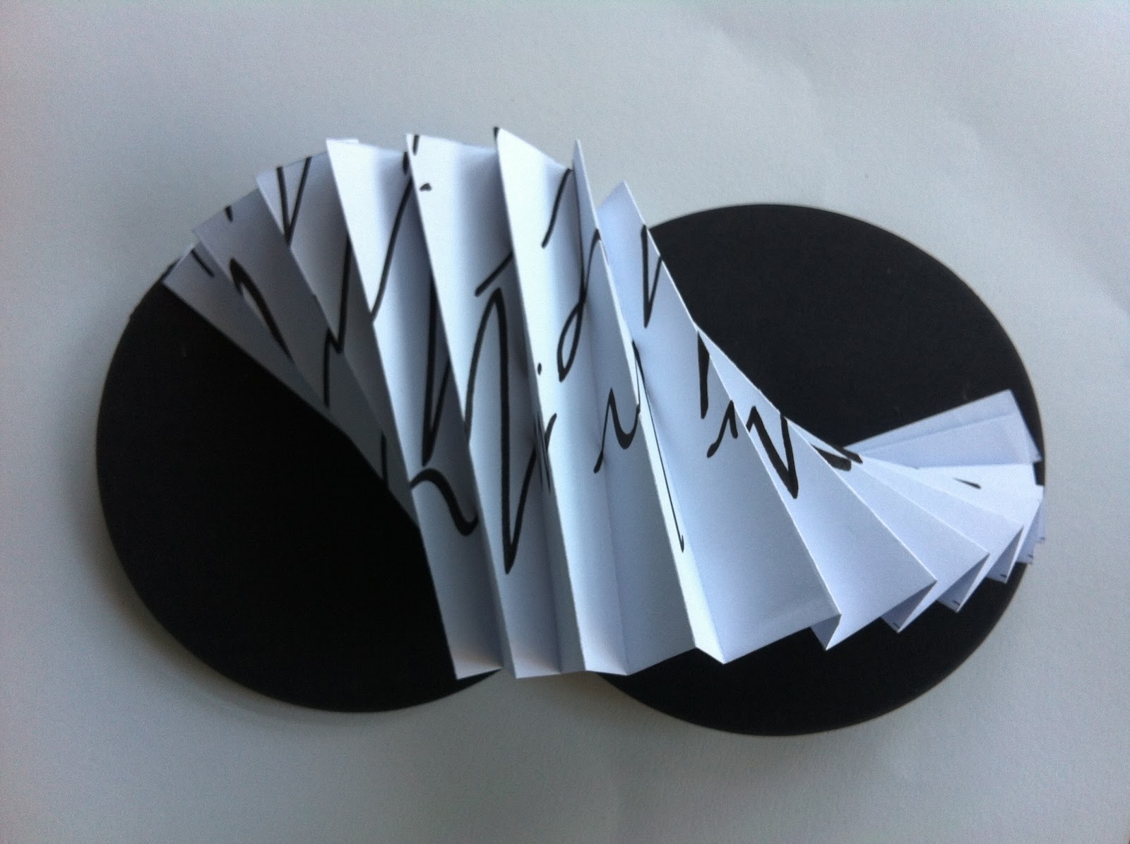
As part of my "Writing/Not-Writing" project earlier this yrar I made a large number of A2 drawings of "not-writing", and realised that these mark woudl make interesting matrrial for folded books.  The concept of an artist's book implies the potential for books to be thing which can be enjoyed as pieces of art in themselves, without the more common assumption that books are places for recording words, information, ideas, which are based on written or printed script which can be read.  An artist's book does not demand to be read, but rather to be looked at, handled, turned over and experienced.  Using marks which resemble script, but which are in fact not organised writing at all, explores this idea and suggests to the viewer that the book is an artefact which holds the potential for word-based meaning which in this case is with-held.

My sheets of not-wriing were done on heavy-weight cartridge papaer which lends itself very well to making firm fold with an almost architectural quality: the fols are resilient and will stand up on their own: perfect for folded books.

I cut a number of 2" strips across my drawings and then folded each one in half, and then in half and in half again.  I then made further diagonal folds, bending these backwards and forwards in different ways.  I liked the sculptural qualities which they exposed, and found I was playing with them to make a variety of curved and convex shapes.  


making alphabet books

Over the past few weeks I have been experimenting with making small artists books,  building on some work I began last year during my Foundation course.  I've been lazy about recording things recently, so what follows is an attempt to catch up with the autumn's work.  First up, alphabet books.  

While pootling around looking at blogs a while ago I came across the web-site for a wonderful international blog called A Letter a Week and decided I would have a go at making some alphabets of my own.  The first one I attempted was entirely made up of letters cut from newspapers, both lower and upper case.  I mounted these on 3" square sheets of cartridge paper, and then mounted these, in turn, onto larger squares of black paper, folded and creased .  I glued each folded letter sheet to the next, creating a 26-section folded book.  It does not photograph very well, and is easiest to see when you can pick it up and flip through the sections.  Not very special, but a good way to get my book-making juices running again after a gap of almost a year. 


My second alphabet consists of 26 3" square sheets on which I have created images of the 26 capital letters, drawn in sepia or black dots.  These are held in a coptic-bound book, each signature being a single origami-folded envelope, just big enough to hold one of the dotty letters.  I rather like this one, my Book of Letters, because of the pun on "letters" and "envelopes".  It is a better size and scale than the first book, and is nice to handle.  You have to pull out the individual letters to see them properly, but there are hints of each one showing through the open top triangle of each envelope.


Thirdly, I decided to mount the letterpress alphabet book which I had printed during a Letterpress course at UWE in July 2011.  This was a mammoth typesetting and measuring exercise, done on the last afternoon of the course, and almost abandoned because of lack of time. Thanks to Angie Butler, we got the type set up and printed, but apart from cutting the finished printed sheets into strips, I had not, until now, worked them into book format.

The result, now, is a very simple folded accordian book of all 26 letter prints (each one using an upper and lower case example of each letter).  I had intended, when i made the original print, to do 26 accompanying small drawings (or possibly rubber-stamp prints) of simple images to illustrate each of the letters, but so far this is still just an idea).