Showing posts with label painting. Show all posts

Saturday, 25 February 2012

David Hockney at the RA

To London, with friend Sylvie, to see the David Hockney show at the Royal Academy, The RA website with info about the show is here. Glad we had pre-booked timed tickets, as there was quite a long queue in the courtyard, all advance tickets having been sold ages ago.  There were an awful lot of people there,  although the crowd spread out a little after the first room.

The majority of the works on show are his recent large landscape paintings, done in Yorkshire in the last few years, and done on a grand scale using a large number of separate but joined smaller canvases and lots of strong colours.  Many have been painted from memory in the studio, although Hockney also uses photographs a lot, and he also does a lot of pointing in situ.  Some of the works were lovely, but some looked rather formulaic, a bit child-like even, although I admired the sheer scale of the big landscapes, they capture expansive vistas of the English countryside,


the rolling hills and hedges, and - in spring and summer, anyway - the strong colours.   The paintings of the lane near Woldgate Woods were lovely, depicting the changing seasons. and had a lyrical quality in the grandeur of the trees and the perspective of the receding track disappearing into the vanishing point at the end of the lane.  Lovely.


His big landscapes also showed off his painting technique - almost like the pointtiliste impressionists - lots of  small lines and marks, using bold and unexpected colours - blue in the grass, red in the green of the trees, purple in a tree stump.  The build-up of make-making conveyed depth and town and the changing light.  Vaguely reminiscent of Van Gogh in places - his fields not unlike the fields in Van Gogh's paintings at Arles.


I liked the much-vaunted paintings of trees and cut timber rather less,  possibly because they seemed less subtle, rather coarsely executed.  Indeed, the quality of the pairing itself was not always very good - you can see the bare canvas underneath in many places, the paint is almost thrown onto the canvas, all a little slap-dash and hurried.  

While the colours in these pairings are stunning,  the heavy outlined shapes, and the stylised leaves and grasses, reminded me of cartoon images in kids picture books rather than observed landscape, and i was not sure what Hockney was trying to convey by them.


However,  the series of paintings of three magnificent trees in a field,  Thixendale Trees, seen at different seasons through the year, were stunning.  I also very much liked the charcoal drawing of these trees, from which the pairings were done.


There were a few earlier works, including Mulholland Drive: The road to the Studio (1980)  (we lived with a very nice print of this for some years, courtesy of Ken, so I thought how nice it was to see the original).


 Except, hey, what's this?  It wasn't the original  painting after all,  but a 'photographic reproduction".  Now, that seems a very poor show, to me.   Couldn't they have persuaded the Los Angeles gallery to let them borrow the real thing?  Or if not, why not show a different real painting,  if not this iconic one, from the Californian landscape series?  This seemed to me to be a bit of a cheat.

There is a video on the RA website in which he discussed his huge painting, A Closer Grand Canyon,  (which is in the RA show, and has the most amazing colours, especially strong reds) ) and which was done on a large number of smaller, roughly 2' x 3' canvasses, all hung together to make a single picture..  He explained that the Mulholland Drive painting was done in acrylic on a single canvas, and it is absolutely huge and therefore very difficult to move - and the LA gallery wouldn't agree to move it because of the risk of damage.  So that explained the photographic reproduction - but it's a pity the gallery notes in the RA show didn't explain the reasons why.

However, they did have the original of Nichols Canyon, also 1980, which was terrific, and similar in style and colours to the Mulholland Drive  original.


I did like very much the i-pad drawings, of which about 50 had been enlarged and printed on A2 sheets. Presented this way the wonderful use of line and colour really shows up well.
 I-pad drawing No 2 from David Hockney's The Arrival of Spring in Woldgate, East Yorkshire 2011
Image copied from The Guardian website here.


 A whole room full of them  hung three rows high, was also quite startling.  There was quite a lot of repetition in the subject matter of these drawings, but somehow this was less troublesome (to me, the viewer) in the i-pad drawings than in the bigger tree paintings.

Then there was a room with 6 cabinets containing some of his sketchbooks, and cleverly-mounted screens above each one showing a looped sequence of images of each of the sketch-book pages. These were truly inspiring for me.  His drawings are generally lovely - simple, clear, lots of pen and ink, and lots of watercolour.  He uses books of varying sizes, and seemed frequently to fill a book in a single day.  Some of the pages showed that even Hockney can make a mess of a drawing sometimes!  Some of the pages had very little, a few smile lines, the idea of a drawing rather than a finished sketch.  Others were very detailed, with heavily worked sketches covering a double page.   I learned a lot from these, about his process and about simply getting on with doing the drawing, and not worrying too much about composition or subject matter.  Some of the pages were very hum-drum domestic subjects, the breakfast things on the table, a plate or a book.  Drawing every day is the thing.

This he now does increasingly on his i-pad rather than in a sketch book, and there were a fair number of small i-pad images too.  And then some, drawn in Yosemite National Park in the US, which had been magnified and enlarged massively - to fill a whole wall in the fnal room.  You would expect them to lose their impact when enlarged so very far - but somehow they were enhanced, and the quality of the print, and the coverage of the colour, was fantastic.

I think I liked these best of all, after the sketchbooks.

Finally there was a room showing some of his videos made with 18 adjacent but slightly mis-aligned cameras.   The idea was, I think, to replicate the way the human eye looks at lots of separate images simultaneously and somehow magically joins them up to crate a single image.  But our eyes are flitting boat all the time, and our perspective changes constantly as we move our heads.  The video images attempt to copy this sense of movement and overlapping images.  Some of the film sequences were just of hedges or trees, with leaves waving in the wind.  The nicest, I thought, were the ones of dancers, which had clearly been great fun for those involved too.

Overall, I enjoyed the exhibition but I felt that Hockney's landscape work, while impressive in many ways, had been a bit over-hyped. And the RA was no doubt making a fortune from the crowds, the books, the merchandising, etc.  I would have preferred to see more of a retrospective covering a wider range of Hockney's work, rather than concentrating so much space and energy on a very specific period and style of his work.  But perhaps that will be coming at a future date.

Monday, 23 January 2012

College 23rd january: pathway project

Today I took advantage of an almost empty room 04 to do some more 'writing' on a large scale.

I taped up sheets of A2 black paper onto the wall, and see white acrylic, watered down quite a bit, to make some big 'script' paintings, working vertically on the wall, and allowing the paint to drip a little.  I did two large pieces: this squarish one....


and this one, rather longer and thinner....


And some separate sheets (partly done as warm-up exercises: it takes a little time to 'get my hand in' to the non-writing script each time).


I liked the results, and got some very positive feedback from other people, including Matt who made a point of seeking me out to tell me, which was kind of him.

One of the interesting things which is emerging is that my 'writing' is acquiring a consistent style and form, all of its own.  My earlier drawings were each one different - perhaps because I was consciously trying to 'design' different script styles.  But as I've grown more familiar with the process, and more confident, I am thinking less, and loosening control, and the result is a flowing script-like, rhythmic line which is not at all like my 'real' handwriting.

Psychologists could no doubt have a field-day with that.....

I also had another useful tutorial with Mark, who had even more suggestions about other artists who I could look up - if I have time.  And a stern reminder about getting my essay done.  Oh dear:  where have my time management skills gone?

Sunday, 22 January 2012

Writing and Painting

I've been working towards doing something on a bigger scale for my writing project, and today I suddenly realised that I had the perfect space to do this at home - on the bit of 'temporary wall' which is soon to be transformed into large folding glass doors to the garden.

I found I had about half a roll of decorators' lining paper.   I taped two pieces (using up all I had) onto the wall and then did some script writing using a diluted acrylic and a largish brush.  The process itself was both fun and liberating, and the resulting images looked good.    


I rushed off to buy another roll, and used this to cover the entire space, which is about 7'6" square.  It took a bit of patience to get the papers all taped up and together,  but was worth it for the exhilaration of doing the painting, using two chairs to stand on, and stepping from one to the other so that I could travel right across the 'canvas', working from one side to the other and back again, painting as I went.  Great fun!


I very much liked the results.  I don't quite know how or if I can transport them to college for the assessment session next week, but I will have a good try.


Friday, 11 November 2011

Art I Like: Gerhard Richter

I have been thinking more about the subject of my art history essay, and begun looking seriously at information about modern colourist painters.  And where better to start than with Gerhard richter, not least because there is a major retrospective exhibition of his work on at Tate Modern at present (until January 2012) which I really want to go and sees.  There is a film on Tate Channel of Richter talking to Nicholas Serota, Tate Director, about the show, and some film of him at work on his big abstract colour paintings, and about the business of selecting, designing and installing the exhibition itself.

The link is here Gerhard Richter Panorama film on Tate Channel

What I found particularly interesting was his very calm and almost casual approach to his work, there is no urgency, no hurry, paintings can take him weeks or even months to do.  Serota asked him "how do you know when an abstract painting is finished?" and Richter replied "I don't know, I just know, suddenly, that there is nothing more to be added, and it is done".  


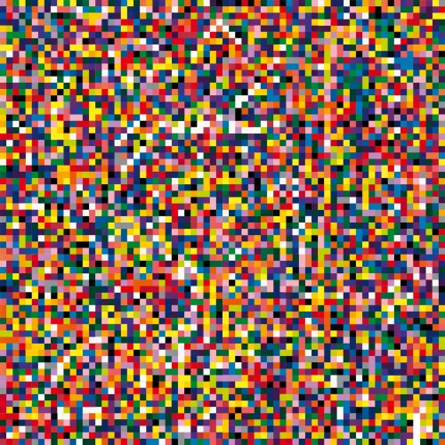
I really like Richter's colour series, simple blocks and stripes of colour.  I especially warm to his huge canvasses covered with small squares of colour, some of them like a decorator's colour card, the bigger ones more like postage stamp quilts.   These remind me of so many of my own quilt designs.  The selection of put bright and random colours, and the vibrant effect that can come from their placement in huge numbers, is compelling and also endlessly interesting.


This is a rather nice portrait of Richter from The Guardian Arts Blog....

Gerhard Richter, whose work will be featured in a forthcoming Tate Modern exhibition, pictured with 4900 Colours: Version II. Photograph: Graeme Robertson, copied from the Guardian Blog, 7th Sept 2011

Monday, 17 October 2011

College week 7/1 Odds and ends day 17th October

Today we had a muddled old day of bits and pieces, in theory time to catch up on this term's workshops in preparation for the next appraisal session after half term, but in practice, for me anyway, it turned out to be a bit of a wasted day.

We had the option of three short workshops: textiles (unspecified) with Teresa; oil painting with Mark; and how to stretch a canvas with Jan.  Or doing your own thing...  I hadn't really thought about how best to use the time, and was unable to join the textiles group (which was learning to use dissolvable fabric for machine embroidery) because there are only 5 sewing machines and I was slow to get down to the workshop room.

So I did Mark's oil painting workshop, which was interesting because I'd never touched oil paints before, but also unsatisfactory because I had not expected to be painting and had no images in my head.  I played around with missing paint with varying amounts of linseed oil and other flow enhancer, and covered 6 small 6x6" boards.

I quite liked the results, but the day itself felt a little aimless, and I doubt I shall use oils again - not least because of the costs and the fuss and the smells, etc,etc.   Other people, however, were very enthusiastic and some nice pieces were emerging.  Here are there rather pathetic results of today's efforts.


We were also supposed to have one-on-one tutorials with Mark but I missed the signing up process and decided my mood was not conducive to hanging around until 4.00 or later  - so I grumbled a bit to Harriet and Jo and took myself off for an early finish, promising to talk to Mark tomorrow on the trip to Oxford.