Sunday, 15 December 2013

Second ALAW 2013 alphabet completed

The laser-cut versions of my personal hand-written true-type font produced a set of cut-out letters, all in 3mm thick card, in both upper and lower case.  I decided to use the upper-case set for my second alphabet.

In this case, I simply mounted the individual letters on folded heavy-weight cartridge paper, which i had previously cut and folded and assembled into a 26 sheet concertina book, which fits into another simple box.  Like my peace alphabet, these have also been sitting waiting for me to find the time to mount and finish them for some long time.

I realise that I have cheated rather on the concept of posting one letter each week.  That had been my firm intent, but life has been getting in the way, and while my conscience has been badgering me regularly to post them and to put them together into a book, I haven't been good at keeping to schedule.

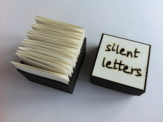
Anyway, the letters are made, the book is assembled, a box has been constructed, and - because I dare not risk further prevarication and delay - here they all are.   I have called them 'silent letters' - but it's a misnomer because, in comparison to my abc for peace, these positively shout out loud:  they are capitals, they are in black on white, they stand proud of their mounting concertina, and they demand to be taken notice of.


Because the profile of each letter has come from my original handwritten script, in normal hand-writing size, the enlargement to 220 point reveals interesting details in the shape of the line in each letter.  So the profile has peculiar irregularities, dips and bends, which show up particularly well in these raised, cut-outs.  Here are two good ones - Q and F.


The finished book is 7mm or 3" square and just fits neatly into a slightly larger custon-made box.


I have been a laggardly contributor to ALAW 2013, because, like all of us I guess, lots of other things have demanded my time and attention during the year.  However,  I have enjoyed having this project at the back of my mind during other distractions, and I feel I have, latterly anyway, got back my initial excitement about the whole idea of creating unique alphabets in this forum.  So I hope to be able to carry on into ALAW 2014, but with a firm resolution to make my pieces in proper time and order, and to keep up with regular, if not weekly, postings to the blog.

I've also, as in previous years, much enjoyed seeing other people's work as it has emerged, and am intrigued by your ingenuity and creativity in finding so many ways to present and interpret such familiar but fantastic symbols.

Peace alphabet - finished at last

Actually, the 26 letters for my peace alphabet were finished months ago, but the task of assembling them into a book/object has been loitering in the margins of my time/place/consciousness.  And with the end of the year in sight, and amid all the hustle and bustle of the holiday season, somehow my letters emerged at the top of my 'to-do' list this weekend.  Possibly as a displacement activity (I am always the last person to the post box with my Christmas cards) but who cares?  They are done, so here's the result.


I showed the individual letters up to 't', I think, back in July.  To re-cap - my letters are based on a hand-written alphabet which was turned into a true-type font via www.yourfonts.com.  I used this, at 220 point size which fit pretty well into the 7cm squares for ALAW, to create a file in InDesign which was then laser-cut  on 3mm thick card, providing me with relief shapes for embossing onto Somerset print-making paper.  The embossing shows the slightly brown edges which come from the laser-cutting process.


I trimmed the individual letters a little, and then mounted them onto cartridge paper to make a  concertina-fold book.  The end boards were also laser-cut, using the same personalised font, but in 18 point.  They are housed in a simple box from 3mm black board, with a white version of the title mounted on the top section.


I was very pleased with the font itself, and have been using it for various documents produced on my computer.  It feels good to be able to print things out in something approaching my own handwriting. However, the font isn't transferable on documents I send to other people's computers, unless I also send them the ttf. file.  

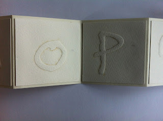
Blown up to 220 point, the hand-written nature of the letters becomes more obvious and more interesting:  every little wobble of the original line shows up and gives unusual edges and twists to the main letter strokes.  This shows up well, for example, on the letters 'o' and 'p' .


At the start of the year I was struggling a little to think what I would do for my abc for peace.  But these embossed letters have solved the problem.   They speak of peace, to me, because they are quiet, in the sense that they are all in lower case (no e-mail 'shouting' here!), they are embossed - so you can feel them rather than 'say' them, there is no colour contrast, but the slightly smoky edges give a hint of the violence of the laser which produced them.