Monday, 31 October 2011

College week 8/1 31st October Art History

Today's topic was 'Using People" and majored on the work of photographer Annie Leibovitz (b 1949, Connecticut, USA).  Art college trained, her work is carefully composed and thoughtful. She has worked in many spheres, including Rolling Stone magazine and lots of work with musicians, film stars and other celebrities.   Among her iconic images were some taken of Mick Jagger when she went on tour with the Rolling Stones in 1975.


 She also took a definitive photo of John Lennon, with Yoko Ono, only hours before Lennon was assassinated in New York in 1980, and which was used on the cover of the tribute edition of Rolling Stone magazine.


Some of her portraits refer back to previous painters, or to fairy tales or stories, even when the commissions are for fashion magazines or advertising.  Such as this 


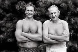
She also has a body of very personal photos of her family, here her brother and father.


and here of her partner Susan Sontag.  


She famously photographed the Queen in 2006 and was filmed doing so by the BBC, who also recorded the fact that the Queen was less than happy with the photography session.  The results, though, were magnificent portraits of the queen, combining the sort of stately dignities she might have wanted, with the kind of fairy-tale mists and mystery of some of her other work.


She didn't like being the subject of photographs herself, as in this wonderful portrait by John Keatley in which she seems to be hiding from the camera, using her hand to shield her face but also mimicking the position she adopts, looking at the subject?viewer through one eye, when she is working the shutter.


More about her work in a Guardian article here:
http://www.guardian.co.uk/artanddesign/jonathanjonesblog/2007/may/02/annieleibowitzoneofthemos

Saturday, 22 October 2011

Oxford Trip, 18th October

On Tuesday our Foundation class went on a trip to Oxford, to look at galleries, museums,  buildings, and to draw, whatever.  For me it was something of a nostalgia trip.  I think my last visit to Oxford was in about 1972 when I was a student and visiting quite regularly.  So it was nice to go back, especially on a beautiful crisp and sunny autumn day, and to find that the city and the university rally hasn't changed at all.  I wandered through Jericho and found old haunts, dissevered the Little Clarendon Street is no longer as quaint and pretty as it was, but that St Giles churchyard is as lovely and peaceful as ever, despite begin surrounded by main roads.  Lots of bikes, of course, and lots of busy-looking students.  It is early in the new term, so there seemed to be a lot of young people surreptitiously consulting maps and directions, as of course were the tourists, although there weren't too many of those about.

First I went to the Natural History Museum, which has an impressive array of skeletons and fossils, from the tiny to the enormous.  


The building itself is a little like a miniature version of the London natural history Museum.  Amazing building, on a steel frame, rather like a London railway station, but the steels are all decorated, very William Morris...

Outside, there are dinosaur footprints in the grass, and huge tree roots brought from rain forests in South East Asia and similarly wild places.


You have to go through the Natural History Museum to reach the wonders of the Pitt Rivers collection, which was almost overwhelming in its range and diversity, and the sheer quantity of material it holds. All jumbled together in big glass cases, with labels apparently written in longhand in the 1870s, and not much sign of anything having changed or been added since about 1900.  I presume someone opens the cases and removes the dust form time to time, although even that seemed doubtful in some of them, where a layer of fine dust seemed to cling to every surface.

I had meant to draw, but in practice the lighting is very low, and the cases are so crammed with objects, and the overall effect is so clamourous, that I found I could not focus or concentrate. Among the things which particularly entranced me were the decorated earthenware pots

the stencils made from palm leaves


and the amazing ceremonial heads and masks.


So I went off in search of lunch, and found Blackwells bookshop on The Broad, where I rewarded myself with a very nice sandwich and some growing and only 3 small book purchases.  Blackwells is huge and worth a day in itself.

Suitable refreshed, I wandered on to the Ashmolean.  To my shame I never ventured inside when I was a student visitor (nor to Pitt Rivers, either).  The Ashmolean has undergone extensive recent alterations and extension, and ins now a beautifully light and airy gallery space, with a mixture of classical museum fare and a good collection of European and British art.  I did not have huge amount of time, so I concentrate on the lower ground floor (including textiles, writing implements) and the 20th century art on the top floor.  There is a room full of 20th century British painting - Spencer, Piper, Nicholson, etc, etc; and a room of mainly Pissarro and other Impressionists.   Absolutely lovely, and in a gallery full of natural light and space.  the contrast between the 'less is more' approach of the Ashomlean and the 'cram it all in' style of the Pttt Rivers was quite striking.  The Ashomlean won, hands down.

I spotted an interesting installation made by a collaboration of local school children - a kind of patchwork ceramic wall, made of a series of small tiles, each with a relief of a small object, toy, key, whatever.  It looked even better in real life....


I didn't get much drawing done, but I saw lots, and got a good feel for he range of objects and art available, and I shall go again, before long, under my own steam and take in slightly less scope but in more depth.  A very successful and stimulating day.

Friday, 21 October 2011

There is an interesting piece in the Guardian art blog today about the colour of the walls in art galleries, inspired by the re-opening of the Musee d'Orsay in Paris, which has painted its walls in deep shades like this:
Suit you? … French ministers inspect the Musée d’Orsay's new-look non-white walls. And some paintings. 
Photograph: Pierre Verdy/AFP/Getty Images, copied from The Guardian.

The link to the Guardian blog is here. 

Jonathan James argues, amongst other things, that painting gallery walls white , at least for pre-20th century art, is a bad thing but is done partly to save galleries the bother of choosing something else (and for purely practical and economic simplicity too, of course).

It's an interesting issue,  and applies also to the coloured mounts sometimes used around pictures or prints.  Changing the colour can completely change the overall look and relative impact of an image.  Soemthing to consider in mounting my own work, or in presenting a portfolio.  At home, all my walls are white, and I have always thought that this was the purest and simplest way to focus on the image, rather than its location and surroundings.  But perhaps I've got it worn.  Hmm.  Food for further thought.

Thursday, 20 October 2011

Art History: what is real?

There is an interesting piece in today's Guardian blog about the judgement, by the "experts" of the art world, that a previously unknown painting is thought now to be a genuine but previously unknown Velazquez.  This link will take you to the Guardian blog item.  And this to the original Guardian article.

The newly-discovered painting by Spanish artist Diego Rodriguez de Silva y Velazquez at Bonhams auction house in London, England. Photograph: Bonhams


Jonathan James, in his blog piece, talks about the extent to which ordinary art watchers have any, or sufficient, knowledge to engage in the debate - comparing it to the general wealth of opinion, held by lots of different kinds of people, about, say, Shakespeare.

But I think theres' another question here, too - that this painting is suddenly valued at over #3m, just because it can now be ascribed to Velzquez.  yesterday or lat year it was worth a fraction of that amount, and now it is worth a fortune.  But it is the same painting.   The "experts" can have a huge influence on art  prices, and markets, but it doesn't seem to me to change the quality of the painting itself.  if we liked it before, we should like it no more just because of it's authorship.  Or should we?

Monday, 17 October 2011

Life sometimes gets in the way

Today the  builders moved in and life will be chaotic for at least6 weeks while Duncan, Benjie and Leon do fantastic things to extend the kitchen at the back of my terraced house.  There will, in due course, be shiny new Aga (I am resisting all attempts to make me feel guilty about the gas consumption: I am frugal in most other methods of energy-consumption), and folding glass doors opening right across the back of the house onto my tiny but in due course beautifully ranged garden.  Can't wait, and Duncan promises it will be all done well before Christmas...but my timing is not wonderful as the weather promises to turn Nordic any day now.  However, Lizzie (daughter urgently sharing my house) and i have lots of experience of living with builders and their mess.  It will all be well worth it in the end.  And for the time being, there is no point worrying too much about cleaning the house.... and several good reasons to eat supper elsewhere.

College week 7/1 Odds and ends day 17th October

Today we had a muddled old day of bits and pieces, in theory time to catch up on this term's workshops in preparation for the next appraisal session after half term, but in practice, for me anyway, it turned out to be a bit of a wasted day.

We had the option of three short workshops: textiles (unspecified) with Teresa; oil painting with Mark; and how to stretch a canvas with Jan.  Or doing your own thing...  I hadn't really thought about how best to use the time, and was unable to join the textiles group (which was learning to use dissolvable fabric for machine embroidery) because there are only 5 sewing machines and I was slow to get down to the workshop room.

So I did Mark's oil painting workshop, which was interesting because I'd never touched oil paints before, but also unsatisfactory because I had not expected to be painting and had no images in my head.  I played around with missing paint with varying amounts of linseed oil and other flow enhancer, and covered 6 small 6x6" boards.

I quite liked the results, but the day itself felt a little aimless, and I doubt I shall use oils again - not least because of the costs and the fuss and the smells, etc,etc.   Other people, however, were very enthusiastic and some nice pieces were emerging.  Here are there rather pathetic results of today's efforts.


We were also supposed to have one-on-one tutorials with Mark but I missed the signing up process and decided my mood was not conducive to hanging around until 4.00 or later  - so I grumbled a bit to Harriet and Jo and took myself off for an early finish, promising to talk to Mark tomorrow on the trip to Oxford.

Tuesday, 11 October 2011

College week 6/3 Drawing 11th October

Today we had more drawing, tho time with Matt who had asked us yesterday to bring in 4 cardboard boxes.  No clues as to why we would use them for.  Largely because of the bother of lugging things to college (it is a 30 minute walk each way) I found various small boxes to take.
Matt's idea was that we should draw from observation some figurative work onto the surfaces of the boxes, using all sides.  Translating a 3d object into 2d drawing on a 3d object...especially he suggested we went outside and drew buildings, cars, whatever.
It was cold and grey and I decided to stay indoors.  I made 3 drawings.

(1) of one of the work tables in the room;


(2) of the room itself - which of course was "indside-out" when finished; and


(3) of a pair of scissors onto a tiny box which had originally held ink cartridges.


 It was a fun exercise in scale and relative sizes and shapes.


It also led to an interesting discussion about drawing and perspective and how we see things. and the view-point we use and often assume when we draw.

College week 6/2 10th October Alternative Printmaking

Today was a one-day workshop to explore various methods of transferring an image onto paper or fabric.  We had demonstrations of each method from Abi Nichols and then we were free to play around with them in any way we chose.  The methods started with the very simple:  tracing using typewriter carbon paper which I didn't bother to try, and I'm not sure this is what I would call "printmaking".  Next up in terms of complexity was Xerox transfer, using a recently printed photocopy, and lacing this face-down onto the receiving surface, soaking the photocopy paper in cellulose thinners, and burnishing with a spoon.  The images transferred tended to be blurry but attractively blurred or faded.  My efforts worked quite well on paper but less well on cotton fabric (which was very thick, much thicker than I would ever select for quilting or embroidery purposes).

The came Iron-on transfer, using purchased special sheets which can be put through a normal printer or photocopier, and then placed face-down onto the receiving fabric (no point in doing this onto paper) and ironed for 3 or 4 minutes with a hot iron.   The results in my case were virtually useless as the photo image which Abi had of mine was too small to be effective.  I have used this approach before now in textiles work.  The print leaves a strangely plastic-feeling finish on the fabric.  Fine for a t-shirt but not too good for other types of work.  Abi demonstrated using household bleach and a cotton but to bleach out some of the image on an ordinary photo on glossy paper.  Again, tho si not what I would call printing, and th results seemed of dubious worth.  I didn't actually do this one but observed the work of others.

The most interesting technique was Cyanotype printing.  Here we used a chemical mixture of equal parts of Potassium Ferricyanide and Ferric ammonium citrate.  This is a slightly gluey liquid which you have to use in a dark-room or semi-dark-room and paint a thin layer onto the fabric or paper you want to print onto.   This will show as yellow.  When this is dry (you can use a hairdryer to speed things up) you cover it with an acetate negative and invert the m both onto the screen of a UV vacuum light-box.  We left ours for 25 minutes, but the time is variable depending on the atmospheric conditions, the strength of the UV light, and the thickness of the chemical paint.  You then need to wash the print in running cold water for about 20 mints to remove all the remaining chemical paint.  I had two attempts at this. The first one produced quite a good image but I felt that the positive image I had used would bloom much better in a negative version. The second attempt did this, and also a print based on a photo of some people.  These looked great when they came out of the UV light, but by the time they have been extensively washed, the strong blue colour had faded somewhat.


You can apparently do cyanotype prints at home if there is sufficient sunlight to develop the image  I will try it sometime.  I have bought a Cyanotype printing kit at the Festival of Quilts this year but haven't got round to trying it out yet. ...just waiting now for the next good sunny day....  The overall effect of the cyanotypes is a bit "quaint" but the odour is very attractive and I can see that there could be ways of building this up in combination with thoer print methods to make complex print images.

Overall the day was interesting but I felt that some of the methods on offer are rather old-fashioned and there are newer and better methods, e.g. using matt medium as shown on Quilting Arts TV to transfer images in positive and negative onto fabric.  However, I have never bothered to work through all these methods in any methodical way, and I now feel both confident and driven enough to try this out in the coming weeks.  I think it is quite lily that I will want to print onto fabric at some future stage, and getting it right now would be good.  Also, while I have access to the UV box at QR it would be sensible to exploit it as far as possible, and use it for further Cyanotype prints.

College week 6/1 10th October Art History


Another really interesting session with Jo Kear.  This morning she looked at on-line research resources including brilliant videos and short films on the Tate Channel on the Tate website, link here.

We looked at one on Measuring the Universe,  a summer project at Tate St Ives, inspired by every family's habit of measuring the height of their children against the kitchen wall.  Also a brilliant video about John Wood and Paul Harrison who make installation and performance art based at Spike Island in Bristol: the link is here..


There is also lots of fantastic material on the V and A site (link is  here), and lots of other London galleries including the Saatchi, the National Gallery, etc, etc.

I also have found and used the websites for MoMA New York here , the Guggenheim link here, the Louvre (link here), etc, etc.

Too much information !

There is so much available one could spend an entire life just rummaging through and looking at on-line material and images. So selectivity becomes a new core skill, which I am beginning to learn.

The main subject of Jo's lecture was a case study in really looking at a picture, and understanding how to de-code it in terms of its form  (medium, form, size, subject matter, colour, technique, style, etc etc) and context (artist, time, historical, social and political contexts, etc, etc).  We looked at a huge painting which I had never heard of before, The Raft of the Medusa painted in 1819 by the French artist Theodore Gericoult (1791-1824).  It is massive, 23 ft long and 16 ft high, and hangs currently in the Louvre.


Jo unfolded the context of the painting (the controversial wreck of a French Government sponsored boat carrying settlers to Senegal, and the subsequent loss of most of the steerage passengers in dreadful circumstances at sea).  We understood how the painting was read by the public and the government, and how it fitted into the French political scene in the years immediately following the death of Napoleon and the downfall of the First Republic.

We looked at some other works by Gericault, and by Delacroix, a contemporary French painter, and talked more generally about the Romantic style, and how artists used it to focus on big emotions and passionate human responses.

A really useful session, I learnt a lot about how to unpack a painting and look for the context and related information to turn what at first sight seems like a huge, dark , rather over-blown picture into a fascinating statement about the artist and his world.  Another great Jo Kear morning!

Wednesday, 5 October 2011

Art on the Hill

Glorious summer weather this weekend at the beginning of October for Windmill Hill's Art Trail.  The link is here. 

I didn't get to see as much of the work on show as I had hoped because of too many other things in the way, but I did manage about a dozen venues and really liked much of what I saw.  In particular, Ruth Broadway's beautiful pen and ink drawings of domestic things such as this one; Jo Mann's interestingly textural abstract landscapes like this one http://www.artonthehill.org.uk/jo-mann.html (which had special resonance given the work we've been doing in painting this week);  and Anna Warsop's really interesting collagaph prints based on aerial photography and landscape s and maps.  Some of these worked well as paintings too, and the collagraph plates themselves had a richness of texture which made them both tactile and visually compelling, an example is here http://www.artonthehill.org.uk/anna-warsop.html.

 I also really liked Peter Ford's prints onto hand-made paper, on show at his Off Centre Gallery in Cotswold Road.  The link is here.  Very rich texture and depth of colour, built up from small units, no more than about 6" square, and each unit very simple largely geometric shapes and patterns.  The thickness and texture of the papers adds to the complexity of the finished pieces.  Lovely, inspiring work.

On Sunday evening I was part of the Windmill Hill Chorus which sang Haydn's Creation, after only 6 rehearsals on preceding Sunday afternoons.  It went pretty well, in spite of us in the back row of the altos getting a bit lost from time to time.  The soloists were brilliant, and the audience seemed to think we were OK.  Fun singing, anyway.

College week 5/1 Art History

This week was called 'Telling Tales' and looked at works which relate to fairy tales, fear and fantasy, childish things which acquire an easy otherness for adults.   Not really my thing.

Jo Kear also gave us some hints on useful electronic sources of information on art, including You Tube and Twitter, and a brilliant website called Design Milk, where there are all kinds of amazing and interesting bits of art and design - such as this continuous-line drawing with a difference  The link is http://design-milk.com/faber-castell-pen-portraits/


or these amazing embroidered portraits by Cayce Zavaglia.  Check her website link here

http://design-milk.com/embroidered-portraits-by-cayce-zavaglia/#more-82970


Also I was intrigued by the foldable cover of the current issue of the German design magazine Novum - I am going to try to get hold of a copy.  Looks amazing...


There is a video about how the cover was made, follow the link here  to novum  is here
http://design-milk.com/novum-magazines-foldable-paper-cover/#more-85681

Tuesday, 4 October 2011

College week 5/3 Digital Imaging 4th October

Tuesday meant a whole afternoon in the Mac Suite with Gareth, in theory working on the stamp project we have to complete by end November.  My memory for using Photoshop etc is abysmal, so I was needing a great deal of help to do even the simplest things.  I think I can now at least open and create layers, and use  a few basics like the crop tool and the move tool.  But I need to do a great deal more in this department or I will never get the hang of it.

Monday, 3 October 2011

College week 5/2 More Process Painting 3rd October

On Monday we had the second session of process painting.  We had the whole day to work on our prepared boards and to develop ideas from last week on a bigger scale.  I had concentrated on surface textures last week, so I carried on with this, and working mainly but not wholly in blue.  I was still really just playing - there was not much pre-planning in my head, but the action of putting the pain on, scraping it back, layering more on, scraping back again, was satisfying in itself and produced interesting effects in both texture and colour.


During the lunch break I went and had another look at the Bridget Riley prints in the RWA Gallery - inspiring in form, colour and scale.  Working on bigger boards, about 600mm square, was also liberating.

One of my fellow students was working really big, on a canvas about 3ft x 6ft, and his results suggested that being bold on a bigger scale can produce very good outcomes.  Something to try at home.

I made two large and a series of 4 small paintings today, and was quite happy with them all.  I might well return to painting ing this style again later on.  Photos of my efforts are here....


In the evening I was looking at various contemporary quilt websites and blogs and came across a rich seam of quilts which reflected similar approaches, but in fabric.  The use of colour, form, method, rhythm and texture to create an effect of colour and light is the same in both textiles and paint - with no effort to be representational.
Examples here.....