Monday, 26 September 2011

College week 4/1 Process Painting and Acrylics

First of two day-long workshops with Mark Samsworth on Process Painting.  We started with a brief overview of how process painting fits into the post-war development of new styles of abstract painting, from the Abstract Impressionism of the 1940s and 50s and 60s (Pollock, Tobey, Motherwell, de Koonig, Lee Krasner), through the Post Painterly Abstraction of the 60s and 70s (Joan Mitchell, Helen Frankenuaer, Kenneth Noland, Morris Louis) and on to Process Painting in the 80s and 90s (Callum Innes, Jason Martin, Clem Crosby, Ian Davenport, Mali Morris).


We talked about how acrylic paint can be manipulated and altered by the addition of various mediums and additives, to create better flow, gloss or matte surfaces, textures and other special finishes.  


We also talked about the various elements which together make up the painting process, and which can be varied and manipulated to produce different effects. These include having a systematic approach, the action of applying the paint, the tools we use, colour, surface, base board, type of additive and finish.  


The point of process paining is to focus on the process of making the painting.  There is no hint of figurative or representational art.  The action of creating the piece is the justification for it.  There may be a title, or maybe not. The finished work is complete when it is complete.  Often process painting works are very large, although they can be on a small scale too.  The process may be repetitive or a single process.  It could probably be reproduced, and may lead to series of similar works.


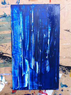
So our task today was to try these things out on a small scale, to experiment to see what effects we could make, in preparation for making a bigger and more composed piece next week.  So we played!  We had an endless supply of small primed boards, and lots of paint and different additives, and we tried out different approaches, using brushes, palette knives, spreaders, cardboard,  and whatever else we could find to apply the paint.  


We all produced very different results in widely different styles.  Here are some of mine....


College week 4/1 This week's art news

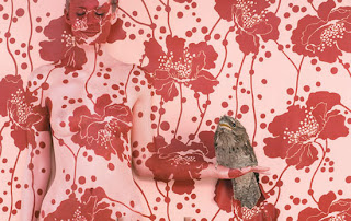
As part of our weekly art history sessions, Jo is focussing on things that are in the news.  This week it was the Chinese artist Lee Bolin who (with the help of a team of painters) creates works which involve him being painted so that he disappears into the background of his location.  


The paint process is meticulous and skilful, and it is hard to see where the figure sits among the real landscape setting.  His work was featured in yesterday's Guardian.  Here's the link
http://www.guardian.co.uk/artanddesign/gallery/2010/feb/17/liu-bolin-art-invisible-man#/?picture=359393340&index=9


 He started making pieces of this kind as a protest against the Chinese Government's demolition of various historic buildings, but hos work now suggests a wider commentary on freedom of speech and expression in China, especially for artists like Ai Wei Wei - do you have to blend into the generality?  Or can you skilfully hide among the masses while retaining your unique identity, albeit disguised and invisible? 


We also referred to the Australian artist Emma Hack, who does similar work related to wallpaper and interior decoration, in collaboration with Florence Bradhurst. 


 This too was mentioned in the Observer piece.  Web link is here http://www.emmahackartist.com/wallpaper.php


We also looked at the current exhibition as part of the London Design Festival of work by Am Song, whose huge piece, RedDress invites the viewer to become part of the work, and is some sort of comment on the fashion industry with an enormous red woollen dress spread out on the floor in a huge sports hall.  


I'm not sure I get the point of this one, although technically it is very impressive and must have  been a nightmare to construct.


In both these instances, though, I am left wondering who is the artist: is it the technicians and painters and sewing experts who did the hard work, or the artist who conceived of the idea and who gets the fame?

College week 4/1 Art History, Originality

Monday mornings this term start with art history with Jo Kear - always interesting and challenging, but especially so as we start at 9.30.  This shouldn't be such a struggle, but I am regularly rushing to leave the house on time, and the final tramp up Park Street nearly finishes me before the day has begun.  Today I jumped on a bus at College Green, glad of my bus pass to go such a short but steep ride.


Today's lecture was about originality in art - both in terms of creating a one-off piece, and in terms of pushing the boundaries to make something entirely new.  We looked at the Mona Lisa, and the story of it's theft from the Louvre in 1911 and its disappearance for two years.  


Even now, art historians and custodians at the Louvre are not 100% sure that the picture they recovered is in fact the original.  And what is so unique, now, about a picture which has been reproduced a million times in various suitable and less suitable formats from post cards to umbrellas?  Why the big security in the Louvre, why the huge queues of tourists who regard it as just another tourist 'must see' without any wider interest in art?  


Jo showed us various works where a 20th century artist has produced a picture based more or less closely on a previous 'old master'.  In each case there are both similarities and differences between the two, and the degree of mimicry or inpdiration varies widely.  But these examples indicate the extent to which artists continually refer back to some of th classic works of the past.  


One example was Picasso's Las Meninas (after Velasquez) in 1957, based on Velasquez' Family of Philip IV painted in 1656-7.  


Or Cindy Sherman's Untitled 216, created in 1988-90,  which was inspired by Jean Fouquet Melun triptych Virgin and Child surrounded by Angels from c 1450.


Or Ron Mueck's Angel 1997, inspired by Cimabue's Virgin and Child enthroned with two angels, dated from 1265-80.


Some 'copying' has been unashamedly commercial, e.g. various adverts for Habitat in 2006. 


And in terms of art creating unique objects, some art is quite deliberately created in ways which make use of modern technology and electronic transmission - whether through You Tube films or downloads, e.g. Gilbert and George's Planed in 2007. A BBC News report is here.  The image itself is reproduced here...


Bridget Riley, RWA

Today I spent lunchtime looking at the Bridget Riley prints in the RWA Gallery.     http://www.rwa.org.uk/whats-on/exhibitions/2011/10/exhibition-bridget-riley/


They were part of a bigger exhibition, including work by Louise Bourgeois and Tracey Emin (of which, more another day).


The Riley prints were especially interesting given that we have been doing two workshops on screen printing.  The most obvious reaction was to admire the extremely skilful registration of the prints, and to admire the large scale of many of these works.   I also very much liked the colour placing and mixing, sometimes obvious and sometimes quite strange  conjunction between opposing and complementary colours, like orange and blue.


There were a whole series of prints based around this swirling, wave-like design:


I also began to wonder about the ownership and creativity of some of the work.  How many different varieties of coloured lines can you produce, and still find it original, and still command enormous prices?


What is the difference between some of Riley's designs and some much more humdrum and commercially produced work, e.g. in wallpapers, wrapping paper, etc?  I know this sounds like sacrilege, but it seems to me that there is a very fine, and often invisible line, between 'high' and 'fine' art, and everyday decent design.


The exhibition also included work by Michael Kidner, another British Op artist of whom I had not previously heard.  His work was also interesting because of the constant tessellations, many of them hexagonal, so his paintings looked very much like old English-method patchwork quilts.


However, I later looked him up on-line and discovered that he actually produced a much more diverse body of work, some rather like Riley, and some more original.  The relationship between both these artists and regular patchwork quilt designs is quite striking.


Wednesday, 21 September 2011

Frome

Today I went to Frome for a birthday day out and to see two shows - the Frome Arts Society show at Black Swan Arts centre  details here, and the Brunel Broderers show "Curiouser" at the Silk Mill Studios. Brunel Broderers link here
The former was not very impressive - a lot of unexciting watercolours of local houses and views, and one or two really dreadful bits of 'abstract' painting.  The Broderers' show was much more inspiring, with some very well crafted pieces and interesting designs.   I also just wanted to see what Frome was like as a place - and was delighted to find such a nice little town, full of interesting crafty shops, lots of textiles and re-foudnd clothes and household objects and furniture.  All very pretty and atmospheric.

Tuesday, 20 September 2011

RWA Exhibitions Sept 2011

During my lunch break today I went to look at the current series of exhibitions in the RWA gallery.  More information is at the link here.


There are several separate shows.  Firstly, a small retrospective of screen prints by Bridget Riley, which I much enjoyed, not least because we have been exploring screen printing at college this week.  It was interesting to see how exactly the prints are register.  The shapes are the recognisable Riley swirls and sweeps, with rather odd mixtures of pure colour - greens and pinks, for example.  I am not sure I really like Riley's works of this kind - the bigger, painted and brightly coloured panels are more gripping, to my taste, but these prints were technically interesting.

The main work on show is the group of paintings by Louise Bourgeois which Tracey Emin added to after Bourgeois's death in 2010.    There is a Guardian review here http://www.guardian.co.uk/artanddesign/2010/dec/01/tracey-emin-louise-bourgeois-exhibition 


I liked the Bourgeois paintings, rich colour and smooth line drawings, but I was less than enthusiastic about Emin's additions, which seemed to me to diminish and detract from Bourgeois' work, rather than enhance it.  The overall effect seemed to be rather childish and silly, like rude drawings in the school toilets, and I can't get excited about them.  I'm not sure they say anything useful about sexual abuse or miscarriage, or whatever Emin has added - although others clearly think otherwise.

These drawings prompted a heated discussion in our first Art History session with Jo Kear the other day - at that point I hadn't seen them so didn't join in, but now I have, I would have supported the negative voices....

Next, and in the same room as the Riley prints, was a rather odd selection of landscape works by various artists from the RWA collection called Naturescape.   I'm afraid none of these pictures made a great impression on me, although I am sure they were good examples from the RWA Collection.  They didn't seem to me to fit with the other bits of the exhibition.

And finally, there was a selection of large canvases by Michael Kidner, a pioneer of Optical Art in the 60s.  Many of his works would have been equally comfortable if produced as patchwork quilts, being regularly repeating and tessellating geometric shapes, many hand coloured much like some of my sketches towards quilts done in the 80s and 90s.  The overall effect of some of these works was quite arresting.

College Week 3/1 Art History

Monday mornings now start at 9.30 with Jo Kear's Art History lectures.  Today we were looking at portraits, how to 'read' them, and what they tell us about the artist and the sitter.  We looked at a wide range of types of portrait,  commissioned for differing purposes.  Holbein's portraits of Anne of Cleeves


 and Christina of Denmark in 1538,


were commissioned by Henry VIII when he was scanning the courts of Europe for his fourth wife.

Eugene Delacroix's self portrait in 1828 - confident, direct, colourful - was compared with his friends and cousin Leon Reisener's Daguerrotype portrait of him 14 years later - less direct, darker, more anonymous somehow.  

We looked at Vermeer's Girl with the Pearl earring, and considered why and how some portraits lose touch with the identity of the sitters.  


Jo introduced us to a National Museums and Galleries of Wales portrait of Kathryn of Berain, whose history is somewhat mysterious.  Note - to flag this up with Jo and with Wales Women's Archive for a possible presentation at a future annual conference.  


The National Portrait Gallery has commissioned a series of imagined lives of some of the unknown people in some of their paintings, with an exhibition at Montecute House in Somerset.  The link is here.  It might be worth a visit together with a trip to textile and print shows at galleries in Somerton and Wells.....

Co-incidentally, I picked up a flyer at the RWA today for a new dramatic series being put on in the Alma  Tavern this autumn, where writers have been invited to create short plays based on the characters shown in a series of old photos culled from a market stall in Berlin.  More info is here.

Monday, 19 September 2011

College week 3/2 Screen-printing 2

Second session on screen printing today.  A couple of people were absent which meant there was a little bit more room for us to work.  I had done a little bit of thinking about my image since last week, and had drawn something based on negative spaces around a group of trees, firstly drawn, and second done was matisse- style cutouts.  This morning, with Janie's help, I printed these out onto acetates and put all three images onto a photo screen for printing.  I printed up several prints from the drawn image from last week,  using the paper backgrounds I'd prepared then.  But the more interesting work was to print the new images onto some of my hand-dyed fabrics, and also some loose-weave calico and some transparent viscose which I brought from home.  The acrylic paint needed to be thinned with a medium to slow down the drying time so the paint doesn't harden onto the screens.  For working on fabric you use a special textile medium, which helps the paint to absorb into the fabric without leaving a slightly sticky and hardened 'hand' to the feel of the cloth.


The screens we used were mounted on simple but effective printing boards, allowing the screen to be held steady but 'flipped' up to allow for positioning the paper and replacing it for overprinting.  I will try to make a smaller similar gismo to use with my A4 screens at home.

I had just about enough time to over-print some of the fabric samples in a second colour, and this worked well with the negative/positive screens I had made up.  I felt that the work today was more promising, and that I had got the feel of how to assemble and use a screen, how to mix the paint and medium appropriately, and how to register prints and overprints, also how to clean up afterwards.

I don't think my images were particularly good, nor that they were very well suited to the photo-screen method - I could have worked just as well with cut-out stencils today.  But it was helpful to work with a simple design as practice, and I would feel confident to plan a more complex and subtle set of prints using a photo screen at a later date.  I enjoyed using the screens and I might well return to screen-prinitng in my personal project work later in the year.

I can add some images of my print work here later on.....

Wednesday, 14 September 2011

Dylan Thomas

To the Tobacco Factory Theatre to see Bob Kingdom in Dylan Thomas Return Journey, an impressive monologue mixing a little contextual description with a great deal of Thomas's own writing, including the whole text of his short story about an ill-fated but boozy charabanc outing which never managed to reach Porthcawl, and much of Fernhill, and some of his best poems.  Kingdom's physical portrayal of Dylan Thomas was convincing, his accent near perfect.  Thomas claimed to "speak three languages: English; BBC Third Programme; and Saloon" and Kingdom delivers all three, plus a fair selection of Swansea, Valleys and West Wales accents too.  All very atmospheric, inducing a little nostalgia for the old country.  And much of it very funny too.  More info about the production is here

Centrespace Gallery

Open Edition was the title of a show of work by MA graduates from Newport College of Art at Centrespace Gallery, a small gallery tucked away in a tiny backstreet in the old commercial centre of Bristol.  Most of the work was screen printing, so of particular interest given our current workshops at QR.


Carly Llewellyn's images were skilfully done prints of items of lingerie - stockings, bras, bodices, in translucent fabrics printed simply in black on white paper.  Neil Smithson's work included some fairly similar items, but using men's ties.  Vicki Hall's mono prints I found especially compelling: they were mono prints, mainly in black or black and red, drawn freehand onto a silkscreen and printed.  The results were interesting as textural studies rather than images or abstract designs, and were mainly printed onto plain cotton calico, some pieces being pieced and patched before printing.  I liked the randomness of the prints, and the way they were mounted in series and groups.   More info and image on the link here

Given that I am vaguely thinking about printmaking as my main approach this year, it is interesting to look at a range of work by emerging artists and students  - to see what can be done using different techniques, to build up a better awareness of what 'works', and to develop my own ideas of what I want to achieve in my own work.

College week 2/2, Art History, 12th September

Tuesday means Art History with Jo, for the time being anyway.   I had missed the very first class yesterday so was rather please when we went back over some of what had been raised then.  This included spending some time discussing various definitions of art, including the Oxford English Dictionary which opines thus:  "the expression of creative skill through a visual medium such as painting or sculpture; or the product of such a process: paintings, drawings and sculpture collectively". The OED also defines craft as "an activity involving skill in making things by hand, or things made by hand". This prompted a quite heated debate, enlivened by (the other) Jo's strongly critical reaction to some of the Tracey Emin work currently on show at the RWA, and almost derailed by one of our number who swerved off into a rant about defining the whole of nature and the works of his divine creator as art.  Oh dear... We then learnt how to unpick and analyse a painting/art-work by looking hard at two paintings by Piero della Francesca of the Duke and Duchess of Urbino, 1472-3; 

and then did some further analysis in groups of a range of images of more recent work.  The first half of the session was stimulating and I  learnt something about who to read a painting, but the second half was rather dreary, as we were relying on guess work too much of the time, and we were not terribly engaged.  But overall I got quite a lot out of the session and will feel more comfortable in future about using quite a conscious analytical framework to help me think about context, meaning, technique, symbolism etc.  

Thursday, 8 September 2011

Welcome!

Welcome to my blog! This is a my first ever blog and I plan to use it mainly as part of my studies at Bristol School of Art where I am just starting the second year of a part-time Foundation Diploma in Art and Design.  The blog will be a kind of journal, recording my course work and projects, and other things I do related to my work.  It will also record my research into other artists and the influence of their work on my own art.  But I expect life in general will creep in too.

My creative activities until recently have been almost exclusively about quilts.  I have been making patchwork quilts for years, mostly straightforward repeating geometric patterns, generally using plain colours.  In the last couple of years I have been branching out, moving more towards contemporary or art quilts, but actually without much confidence in my design ability.  Most of the pieces I've made recently have been small, and quite a lot have never been finished.  This is in sharp contract to the years of making big bold quilts,  all of which were proudly finished and well used, on beds or sofas or hanging on the walls of my house.

I belong to the Quilters' Guild and its Contemporary Quilts Group, and have signed up for the CQ Journal Quilts challenge, which requires each member to make a small quilt each month.  Sometimes there is no theme, but for 2011 the quilts must each be 10" by 10" in size, and the first four had to include a circle somehow, the second four have to include text of some kind, and the last four have to include buttons.  I am trying to experiment with various kinds of quilt design, and also with a whole range of techniques including painting, printing and image transfer onto fabric, dyeing and embellishment, but above all, creating my own unique designs.

It is largely to explore and enhance my limited skills in design that I wanted to take an Art Foundation course.  Finding the Queens Road course in Bristol last summer was a tremendous excitement, and the first year of the course has been just as good as I hoped.  I have had a chance to try out many approaches and skills including ceramics, printmaking, sculpture and 3D work, felt making, glass fusing, enamelling, pinhole photography, artists' books, as well as painting and drawing.  The tutoring and the structure of the course has gently and gradually stretched my horizons and encouraged me to play and to explore in new ways.  The art history lectures, and the module on conceptual art, have really changed the way I look at art and given me confidence to make my own judgements about what I see and what I like - and why I like it.

As we start the second year, it is clear that the pace is changing again. There will be far fewer group workshops and far more independent work on a couple of big projects.  The resources of the college and staff will be available but it is up to us to make use of them as we see fit.  This is both exciting and terrifying.  But the group has built strong bonds of support and mutual respect, and I am looking forward to working alongside my fellow students as we journey onwards.

This blog will be part of my second-year submission.  I have never blogged before so my posts may be somewhat basic until I get the hang of it.  I am learning to keep my camera in my pocket and to take lots of photos.  I have today bought a new iMac - on which I am writing this first post - and hope that this will also help me in my work and in manipulating photos simply and quickly for this blog.

I'm not expecting a large blog following - indeed any following - but at stages through the year I will perhaps let my fellow students have a peep...

So, here goes, to art, life and everything: welcome to my world.

First day nerves

Well, this is my first blog post, and a significant milestone in my technical education.